SEO Benefits of Responsive Web Design for UK Businesses
Table of Contents
Responsive web design is the practice of building a single website that automatically adjusts its layout, images, and content to fit any screen, from a widescreen desktop monitor to a 5-inch smartphone. For UK businesses, this is no longer a design preference; it is a direct factor in how Google indexes your pages, how users behave on your site, and whether visitors convert into customers.
Google’s mobile-first indexing means the search engine now uses the mobile version of your website as the primary basis for ranking decisions. A site that works poorly on a small screen will not rank as well as one that has been built to adapt. Beyond rankings, the experience a visitor has on a mobile device directly affects bounce rates, time on site, and the likelihood that someone picks up the phone or fills in a form.
This guide covers 12 specific SEO benefits of responsive web design, from Core Web Vitals and crawl efficiency to local search dominance and UK accessibility law. You will also find a comparison of responsive design against legacy alternatives and a practical audit checklist to assess where your current site stands.
What Responsive Web Design Actually Means
Before covering the SEO advantages in detail, it is worth clarifying what responsive web design is and how it differs from approaches that were once common. Many businesses assume their site is responsive when it is simply mobile-compatible, and there is a meaningful difference between the two.
Responsive vs Adaptive vs M-Dot: Knowing the Difference
These three approaches represent different eras of solving the same problem. Understanding which one your site uses matters because each carries different implications for SEO and maintenance.
| Approach | How It Works | SEO Impact | Maintenance |
|---|---|---|---|
| Responsive | Single codebase; fluid grids scale with viewport | Low one site to update | Moderate: still one URL but brittle between breakpoints |
| Adaptive | Multiple fixed layouts triggered by device type | Medium: each layout needs separate updates | Poor: split link equity, duplicate content risk, redirect overhead |
| M-Dot (m.site.com) | Separate mobile subdomain | High: two sites to maintain | High : two sites to maintain |
M-dot subdomains were the dominant approach in the early 2010s. They split your inbound link equity across two domains, required canonical tags and redirects to function correctly, and were a constant source of indexing errors. Adaptive design reduced that problem but introduced its own fragility. Responsive design, built on fluid CSS grids and media queries, solves both issues cleanly.
How CSS Media Queries and Fluid Grids Create Flexibility
The technical foundation of responsive design relies on two CSS mechanisms working together. CSS media queries detect the width of the viewport and apply different style rules accordingly. Fluid grids use percentage-based widths rather than fixed pixel values, so layout columns stretch and compress proportionally as the screen changes size.
This means your content, navigation, and images reconfigure automatically without loading a separate page or triggering a redirect. Every user, regardless of device, sees the same URL with the same content, which is the condition Google’s indexing system is built to reward. If your site currently relies on a web development approach that separates mobile and desktop, the impact on search visibility is measurable and cumulative.
What “Mobile-First Indexing” Means for Your Rankings
Google completed its rollout of mobile-first indexing across all sites in 2023. This means Google’s crawler primarily uses the mobile version of your page to determine its ranking. If your mobile experience is stripped down, shows less content than the desktop version, or loads slowly on a 4G connection, those deficiencies are what Google’s algorithm evaluates.
The practical consequence is that desktop-only optimisation is no longer sufficient. A site that loads in 1.8 seconds on a laptop but takes 6 seconds on a mid-range Android phone will be ranked on the basis of that 6-second experience. Responsive design, when implemented properly, delivers the same quality of content and performance is available to every crawl and every visitor.
The Core SEO Benefits of a Responsive Website
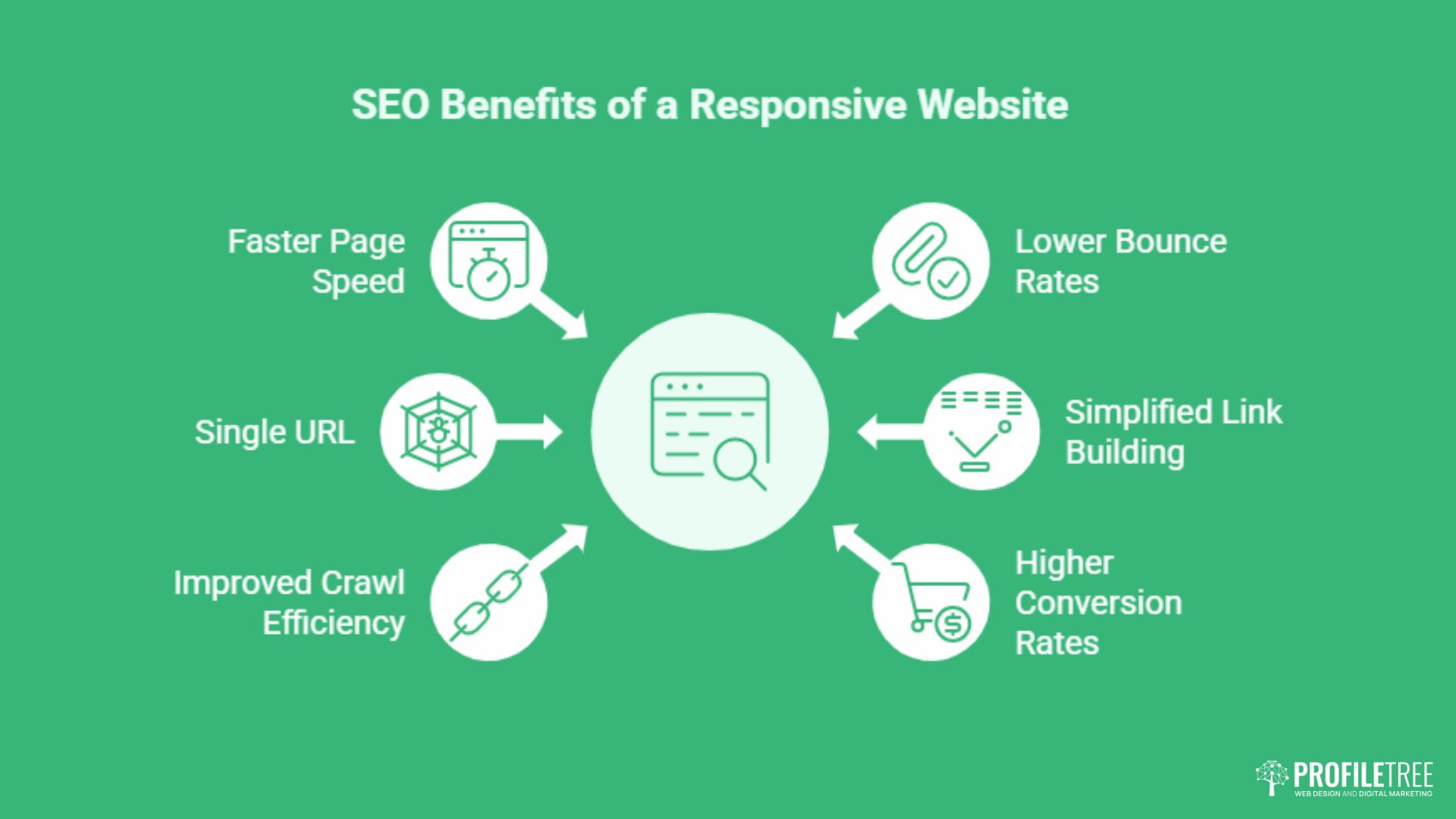
The following six benefits represent the most direct, measurable ways that responsive design affects organic search performance. Each connects to a ranking factor or a behavioural signal that search engines use when determining where to position your pages.
1. Faster Page Speed and Core Web Vitals
Page speed has been a Google ranking factor since 2010, but the introduction of Core Web Vitals in 2021 made specific performance thresholds part of the ranking algorithm. The three metrics that matter are Largest Contentful Paint (LCP), Cumulative Layout Shift (CLS), and Interaction to Next Paint (INP). Responsive design directly influences all three.
LCP measures how long it takes for the largest visible element: usually a hero image or a headline block, to appear on screen. On a responsive site, images are served at the correct resolution for the visitor’s screen size. A mobile visitor does not download a full-resolution 2000-pixel-wide image; they receive a scaled version sized for their viewport. This reduces file size, speeds up delivery, and pushes LCP scores into the “Good” threshold that Google rewards.
INP replaced First Input Delay as a Core Web Vital in 2024. It measures how quickly the page responds to any user interaction throughout the session, not just the first click. Responsive sites built on clean, efficient CSS tend to carry less layout recalculation overhead, which keeps INP low. Poorly coded responsive designs, however, can introduce layout thrashing if media queries are applied imprecisely, which is why the quality of the underlying web design implementation matters as much as the intention to be responsive.
2. Single URL Eliminates Duplicate Content Risk
When a site runs separate desktop and mobile versions, every piece of content exists at two addresses. Search engines must then decide which version to index, which to treat as canonical, and how to distribute the link equity that your backlinks have earned. Without careful canonical tag management, this split creates a duplicate content problem that actively drags your rankings.
Responsive design removes this entirely. One URL serves all devices. Every backlink, social share, and citation points to the same address. All the authority those links carry accumulates in one place. If you want to see whether your current site has any duplication issues, a duplicate content check will surface any pages that are competing with themselves in search results.
3. Improved Crawl Efficiency and Faster Indexing
Google’s crawler has a crawl budget for each site: a limit on how many pages it will process in a given crawl cycle. Sites with separate mobile and desktop versions require the crawler to visit both, consuming budget on what is effectively the same content twice. This is a particular issue for larger sites where important new pages can take longer to be discovered and ranked.
A responsive site presents one set of URLs. Googlebot indexes once and gets the full picture. This efficiency means new content is discovered faster, updates are reflected in search results sooner, and the crawl budget is spent on genuinely distinct pages rather than duplicated versions. The interaction between responsive design and indexing is explored in more detail in ProfileTree’s guide to AI-driven crawling and indexing.
4. Lower Bounce Rates Through Better User Experience
Bounce rate is a behavioural signal. When a user lands on a page and immediately leaves without interacting, search engines interpret this as a sign that the page did not satisfy the search intent. On a site that is not mobile-responsive, a significant proportion of mobile visitors will leave quickly, not because the content is wrong, but because the layout is broken, the text is too small to read, or buttons are too close together to tap accurately.
Responsive design removes those friction points. Navigation collapses into a thumb-friendly menu. Text reflows to a readable width. Forms stack vertically rather than overflowing the viewport. The result is that visitors stay longer, read further, and interact more, all of which send positive signals to search engines. Paired with solid SEO services, a lower bounce rate translates directly into improved ranking stability.
“A responsive site is not a technical nicety; it is the basic standard users expect before they will trust a business enough to make contact. We see it consistently across the SMEs we work with in Northern Ireland: fix the mobile experience, and the enquiry rate follows.” — Ciaran Connolly, Founder, ProfileTree
5. Simplified Link Building and Concentrated Backlink Equity
Every backlink your site earns through PR, guest content, partnerships, or organic citation is an endorsement that passes authority to a specific URL. When that URL is unique and consistent across devices, all of that authority flows to one page. When links point to desktop and mobile versions interchangeably, or when redirect chains convert one to the other, some of that authority is lost in transit.
A responsive site means your link-building efforts compound rather than divide. An article placed on an industry publication, a local business directory listing, or a mention in a trade association newsletter all reinforce the same URL. Over time, this accumulation is one of the most durable advantages a well-structured responsive site has over a legacy dual-version setup.
6. Higher Conversion Rates Directly Supporting Business Goals
Search rankings are a means to an end. The goal for most UK businesses is enquiries, bookings, purchases, or phone calls. A mobile visitor who lands on a responsive site finds the call-to-action button the right size for a thumb tap, the contact form readable without zooming, and the phone number formatted as a clickable link. These details, trivial individually, determine whether a session ends in a conversion or an exit.
The analytics consequences are equally direct. A single responsive site provides a unified dataset. You can see the complete user journey from first visit to conversion without reconciling data from separate mobile and desktop properties. This clarity makes it possible to identify exactly where users drop off and refine the experience accordingly.
The Hidden UK Business Advantages of Responsive Design
The six benefits above are well-documented and appear in most discussions of responsive design and SEO. The following four are less commonly addressed in global content but carry significant weight for businesses operating in the UK and Irish markets. Competitors in search results have largely missed these angles, which means covering them in depth creates a genuine competitive advantage in terms of ranking and relevance.
7. Accessibility and UK Legal Compliance
The Equality Act 2010 places an obligation on UK businesses to make their websites reasonably accessible to disabled users. A non-responsive site that fails on a screen reader, cannot be operated by keyboard alone, or presents content that is illegible on mobile assistive technology, is not merely a poor user experience. It is a potential legal liability.
Responsive design, when built to WCAG 2.1 AA standards, addresses a substantial portion of accessibility requirements. Reflo: the ability of content to display in a single column at 400% zoom without horizontal scrolling, is an explicit WCAG criterion. Touch target sizing, text spacing, and focus indicators all become easier to manage in a responsive framework because the layout already adapts to different conditions by design.
This matters for SEO because accessibility and search engine crawlability overlap significantly. Properly structured HTML with semantic roles, sufficient contrast, and logical heading hierarchies helps both screen readers and Googlebot understand your content. ProfileTree’s guide to ARIA and accessibility covers the technical implementation in detail, and our work on accessibility compliance explores the legal context for UK businesses specifically.
8. Local SEO Dominance for UK “Near Me” Searches
A large proportion of local searches happen on mobile devices, often in real time. Someone walking through Belfast city centre searching for a nearby accountant, a plumber searching for a supplier while on a job, or a tourist looking for a restaurant in Northern Ireland will conduct that search on a phone. If the business’s website is not responsive, the experience that search delivers is broken before it begins.
Google’s local ranking algorithm considers proximity, relevance, and prominence. Prominence is partly a function of engagement signals: how long users spend on the page, whether they click through to directions or make a call, and how many users return. A responsive site supports all of those behaviours; a non-responsive one actively suppresses them. Northern Ireland’s cities, explored in depth on Connolly Cove, represent a range of commercial environments where mobile search intent is high and local competition is increasingly sophisticated.
For businesses targeting local queries, a responsive site is not a prerequisite to appearing in Google Maps results, but it is a significant factor in converting those appearances into actual visits. The full picture of how to build local search authority is covered in ProfileTree’s guide to AI-enhanced local SEO.
9. Sustainable Web Design and Your Carbon Footprint
Maintaining two versions of a website, a desktop site and a separate mobile site, requires duplicate hosting resources, double the storage, and twice the server requests for every asset update. This is not a high cost for small sites, but for businesses with hundreds of pages, product listings, or regularly updated content, the energy overhead is real.
Responsive design reduces this. One codebase, one hosting environment, one set of assets to serve. Beyond the operational efficiency, this aligns with growing expectations from corporate clients and procurement teams who scrutinise the sustainability credentials of their suppliers. UK businesses bidding for public sector contracts, in particular, are increasingly asked to demonstrate environmental responsibility. An efficient, well-coded responsive site is a small but documentable part of that picture.
10. Future-Proofing for Voice Search and Wearables
Voice queries behave differently from typed searches. They are longer, more conversational, and more likely to express local intent. “What’s the best web design agency near me?” is a voice query. “Web design Belfast” is a typed one. Both lead to the same result pages, but voice results are almost exclusively drawn from mobile-optimised sources.
Wearables introduce another consideration. Smartwatch screens present content at resolutions and viewport sizes that no fixed-layout site will handle gracefully. A responsive framework, built on proportional sizing rather than fixed dimensions, scales down to those constraints far more reliably than a desktop-centric design. As connected devices proliferate, the gap between responsive and non-responsive sites will widen rather than close.
When Responsive Design Can Hurt Your SEO
Responsive design is not a guarantee of SEO improvement. Implemented poorly, it can introduce performance problems that are worse than the dual-site approach it replaces. Understanding the common failure modes is as important as understanding the benefits.
Hidden Content That Doesn’t Load on Mobile
One of the most common responsive design mistakes is using CSS to hide content on mobile rather than serving different content. A developer builds a desktop experience with rich explanatory text, then adds a CSS rule to hide those sections below a certain screen width. The content is technically present in the HTML but invisible to mobile users.
Under mobile-first indexing, Google treats the mobile version as primary. If significant content is hidden on mobile, Google may choose not to index it at all, or may index it with lower weight than desktop-visible content. The rule is simple: if the content matters for SEO, it must be visible on mobile. Use a responsive layout to rearrange content, not to remove it.
Oversized Images and Assets Not Optimised for Small Screens
Serving a 2MB hero image to a smartphone over a mobile data connection will produce poor LCP scores regardless of how well the rest of the responsive framework is built. The HTML may be perfectly responsive, but if the assets are not, the performance benefits evaporate. This requires implementing srcset attributes on images, using modern formats like WebP and AVIF, and ensuring that image dimensions are appropriate for each breakpoint.
This is where the quality of the underlying development matters. A responsive site built with proper asset optimisation will consistently outperform one where responsiveness was retrofitted onto an existing desktop design without addressing image delivery. ProfileTree’s web development service addresses this at the build stage rather than as an afterthought.
Intrusive Interstitials That Trigger Google Penalties
Google has penalised sites that show large pop-ups or overlays on mobile that obscure the main content before the user has had a chance to engage with the page. This includes newsletter sign-up banners that cover the viewport, cookie consent overlays that do not dismiss properly on touch screens, and promotional modals that appear immediately on page load.
A responsive design does not automatically prevent these. If the pop-up implementation is not designed with mobile behaviour in mind, it can display in a way that triggers Google’s interstitials penalty. On mobile, a pop-up that is dismissible with a small “X” button on desktop may become unclickable when that button is 8 pixels wide on a 375-pixel-wide screen. Testing pop-up behaviour across real devices, not just browser emulators, is a necessary step in any responsible responsive build.
How to Audit Your Site’s Responsiveness: A Practical Checklist
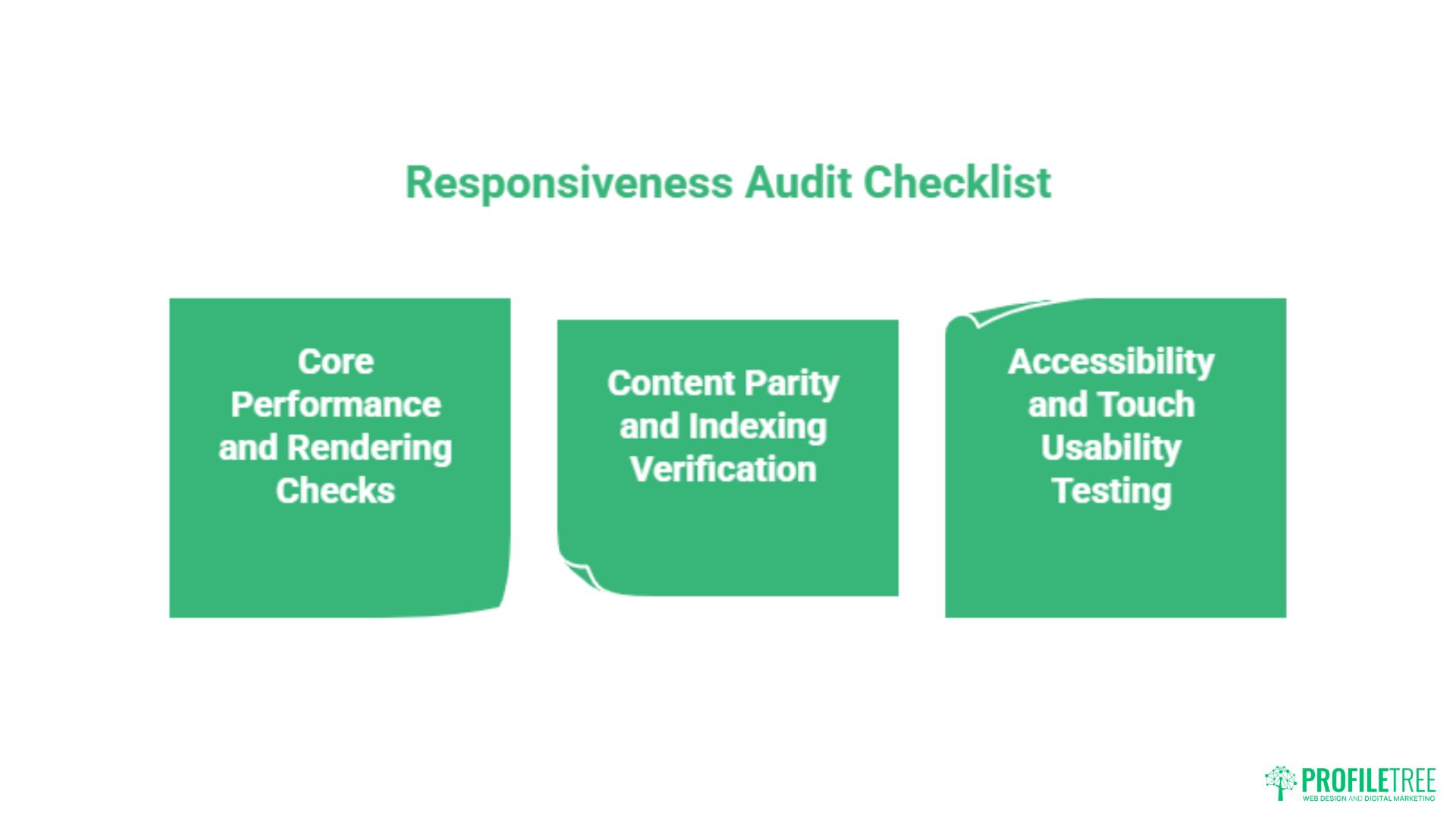
Whether you are reviewing a site you already own or evaluating a new build, the following checklist covers the most consequential points. This is not an exhaustive technical audit, but it addresses the issues most likely to affect your search performance and user experience in practice.
Core Performance and Rendering Checks
Run your site through Google’s PageSpeed Insights tool, which reports LCP, CLS, and INP separately for mobile and desktop. A passing score for desktop with a failing score for mobile is a common pattern on sites that were designed for desktop and later adapted. The mobile score is the one that feeds into your rankings under mobile-first indexing, so a failing mobile report is an active drag on your organic performance.
Resize your browser manually from full width down to 320 pixels, which is the minimum viewport width Google tests against. Watch for content that overflows horizontally, images that break out of their containers, text that becomes unreadable, or navigation elements that disappear or overlap. Each of these is a failure point that will affect real users and the crawler’s assessment of your site’s quality.
Content Parity and Indexing Verification
Use Google Search Console’s URL Inspection tool on your most important pages. Switch the rendered view to mobile. Compare the content Google sees in its mobile render against what you see on your desktop browser. If key sections, images, or structured data are absent from the mobile render, they are effectively invisible to the indexing system.
Check that your headings, metadata, and internal link structure are all present in the mobile render. A page where the desktop version has five internal links but the mobile render has two is a page that is distributing link equity inconsistently. This kind of discrepancy often goes unnoticed until a ranking drop prompts an audit.
Accessibility and Touch Usability Testing
Test your site on at least three real devices, not browser emulators, covering a small Android phone, a mid-sized iPhone, and a tablet. Pay specific attention to tap target sizes, which Google recommends at a minimum of 48 by 48 pixels. Test form inputs to confirm they trigger the correct keyboard type, numeric keyboards for phone number fields, email keyboards for email fields, and that labels remain visible when the field is active.
Run the Lighthouse accessibility audit within Chrome DevTools. A score below 90 on mobile suggests issues that affect both disabled users and search engine crawlability. If your site is not currently meeting these standards and you are not sure where to start, ProfileTree’s SEO services include a technical audit component that covers responsive performance and accessibility in a single assessment.
Conclusion
Responsive web design is not a feature to add to a finished website. It is the structural foundation that determines whether Google can index your content properly, whether visitors stay long enough to convert, and whether your site holds up as device types continue to multiply. For UK businesses, it also intersects with legal accessibility obligations that carry real risk if ignored. If your site is not performing as expected in organic search, the responsiveness of the underlying design is one of the first things worth checking.
Speak to the ProfileTree team about a technical web design or SEO review: view our web design services or explore our SEO services to find out where to start.
FAQs
Does Google penalise websites that are not responsive?
There is no specific manual penalty for non-responsive design, but the algorithmic disadvantage is substantial. Under mobile-first indexing, Google ranks your pages based on the mobile version of your site. A site that performs poorly on mobile, whether through slow load times, hidden content, or poor usability, will rank below comparable sites that deliver a better mobile experience.
What is the difference between mobile-friendly and responsive?
Mobile-friendly simply means a site is usable on a mobile device. It might achieve this through basic CSS adjustments, a separate mobile subdomain, or an adaptive layout. Responsive design is a specific technical approach: a single codebase using fluid grids and CSS media queries to reflow content proportionally across any screen size.
How do I check if my website is responsive?
The quickest method is to open your site in a desktop browser and drag the window narrower, watching how the layout behaves as the viewport shrinks. A responsive site will reflow cleanly at each breakpoint. For a more thorough assessment, run the URL through Google’s PageSpeed Insights or Lighthouse, which flags mobile rendering issues specifically.
Will responsive design improve my local search rankings in the UK?
Yes, indirectly but significantly. Local searches in the UK, particularly “near me” queries, are dominated by mobile devices. Google’s local ranking algorithm factors in engagement signals such as click-through rates, dwell time, and conversion actions. A responsive site supports all of these by removing the friction that causes mobile users to leave quickly.
Is responsive design better than having a separate mobile app?
For most UK SMEs, yes. A mobile app requires separate development, platform-specific versions for iOS and Android, ongoing maintenance, and users must actively download it. A responsive website is immediately accessible to anyone with a browser and is fully indexable by search engines. Apps do not rank in Google’s organic results in the same way pages do.