Effective Website Layouts for SME Conversion Design
Table of Contents
Most small business owners approach a new website by talking about colours and fonts. The website layout rarely comes up until the designer shares a first mockup, at which point it has already been decided. That is the wrong order. Effective website layouts are not a matter of visual preference; they are the structural logic that determines whether a visitor stays, reads, converts, or leaves within seconds.
This guide explains the psychological principles behind effective website layouts, identifies which patterns suit different business models, and shows why these choices need to be locked in at the brief stage, not adjusted after launch.
Why Website Layout Affects Conversion Before a Word Is Read
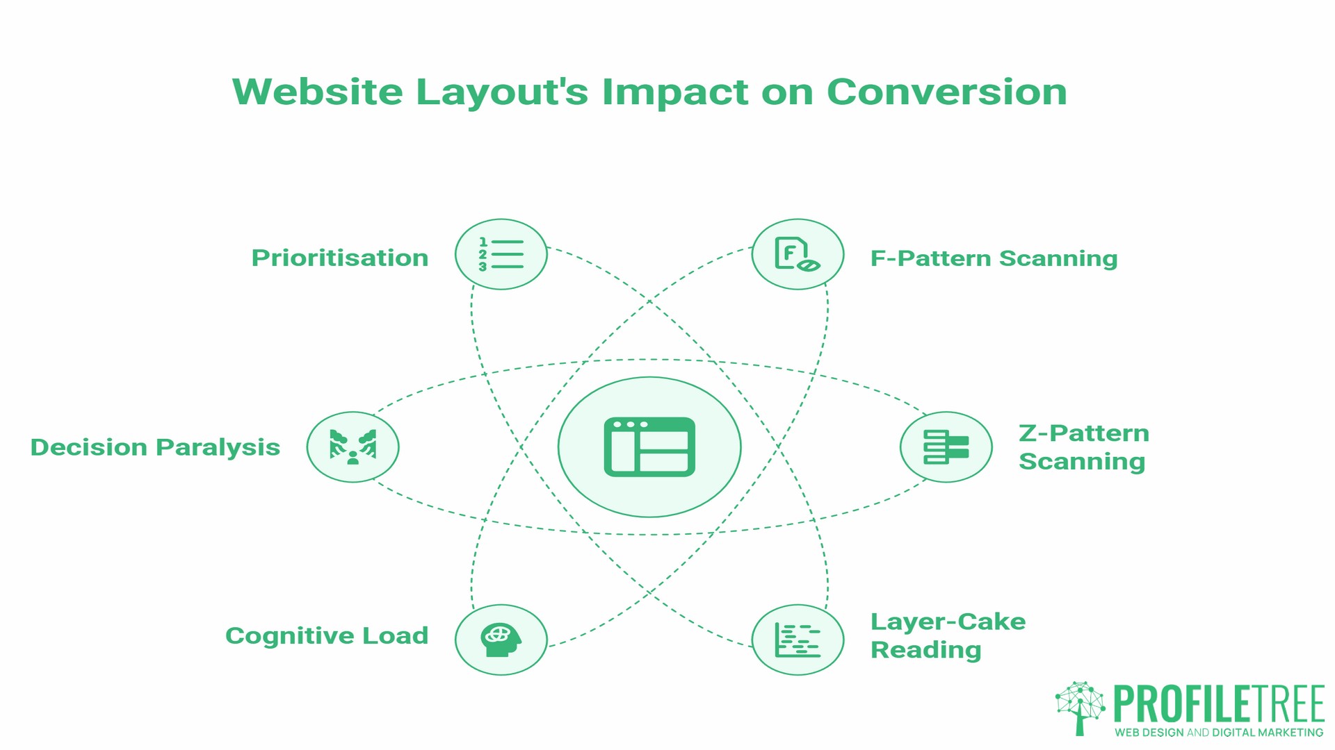
Planning effective website layouts begins with understanding how users scan a page. A visitor processes the visual structure before reading a single line of copy. Research in cognitive psychology shows that humans scan screens in predictable patterns, and your layout either works with those patterns or fights against them.
F-Pattern and Z-Pattern Scanning: Which Applies to Your Business
Nielsen Norman Group’s landmark 2006 eye-tracking study, which recorded over 200 users across thousands of web pages, found that users reading text-heavy pages consistently follow the same sequence: a full horizontal sweep across the top, a shorter horizontal sweep slightly lower, then a vertical scan down the left edge. This produces a pattern resembling the letter F.
The Z-pattern emerges on pages with less text and more visual structure, such as landing pages and homepages, where the layout itself guides attention rather than content density. The eye moves from top-left to top-right, diagonally down, then left to right again.
For a service business with detailed offerings, such as an accountancy practice or a manufacturing supplier, an F-pattern layout places the most important information along the top and left margin, where the eye naturally lands. For a business running a single promotion or a clear two-option offer, a Z-pattern layout guides visitors directly to the call to action at the bottom right of the visual field.
It is worth noting that Nielsen Norman Group’s follow-up research found the F-pattern is partly a failure state: it emerges most strongly when pages lack clear structure. Well-defined headings and short paragraphs pull users into a more engaged “layer-cake” reading pattern, where they read each heading fully before deciding whether to continue. This gives businesses with strong content hierarchy more control over user scanning than the original F-pattern literature suggests.
Cognitive Load and Decision Paralysis
Cognitive load refers to the mental effort required to process a page. A website layout that presents too many competing elements, mismatched visual weights, or unclear hierarchy creates decision paralysis. The visitor does not know where to look next, so they leave.
The fix is not always simplification; it is prioritisation. Every element on the page should have a defined visual rank. The primary action gets the most prominent position. Secondary information sits beneath it. Supporting details live further down. That hierarchy is set by the layout before any content is placed.
5 Effective Website Layouts for UK and Irish SMEs
The five effective website layouts below cover the majority of small business needs. Each has a distinct psychological profile and a set of business use cases where it performs well.
| Layout Type | Best For | Mobile Compatibility | Conversion Focus |
|---|---|---|---|
| Zig-Zag | Brand storytelling, services | High | Trust-building |
| F-Pattern | Information-heavy services | Medium | Engagement depth |
| Single Column | Mobile-first, retail, local | Very High | Speed to CTA |
| Split Screen | Dual audience, B2B and B2C | Medium | Segmentation |
| Grid | E-commerce, portfolios | High | Product discovery |
The Zig-Zag Layout for Brand Storytelling
Effective website layouts built on a zig-zag pattern alternate image and text across a horizontal axis as the user scrolls. The eye moves naturally from left to right, then resets. This rhythm creates a sense of narrative progression, making it particularly effective for service businesses that need to build trust before asking for a commitment.
A web design agency, a consultancy, or a professional services firm benefits from this pattern because it gives each service or proof point its own visual moment without requiring the visitor to commit to reading a long text block. The alternating structure also signals investment in design, which, in turn, serves as social proof.
The F-Pattern Layout for Information-Heavy Services
Solicitors, accountants, healthcare providers, and financial services businesses all face a common challenge: conveying credibility and detail without overwhelming visitors. The F-pattern layout places the most important information in the top horizontal band, then repeats key points down the left margin, with supporting detail to the right.
This website layout works with how users actually read. It does not force an aesthetic experience; it respects the visitor’s intent to quickly find specific information.
The Single-Column Layout for Mobile-First Businesses
Single-column layouts are the correct default for any business where mobile traffic is the majority. According to Statista data from December 2024, mobile phones accounted for around 55% of web page views in the UK. That figure covers most retail, hospitality, and local service businesses in Northern Ireland, Ireland, and across the UK. There is no competing column to confuse the scroll path. Content stacks vertically, the CTA appears at natural break points, and loading times are faster because the layout requires less conditional rendering.
High Street retailers, restaurants, tradespeople, and local professional services all fall into this category. The single-column website layout is not a compromise; it is the architecturally correct choice for a phone as the primary device.
The Split-Screen Layout for Dual-Audience Businesses
A split-screen layout divides the viewport into two equal or near-equal vertical panels. Each panel addresses a different audience or a different service path. This is the correct solution for businesses that genuinely serve two distinct groups, such as a company selling to both consumers and trade buyers, or a training provider working with both individuals and corporate clients.
The split-screen forces an immediate routing decision, reducing bounce rate among qualified visitors because each section speaks directly to a defined need.
The Grid Layout for E-Commerce and Portfolio Sites
Effective website layouts built on a grid organise content into uniform cells, allowing multiple items to be presented simultaneously without visual hierarchy conflicts. This works well for e-commerce businesses because it mirrors how people browse physical shops: scanning across a range of options at the same level. It works equally well for creative portfolios because it presents work without editorialising.
The grid’s weakness is cognitive load at scale. A 40-product grid with no filtering creates the same decision paralysis as a cluttered homepage. A well-structured grid uses progressive disclosure: show 8 to 12 items, allow filtering, and paginate thoughtfully.
The Conversion Trinity: Colour, Typography, and White Space
Three design elements sit beneath the layout structure and determine whether the visual hierarchy the layout creates actually converts. Getting the layout right and then applying these elements poorly wastes the structural work.
Colour Psychology and Industry Trust
Colour associations in web design are not arbitrary; they reflect ingrained cultural and psychological patterns. Blue communicates reliability and security, which is why it dominates financial services, technology, and healthcare. Green communicates sustainability and health, making it the natural choice for food businesses, environmental organisations, and wellness brands. Red signals urgency and energy; it performs well for sale promotions and time-limited offers, but can erode trust when used as a primary brand colour for professional services.
For SMEs, the practical question is not “what colour do we like?” but “what emotion does our primary customer need to feel before they trust us enough to contact us?” That question has a different answer for a Belfast law firm than for a Galway food producer. ProfileTree’s guide to the importance of colour scheme covers the decision-making process in depth.
Colour contrast is a separate consideration from palette choice. Under WCAG 2.1 AA guidelines, as specified in the W3C’s Web Content Accessibility Guidelines, the text-to-background contrast ratio must be at least 4.5:1 for normal body text. This is not a design preference; it is a defined accessibility standard. For businesses serving the UK public sector, compliance is a legal requirement.
Typography as Brand Voice
Typography is one of the most undervalued brand signals on a small business website. The typeface communicates personality before the copy is read.
| Font Category | Psychological Association | Best Fit |
|---|---|---|
| Serif (e.g. Georgia) | Authority, tradition, trust | Legal, finance, publishing |
| Sans-serif (e.g. Inter) | Clean, modern, accessible | Tech, SaaS, professional services |
| Slab serif (e.g. Roboto Slab) | Confident, direct | Construction, manufacturing |
| Script or display | Creative, personal | Hospitality, food, lifestyle brands |
As Ciaran Connolly, founder of ProfileTree, puts it: “Typography is not just the font you use. It is a melding of form, function, and strategic intent.”
Body text should be set at a minimum of 16px, with line height between 1.4 and 1.6 times the font size. These are the thresholds below which readability measurably degrades across devices. ProfileTree’s web development services apply these standards as defaults across every build.
White Space: The Signal of a Premium Brand
White space (the unmarked area between elements) is often the first casualty when a client tries to add more information to a page. The instinct makes sense: more information feels like more value. The effect is the opposite.
Dense layouts increase cognitive load. White space reduces it. A page that gives each element room to breathe signals confidence: the business is not scrambling to tell you everything at once. That confidence reads as quality, which is a genuine conversion driver for premium-positioned SMEs.
Designing for Compliance: GDPR, Cookie Banners, and Accessibility
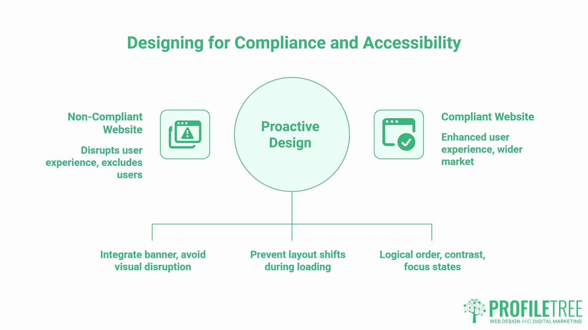
This is the section competitors consistently skip, and it is the most practically relevant consideration for businesses trading in the UK and Ireland.
Cookie Consent and Layout Shift
The mandatory cookie consent banner disrupts the F-pattern and Z-pattern scanning sequences described above. A banner that slides in from the bottom, or a full-screen overlay that must be dismissed before the page loads, interrupts the visual hierarchy that the layout was designed to create.
The solution is to design the layout with the consent layer as a defined component from the start, not as an overlay bolted on afterwards. Position the banner so it does not cover the primary H1, the main value proposition, or the primary CTA. Test the layout with the banner in place on mobile, because a banner that takes up 30% of a desktop viewport can take up 60% or more of a phone screen.
Cumulative Layout Shift (CLS), one of Google’s Core Web Vitals metrics, measures how much the page visually jumps as elements load. A cookie banner that causes the page to reflow scores poorly on CLS. Effective website layouts pre-allocate space for these elements during development so the page does not shift.
Accessibility as a Commercial Advantage
WCAG 2.2 compliance is a legal obligation for public sector organisations in the UK under the Public Sector Bodies Accessibility Regulations 2018. For private sector businesses, it is increasingly a commercial requirement, particularly when tendering for contracts or serving a wide customer base.
Disabled households in the UK represent an estimated £274 billion in annual spending power, a figure cited by We Are Purple and referenced in a UK Parliament Women and Equalities Committee report. A layout that fails keyboard navigation, has insufficient colour contrast, or presents information in a structure that screen readers cannot parse excludes a significant portion of that market. ProfileTree’s work on accessibility compliance in website design covers the specific technical requirements in detail.
Accessible website layout decisions include: logical reading order in the HTML, sufficient contrast ratios, visible focus states on interactive elements, and no content conveyed by colour alone. These are development decisions that need to be reflected in the layout specification before the build begins.
From Brief to Launch: Setting Layout Strategy Before Design Begins
The central argument of this guide is that effective website layouts are a strategic decision, not a design decision. The layout type should be determined by answering four questions before a designer opens any software:
- Who is the primary audience, and what device are they most likely using?
- What is the single most important action a visitor should take?
- How much information does the visitor need before they will take that action?
- What emotion does the visitor need to feel before they trust the business enough to act?
The answers determine whether the correct layout is single-column or grid, F-pattern or Z-pattern, zig-zag or split-screen. A designer, given this information, can build a layout that serves those objectives from the first wireframe.
Measuring Layout Performance After Launch
Once the site is live, website layout performance can be measured directly using heatmapping tools such as Hotjar or Microsoft Clarity. Both tools are free at the entry level and show where users click, how far they scroll, and where they drop off. If the heatmap shows no click activity in the area where the primary CTA sits, the layout is placing that CTA outside the natural scanning path.
This kind of post-launch measurement converts a website layout from a one-time design choice into an ongoing conversion improvement process.
ProfileTree’s digital training services include practical sessions on interpreting website performance data and translating findings into design briefs for developers.
FAQs
What makes a website layout effective for conversion?
An effective layout places the primary call to action within the dominant scanning path, uses visual hierarchy to guide the eye predictably, and reduces cognitive load by giving each element a defined priority. The goal is not to impress the visitor with the design but to remove friction between their arrival and the action you want them to take.
Is a custom layout better than a template for a small business?
Templates are appropriate for businesses with limited budgets and straightforward needs. The risk is that template layouts are designed for generic use cases, not for the specific scanning behaviour of your audience or your business’s particular conversion goals. A custom layout built around the four questions above will consistently outperform a template over a 12 to 18-month period, both in conversion rate and in search performance, because it is built around your actual user journey.
How many columns should my website layout have?
On a desktop, a 12-column grid offers the most flexibility, allowing two-, three-, and four-column layouts within the same underlying structure. On mobile, collapse to a single column as the default. The layout should never require a mobile user to scroll horizontally or zoom to read content.
Does website layout affect Google rankings?
Yes, both indirectly and directly. Indirectly, layouts that create a poor user experience generate high bounce rates and low dwell time. Directly: layout decisions affect Core Web Vitals scores, particularly Cumulative Layout Shift (CLS) and Largest Contentful Paint (LCP). A layout that causes significant reflow as elements load, or that places the primary visible content far down the render order, will score poorly on these metrics.
What are the most effective website layouts for a mobile-first business in the UK?
Single-column layouts, without exception. Mobile phones accounted for around 55% of web page views in the UK as of December 2024, according to Statista. A single-column layout with large tap targets, a visible CTA within the first scroll, and no competing columns is the architecturally correct choice for any business whose primary customers are on phones.
How do I ensure my layout is accessible?
Start with logical HTML reading order, a minimum contrast ratio of 4.5:1 for body text as required by WCAG 2.1 AA, visible focus states on all interactive elements, and text alternatives for all non-text content. Test with a screen reader (NVDA is free on Windows) and test keyboard-only navigation from the homepage through to a completed contact or purchase journey. Accessibility is most cost-effective when built into the layout specification; retrofitting it after launch is significantly more expensive.