Dark Mode Design: Enhancing User Experience and Accessibility
Table of Contents
Dark mode design has emerged as a staple feature in modern digital interfaces, offering an alternative colour scheme that inverts the conventional light interface. This popular mode, characterised by light-coloured text and elements on a dark background, has gained traction not just for its aesthetic appeal but also for its functional benefits. From reducing eye strain to improving accessibility, dark mode has become a key feature for applications, websites, and operating systems.
This comprehensive article delves into the intricacies of dark mode design, exploring its impact on user experience (UX), accessibility, and design challenges. We’ll also examine practical strategies for crafting effective dark mode interfaces and highlight their role in the broader context of inclusive design.
Understanding Dark Mode Design
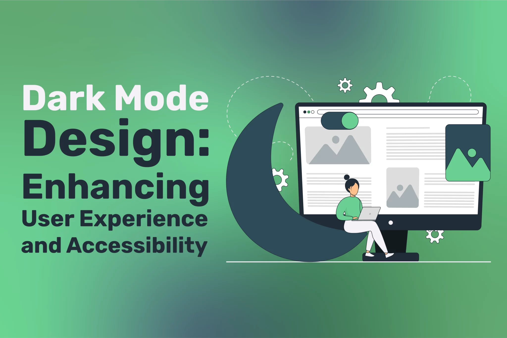
Dark mode, known as night mode, alters the UI’s traditional light theme by implementing a darker colour palette. Historically, early computer monitors used light text on dark backgrounds due to hardware limitations, but the paradigm shifted to light interfaces with advancements in display technology. Today, the resurgence of dark mode reflects a blend of nostalgia, modern aesthetics, and user-centric design principles.
Modern dark mode design combines style and functionality, offering an elegant visual experience while addressing specific user needs.
Why Dark Mode? The Allure and Advantages
Dark mode appeals to users for various reasons, from comfort to practicality. Its benefits extend beyond aesthetics, significantly impacting how people engage with digital content.
1. Visual Comfort and Eye Strain Reduction
One of the most cited benefits of dark mode is its ability to reduce eye strain, especially in low-light environments. Staring at bright screens for extended periods can cause digital eye strain, leading to discomfort, dryness, and fatigue. Dark mode mitigates this by emitting less light and creating a softer interface, making it easier to focus on content.
2. Energy Efficiency
Devices with OLED and AMOLED screens benefit significantly from dark mode. In these displays, black pixels are essentially turned off, conserving energy. This translates to longer battery life for smartphones, tablets, and laptops, particularly when dark mode is used extensively.
3. Enhanced Aesthetic Appeal
Dark mode exudes a sleek, modern vibe that resonates with contemporary design trends. It aligns well with minimalistic interfaces, highlighting essential content while maintaining a sophisticated look.
4. Improved Focus
The darker background reduces visual clutter and distractions, helping users concentrate on primary tasks. This mainly benefits productivity apps, reading platforms, and coding environments.
5. Catered to User Preferences
Dark mode empowers users by offering a choice in how they interact with digital interfaces. This sense of control fosters a more personalised experience, enhancing overall user satisfaction.
The Role of Dark Mode in Accessibility

Accessibility is a critical aspect of digital design, and dark mode contributes significantly to creating inclusive experiences. By addressing the needs of diverse user groups, dark mode enhances usability for individuals with specific challenges.
1. Visual Impairments
Dark mode can accommodate users with certain visual impairments, such as photophobia (light sensitivity). Reduced screen brightness and glare make content more accessible and comfortable to consume for these individuals.
2. Neurodivergent Users
Neurodivergent individuals, including those with autism, ADHD, or sensory processing disorders, may find dark mode interfaces less overwhelming. The subdued tones create a calmer visual environment, enabling better focus and interaction.
3. Age-Related Vision Challenges
As people age, their eyes become more sensitive to light, and their ability to adapt to brightness decreases. Dark mode provides an alternative that reduces glare and facilitates easier reading for older users.
4. Assistive Technology Compatibility
When paired with assistive technologies such as screen readers, dark mode enhances the accessibility of digital content. For instance, high-contrast themes ensure that text remains readable, while icons and UI elements are distinguishable.
The Challenges of Implementing Dark Mode
Despite its benefits, designing for dark mode is not without challenges. Missteps in implementation can lead to poor usability, defeating its purpose.
1. Maintaining Readability and Contrast
Dark mode’s success hinges on properly contrasting text and background. Insufficient contrast can strain the eyes, while overly bright text can be just as uncomfortable as a glaring white screen. Designers must adhere to established contrast standards, such as those outlined in the Web Content Accessibility Guidelines (WCAG).
2. Adjusting Colours
Colours behave differently on dark backgrounds. Vibrant hues may appear too intense, while muted tones might lose visibility. Designers must test and adapt their colour palettes to ensure harmony and clarity.
3. Image and Graphic Optimisation
Images, logos, and icons designed for light mode may not translate well to dark mode. Without proper adjustments, they can appear washed out, overly bright, or invisible against a dark background.
4. Cognitive Overload
Switching between light and dark modes can be disorienting if the transition is not seamless. Ensuring consistency in UI elements and interactions across both modes is essential for avoiding cognitive overload.
5. Increased Development Effort
Implementing dark mode requires additional resources and testing. Developers must consider technical complexities, such as ensuring compatibility with older devices and browsers.
Best Practices for Dark Mode Design
Crafting an effective dark mode interface involves adhering to best practices that balance aesthetics, usability, and accessibility.
1. Focus on Contrast Ratios
Ensure that text and essential elements stand out against the dark background. The recommended contrast ratio for standard text is 4.5:1, while larger text requires a minimum of 3:1. Testing tools like Contrast Checker can help designers validate their colour choices.
2. Avoid Pure Black
Using pure black (#000000) can be harsh on the eyes and reveal imperfections in screens. Instead, opt for dark greys (#121212 or #1E1E1E) to create a softer, more comfortable experience.
3. Use Colour Strategically
Limit the use of vibrant colours to highlight actionable elements or draw attention. A muted colour palette works best for the primary UI, with accent colours providing emphasis where needed.
4. Ensure Consistency Across Modes
Dark mode should be treated as an extension of the overall design system. Elements, typography, and layout should remain consistent between light and dark modes to provide a seamless user experience.
5. Adapt Media and Graphics
Prepare images and icons for both light and dark modes. Transparent PNGs or SVGs can help maintain visual integrity, while colour adjustments ensure compatibility.
6. Test with Real Users
Conduct usability testing with diverse users to identify potential accessibility issues. Gather feedback from individuals with different preferences, visual abilities, and devices.
Dark Mode in Action: Real-World Examples
1. Google Apps
Google has integrated dark mode into many services, such as Gmail and Google Maps. The design prioritises readability, with subtle greys and blues that reduce eye strain without sacrificing functionality.
2. Microsoft Teams
Microsoft Teams’ dark mode reduces screen glare, supporting long hours of collaboration. The thoughtful use of contrast and accent colours enhances productivity.
3. Spotify
Spotify’s default dark mode interface leverages dark green accents to create a distinctive aesthetic. The design aligns with the app’s branding while ensuring usability.
Future of Dark Mode Design
As digital experiences evolve, dark mode is poised to play a central role in next-generation interfaces. Emerging trends include:
1. Dynamic Adaptation
Future interfaces may use sensors or AI to adjust the colour scheme automatically based on environmental lighting or user preferences. This adaptive approach ensures optimal comfort and usability.
2. Integration with Emerging Technologies
Dark mode aligns well with new technologies like augmented reality (AR) and virtual reality (VR), where energy efficiency and visual clarity are crucial.
3. Enhanced Personalisation
Artificial intelligence and machine learning could enable personalised dark mode settings, tailoring colours and contrast to individual needs.
Conclusion
Dark mode is more than just a visual preference—it represents a thoughtful approach to designing inclusive, user-centred experiences. Its ability to reduce eye strain, conserve energy, and cater to diverse needs makes it a valuable addition to digital platforms. However, its effectiveness depends on careful implementation, attention to readability, colour harmony, and accessibility.
By following best practices and leveraging user feedback, designers can create dark mode interfaces that enhance usability and accessibility, offering a superior digital experience for everyone. As technology evolves, dark mode will remain vital for fostering engagement and inclusivity in the digital age.