
Split-Screen Layouts: A Web Design Guide for SMEs
Table of Contents
Split-screen layouts divide a web page into two side-by-side panels, each carrying its own message or call to action. For a small business owner weighing up a website redesign, the real question is not how to code one, but whether the format will win you more enquiries than a simpler layout. The short answer: it pays off when you genuinely serve two audiences, and it backfires when you do not.
This guide is written for the people making the decision, not the developers building it. It explains what split-screen layouts are, when they suit an SME website, where they cost you conversions, and what to ask an agency before you commit. The advice draws on the web design work the team at ProfileTree, a Belfast-based digital agency, carries out for businesses across Northern Ireland, Ireland, and the UK.
What a Split-Screen Layout Actually Is
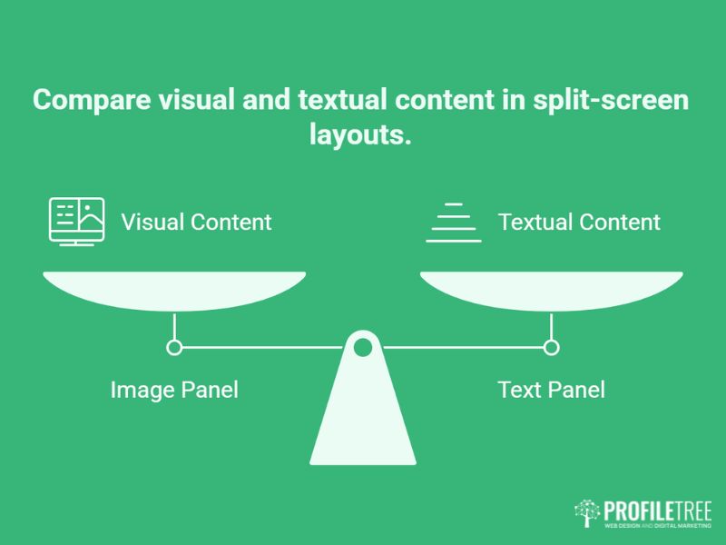
A split-screen layout splits the viewport into two or more distinct vertical sections, each acting as a standalone canvas. Traditional layouts flow downward from a single focal point. Split-screen designs let two ideas sit side by side and compete for attention on purpose. The split can be a clean 50/50 or an asymmetric 70/30, depending on which side carries the heavier message. The panels also need fast, reliable website hosting management behind them, since two hero assets put extra load on the server.
The Core Idea Behind Dual Panels
The point of a split-screen layout is simultaneous storytelling. Rather than forcing a visitor down a single path, you present two at once and let them choose. An online retailer might place menswear on one side and womenswear on the other. A training provider might separate individual courses from corporate programmes. The visitor self-selects in a second or two.
Where You See Them in Practice
Split-screen layouts turn up most often on homepages, landing pages, and service pages where a business has a genuine fork in its audience. A photographer might contrast urban and natural work. A software company might place product features on one panel and a client testimonial on the other, or pair a written pitch with a clip produced through video marketing services. The pattern works when the two halves are genuinely different but related.
How They Differ From a Grid
A grid organises many items into uniform cells of equal weight, which suits browsing across a range of options. A split-screen layout deliberately creates two focal points of comparable importance. If you find yourself wanting three or four equal panels, you probably want a grid, not a split. Choosing between the two is one of the first decisions in any professional website design project.
Benefits of Split-Screen Layouts
Split-screen layouts offer more than visual appeal. When the content genuinely divides into two paths, they improve how quickly people understand a page and how confidently they act on it. The benefits below explain why designers reach for the pattern on conversion-focused pages.
Clearer Visual Hierarchy
A clear hierarchy guides the eye, and split-screen layouts make prioritisation explicit. Each panel becomes a focal point, so the most important information is easy to spot. Designers reinforce this with contrasting colours, bold typography, and strong imagery, telling visitors where to look without a word of instruction.
Faster Routing for Qualified Visitors
When a business serves two distinct groups, a split-screen layout forces an immediate routing decision. A company selling to both consumers and trade buyers can speak to each directly from the first screen. This tends to reduce bounce among qualified visitors, because each person sees a section written for their need rather than a watered-down message aimed at everyone. Defining those audiences early is a job for clear digital strategy planning.
Stronger Engagement and a Cleaner Look
Presenting two related content types side by side invites people to explore both, which deepens engagement as they work out the relationship between the halves. The format also sits naturally with minimalist design. By dividing the page into two clear areas, you keep the interface uncluttered and the message focused. Getting that balance right is part of the craft skilled designers bring to the work, and it is a focus of ProfileTree’s digital training services.
Design Principles for Split-Screen Layouts
A split-screen layout succeeds or fails on a handful of design decisions. Balance, contrast, consistency, and clear navigation keep the two panels working together rather than fighting each other. You do not need to make these calls yourself, but knowing them helps you judge whether a proposed design will work and gives you the right questions to put to your agency.
Balance and Proportion
Symmetry is the traditional starting point, but asymmetry can add interest and direct attention. A 70/30 or 60/40 split gives more room to the side carrying the heavier message, such as a primary call to action. Whatever ratio you pick, the page should still feel settled rather than lopsided. The proportions express which side matters more.
Contrast That Separates the Panels
Contrast is what tells a visitor where one panel ends and the other begins. Designers achieve it through colour, with bold pairings such as black and white or complementary hues. Typography helps too, with bold and lighter fonts adding texture. Imagery does the rest, setting a vibrant photo against a flatter illustration so the two halves read as separate at a glance.
Visual Consistency and Clear Navigation
Despite the division, the two panels should feel like one page. Consistent spacing, alignment, and typography hold them together so the layout reads as unified rather than fragmented. Navigation matters just as much. Split-screen layouts usually push visitors toward a specific action, so buttons and hover states need to be obvious and indicate the next step without hesitation.
Where Split-Screen Layouts Earn Their Place
The pattern is versatile, but it pays off most in a few specific situations. Knowing the strongest use cases helps you decide whether a split-screen layout fits your site or whether another structure would serve the same goal with less risk on mobile. The examples below come up repeatedly in agency web design work.
Ecommerce and Retail
Retailers reach for split-screen layouts to separate two product worlds at a glance. One side might hold a seasonal range and the other a bestselling collection, or one panel could show a promotional offer next to a clear button to shop the full catalogue. The split removes a step: instead of scrolling a long category page, the visitor picks a direction in the first second. For shops with two distinct buyer types, that early fork lifts the odds that each person lands on a relevant product set quickly. Pairing the layout with targeted email marketing campaigns and social media marketing keeps both audiences engaged after the first visit.
Landing Pages and SaaS
On a marketing landing page, a split-screen layout can place a product explanation on one side and social proof on the other, so a visitor reads the claim and the evidence together. Software brands often use the format for self-selection, routing individual users one way and team or enterprise buyers another. Each path carries its own headline, its own proof point, and its own call to action, which makes the page feel personally relevant rather than generic. Some teams add AI chatbot support to each panel so visitors get answers without leaving the page.
Portfolios and Service Businesses
Creative professionals use split-screen layouts to show range without clutter. A designer might set brand work against website builds, or a studio might contrast photography with motion. Service businesses do the same with two offers, such as one-off projects on one side and ongoing retainers on the other. A well-planned bespoke website design makes that contrast read clearly. The format suits any business with a genuine pair of things to present, which is exactly the test to apply before choosing it.
The Mobile Challenge: How Split-Screen Layouts Stack
The hardest part of any split-screen layout is mobile. A 50/50 split is a statement of equality on a desktop, but two equal columns cannot survive on a narrow screen. The panels have to stack, and how you handle that stacking decides whether the design still works on a phone. This is where most split-screen layouts fall down, and where careful planning pays off.
Simple Stacking and Its Weakness
Most designs default to simple stacking, where the left panel becomes the top panel and the right panel drops below it. The problem is that a visitor may scroll through a full screen of the top panel before reaching the value in the second one. If the conversion element lives in the lower panel, plenty of people never see it. On mobile, position decides visibility.
Priority-based Stacking
A better approach reorders the panels by importance rather than by their desktop position. The panel carrying your main offer or enquiry form moves to the top on mobile, regardless of where it sat on the desktop, so the visitor meets the most important content first. You do not need to know the code behind this, but you should expect your agency to plan it in the wireframe rather than leave it to chance. It is one of the questions worth raising during any website development brief.
The Peek Technique and Asset Swapping
Two further tactics keep the split feel alive on small screens. Setting the top mobile panel a little short of full height lets the next panel peek into view, signalling that a second block sits directly below. Swapping a heavy split image for a cropped version or a simple icon also saves space and speeds up loading on slower mobile connections, which matters for both the visitor experience and your search ranking.
Accessibility and Build Considerations
A split-screen layout is only as good as the people who can use it. Two visual columns can confuse screen readers, and a divider that relies on colour alone can shut out users who cannot perceive it. For an SME this is a commercial issue as much as a technical one: disabled households in the UK represent an estimated £274 billion in annual spending power, a figure cited by We Are Purple, so a layout that locks people out is leaving money on the table. The fixes are straightforward when planned early, which is why accessibility belongs in the brief, not the snagging list.
Reading Order in the Code
Screen readers follow the order of the HTML, not the visual arrangement. If the right panel appears first in the markup but second on screen, the experience becomes confusing. The reading order in the code should match the priority you want, and any visual reordering for mobile should be handled so that assistive technology still receives a logical sequence.
Contrast, Focus, and Keyboard Use
Accessible split-screen layouts need sufficient colour contrast between text and background, visible focus states on every interactive element, and no information conveyed by colour alone. Each panel should be fully keyboard-navigable, with a logical tab order across the divide. These are practical build requirements, and they overlap with the wider craft of website development services that any reputable agency should treat as standard.
Performance and Core Web Vitals
A split-screen layout often loads two large hero elements at once, which can hurt Largest Contentful Paint if the assets are not managed. Compress and correctly size both images, serve modern formats such as WebP or AVIF, and consider lazy-loading the panel that sits below the fold on mobile. Performance is a ranking signal as well as an experience one, so treat it as part of the design brief rather than an afterthought, and align it with your wider search engine optimisation work.
“Business owners often ask for a split-screen layout because they have seen one they liked. The first thing to work out is whether you actually have two audiences worth separating. If you do, it can be one of the clearest ways to route people to the right place. If you do not, you are splitting attention for no reason and usually losing enquiries on mobile. The layout should follow the business, never the other way round,” says Ciaran Connolly, founder of ProfileTree.
How to Decide If a Split-Screen Layout Suits Your Business
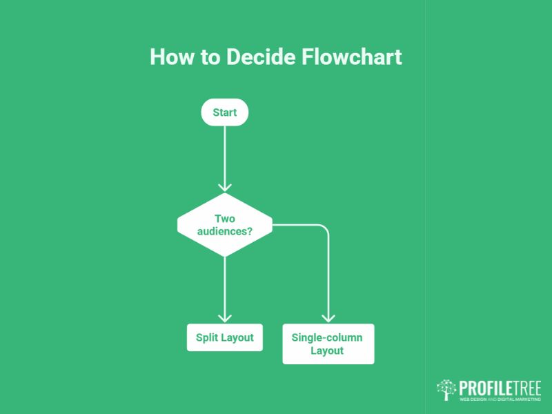
Knowing the theory is one thing. Deciding whether a split-screen layout fits your website is the call that matters for an SME. The steps below turn the principles above into a short decision-support checklist you can work through before you brief an agency or sign off a design. ProfileTree’s website design services apply this same thinking to every layout choice, weighing the format against your goals rather than reaching for it because it looks current.
Decide Whether You Genuinely Have Two Paths
Ask three questions. Do you have two equally important calls to action, such as shop one range against another? Is there a natural contrast in what you offer, such as software for teams against software for individuals? Can your main message land without a single full-width image? If the answer is yes to most of these, a split-screen layout is likely to help. If your audience is really one group, a single-column or grid layout will serve you better.
Check the Layout Against Real Visitor Behaviour
A split-screen layout is a starting point, not a finished decision. Once the page is live, look at how people actually use it. Free tools such as Hotjar or Microsoft Clarity show where visitors click and how far they scroll, which tells you whether both panels are being seen or one is being ignored. If a panel is dead, the layout needs a rethink. ProfileTree can set up and read this data for you through its AI marketing services.
Know What to Ask Your Agency
You do not need to write the specification yourself, but you should know what a good one contains. Ask your agency to confirm the desktop ratio, the mobile stacking order, which panel shows first on a phone, the colour contrast, and how fast the page loads with two large images. If those answers are vague, the layout is being treated as decoration rather than a conversion tool. A sound digital strategy service ties every one of these choices back to your business goals, while ongoing SEO support keeps the finished page visible.
The Bottom Line for Your Website
A split-screen layout is a strong choice when your business has two genuine audiences or a clear either-or choice to put in front of visitors. It sharpens the page, routes people faster, and can lift enquiries from both groups. The risk sits on mobile, where careless stacking hides half your message, and in accessibility, where a rushed build shuts customers out.
The decision should always start with your audience, not the look. If two real paths exist, the format gives each the room it deserves. If they do not, a simpler layout will serve you better and cost less to get right. Treat the live page as something to measure and improve, and lean on an agency that can tell you honestly when a split-screen layout is the wrong tool for the job.
FAQs
Are split-screen layouts mobile-friendly?
Yes, when planned properly. The panels stack vertically on small screens, and ordering them by priority keeps the most important content at the top.
When should I avoid a split-screen layout?
Avoid it when your site serves one main audience or needs to show many equal items. A single column or grid works better in those cases.
What split ratio works best?
A 50/50 split suits two equally important paths. Use 70/30 or 60/40 when one side carries the primary message or call to action.
Do split-screen layouts hurt page speed?
They can, because two large hero images load at once. Compressing assets, using modern formats, and lazy-loading the lower mobile panel keeps speed in check.
Can a split-screen layout support video or interactive content?
Yes. One panel can hold an image, video, or interactive element while the other carries text and a call to action.
How do I make a split-screen layout accessible?
Match the HTML reading order to the visual priority, keep strong colour contrast, add visible focus states, and make every element keyboard-navigable.