Using HTML And CSS to Build a Fast Website Without JavaScript Overload
Table of Contents
Most small business sites do not need a JavaScript framework. A static page built mainly with HTML and CSS will often load faster, stay more accessible, and cost less to maintain than the same site wrapped in React, Vue, or Angular. For brochure sites, blogs, portfolios, and many service pages, heavy frameworks add weight that the visitor never asked for.
This guide shows how Using HTML and CSS as the foundation, with JavaScript added only where it earns its place, produces a quick, modern site that is easy to look after. It covers when a lean approach fits, how to structure clean markup, how to build layouts and interactions with CSS alone, how to host for speed, and how to test what you ship. The advice reflects how the team at ProfileTree, a Belfast-based web design and development agency, approaches performance work on client builds.
You will get more from this if you treat it as a decision framework rather than a checklist. Not every site should drop its framework. The point is to match the tool to the job, and for a large share of SME websites, that job is well served by HTML, CSS, and a small amount of script. Using HTML and CSS as your default, and reaching for JavaScript only on purpose, is a sound habit for any team that values speed and clarity over fashion.
When a Minimal-JS Approach Fits Your Project
A minimal-JS approach suits projects where content, speed, and accessibility matter more than heavy interactivity. Before committing, weigh project complexity, performance goals, and how much maintenance your team can sustain. Using HTML and CSS as the primary build layer works best when the site is largely informational; it is a poorer fit for feature-rich applications that depend on constant dynamic updates. The sections below break down the three factors worth checking first.
Project Complexity
A small business site with static pages, a blog, or a gallery runs well with minimal JavaScript, with faster load times and better accessibility as a result. If the project needs real-time updates, dynamic filtering, or a complex single-page app, some JavaScript becomes necessary. A hybrid build, where script appears only where the feature demands it, balances performance against function. For most SMEs in Northern Ireland and the wider UK, the brochure-plus-blog pattern is the common ca
se, and that pattern rarely justifies a full framework. Much of ProfileTree’s website design service work falls into exactly this bracket. The question to ask is simple: would a visitor notice if this feature were missing? If not, Using HTML and CSS to deliver it keeps the page lighter and the codebase smaller.
Performance Goals
Reducing JavaScript removes blocking resources, speeds up first render, and lowers memory use on the device. For sites where speed is the priority, relying on HTML and CSS for layouts, animations, and transitions keeps load times low, which helps most on mobile and on slower connections. This is where Using HTML and CSS pays off directly: every script you do not ship is weight the browser never has to parse, and on a mid-range phone over mobile data that difference is easy to feel. Faster pages also support the work that goes into search engine optimisation, since load speed is one of the signals search engines weigh.
Maintenance and Security
JavaScript frameworks need regular updates to patch security gaps, and each library or plugin adds a point of possible breakage. A simpler codebase of HTML, CSS, and a small script lowers the upkeep burden. If your development team is small, a lean approach frees them from constant framework churn and the testing that every upgrade brings. Using HTML and CSS at the core of the build means there is simply less to keep current, which over a year of small edits adds up to real saved time. This is a principle the team applies across its website development service, keeping the moving parts to what the project actually needs.
“Sometimes the best front-end solutions are the simplest. Cutting back on heavy frameworks can deliver speed, security, and clarity, particularly for content-led or smaller sites.” Ciaran Connolly, founder of ProfileTree.
Crafting Clean, Semantic HTML
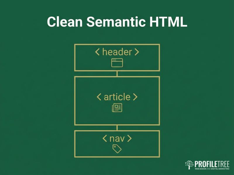
Clean, semantic HTML improves accessibility, search performance, and long-term maintainability. Tags like <header>, <article>, and <nav> give structure and meaning, which helps search engines and assistive technologies read the page correctly. Using HTML and CSS well starts here, with markup that describes what each part of the page is rather than wrapping everything in generic containers. The practices below keep markup lean and readable, and they are the groundwork that makes Using HTML and CSS for layout and styling behave predictably.
Using Semantic Tags
HTML5 gives you <section>, <article>, <nav>, <header>, <footer>, and more. Use them for what they describe. Proper semantic structure helps screen readers, search crawlers, and the next developer who opens the file. Avoid the habit of wrapping every block in a <div> when a meaningful element exists. The payoff from Using HTML and CSS this way is a page that still makes sense when the styling is stripped away, which is the test of whether your structure is sound. Teams that want to build this habit in-house can pick it up through structured digital training courses.
Lean Markup
Each tag should serve a clear structural or styling purpose. Nested <div> containers with no role increase parse time and complexity for no gain. Use class names that describe the content, such as product-list, rather than vague labels, unless you follow a defined naming convention across the project.
Accessibility Attributes
Add aria-label to navigation links and aria-expanded to toggles. Tie form labels to inputs with the for attribute, and give images useful alt text. The Web Content Accessibility Guidelines from the W3C set out the standards worth following here. A minimal-JS build does not mean skipping dynamic behaviour entirely; it means keeping any interaction usable with a keyboard and readable by a screen reader. Accessibility also overlaps with broader digital strategy planning, since a site that excludes part of its audience limits its own reach.
Scripts in the Right Place
For small additions such as a toggling menu or a lightbox, a short inline script is often enough. Large external libraries slow loading when they are not essential, so include only what core function requires. Use defer or async on script tags to keep them from blocking the parse, and reach for a CSS solution first when the effect is a hover, a modal, or a simple animation. Using HTML and CSS for the structure and the styling, then adding script as a thin top layer, keeps the page fast by default.
CSS Layouts, Logic, and Effects
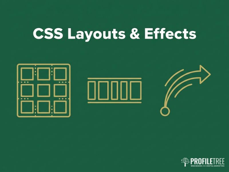
Modern CSS handles layouts and interactions that once needed JavaScript. Grid and Flexbox build responsive structures with light, readable code, while features like :has(), @container, and subgrid extend what is possible without a single script. Using HTML and CSS together at this level is where lean sites stop looking basic and start looking considered. This section covers layout, menus, and motion, and shows how far Using HTML and CSS can take an interface before any script is needed.
Flexbox for Component Layout
Flexbox replaces older float-based and table-based layouts for component-level work. It suits navigation bars, card rows, and aligning items horizontally or vertically. With justify-content, align-items, and flex-wrap, you build components that adapt across screen sizes while keeping media queries and extra markup to a minimum. This is one of the clearest wins from Using HTML and CSS over a scripted layout: the browser does the alignment work natively, with no library to load. It is also why a well-built responsive website design can stay light while still adapting to every screen size.
CSS Grid for Page Structure
For multi-column or more involved arrangements, Grid gives precise control over rows and columns. You can define a template with header, main content, sidebar, and footer without wrapper elements that exist only to position things. Grid combined with media queries adapts the column count for small and large screens cleanly. Using HTML and CSS this way replaces a class of layout problems that teams once solved with JavaScript measurements and resize listeners.
Responsive Techniques
Media queries let layouts adjust by changing flex direction or grid columns at sensible breakpoints. Fluid units such as %, vw, and rem keep designs flexible, and functions like clamp() and minmax() let elements scale within set limits rather than jumping at each breakpoint. The result is a layout that holds up across the device range without a stack of fixed rules.
Replacing JavaScript Menus
Many dropdowns and expansions work with CSS :hover or :focus-within. A mobile toggle may still want a small JavaScript snippet, though pure CSS approaches using a hidden checkbox exist if you prefer no script at all. Choose based on what your team can maintain comfortably; a slightly more verbose CSS pattern can be worth it to avoid shipping script for a single button.
Interactive Effects With CSS
Hover states, fades, and motion run well in CSS. A button that lightens, an image that zooms slightly, or a tooltip that appears can all be done with :hover and transition, no script required. For richer effects such as a banner sliding in or a hero background shifting, @keyframes gives frame-level control. Keep durations short and motion restrained; test on mobile, since weaker devices struggle with heavy animation.
Where you need precise sequencing tied to user input, a small library such as GSAP may be worth its weight, but only then. For everything short of that, Using HTML and CSS to handle motion keeps the interaction smooth without adding to the script budget. When a page does call for richer media, embedded clips produced through a video marketing service often carry the message better than animation alone.
“CSS has changed a great deal. Responsive grids and animated transitions no longer always need JavaScript to work well.” Ciaran Connolly, founder of ProfileTree.
Performance, Hosting, and Testing
Code weight is only part of speed. Hosting, caching, compression, and ongoing testing decide what visitors actually experience. Using HTML and CSS as the base gives you a fast starting point, but the delivery layer is where that advantage is kept or lost. This section covers cutting JavaScript dependencies, hosting for speed, progressive enhancement, and the testing that keeps standards high. Even a site built well by Using HTML and CSS will feel slow on weak hosting, so treat these two halves as one job.
Cutting JavaScript Dependencies
Reducing dependencies improves performance, security, and maintainability. Native browser features, CSS for animation, and HTML for structure remove the need for many libraries. Common cases like jQuery or a slider plugin can often be replaced with a short vanilla script or a pure CSS pattern. Each library adds weight and a possible vulnerability, so audit every one and ask whether the feature justifies it.
Where script is genuinely needed, keep it modular and lazy-load it only on the pages that use it, and run multiple custom scripts through a bundler such as Rollup or esbuild so you ship only the functions in use. The aim is not zero JavaScript for its own sake; it is Using HTML and CSS for everything they do well, so the script that remains is small, purposeful, and easy to audit. The same judgement applies when adding tools that draw on AI for marketing: add them where they earn their keep, not by default.
Hosting and Caching for Speed
Host choice and caching strategy shape real-world load times. Cloud or dedicated hosting with built-in optimisation, paired with server-side caching, browser caching, and a CDN, cuts load times and eases server strain. A static site generator such as Hugo, Eleventy, or Jekyll suits content that is mostly fixed, producing plain HTML pages that pair well with a global CDN for very fast delivery. Enable Brotli or GZIP compression at the server level, since both shrink text assets like HTML, CSS, and JavaScript, with Brotli usually winning on text.
A host that supports HTTP/2 or HTTP/3 lets resources download in parallel, which reduces the cost of multiple CSS and image requests. For CDN setups, give static assets a long cache lifetime and keep HTML shorter where content changes often. A site built by Using HTML and CSS already ships less to cache and compress, so these gains compound rather than fighting against a heavy bundle. The combination of a static generator, a CDN, and Brotli compression is what takes a lean page from fast to near-instant for visitors anywhere. For teams that would rather not run this themselves, a managed website hosting and management arrangement covers the caching and compression setup as part of the service.
Progressive Enhancement With Minimal JS
Progressive enhancement keeps a site usable even when JavaScript is limited or fails. Start with a solid HTML and CSS base, then layer interactivity where it adds value. Core content and navigation should work with script disabled; forms should still submit by standard POST. When you add a feature such as an expandable FAQ or a product filter, make it degrade gracefully, showing all answers or linking to a filter page if the script does not run. Keep essential content out of JavaScript injection, since search crawlers parse script inconsistently.
Let optional script enhance the page rather than define it. Building by Using HTML and CSS first gives you this resilience for free: the page already works before any script runs, so a failed or slow script costs the visitor nothing important. Scripted additions such as website AI chatbots fit the same model, layered on top of a page that already functions without them.
Testing and Maintenance
A lean site still needs testing and upkeep. Check function across browsers and devices, and use Lighthouse and WebPageTest to track load time, accessibility, and search readiness. If you use any script, confirm it degrades cleanly when it fails. Run accessibility tools such as WAVE, and confirm CSS transitions and overlays stay screen-reader friendly and keyboard-navigable.
Test older or less common browsers only where your analytics show real usage; progressive enhancement means those visitors get a simpler but working layout. Re-test whenever you publish new content or design changes, since fresh images or a new partial can quietly cost you speed. The discipline that makes Using HTML and CSS pay off is the same one that keeps it paying off: measure after every change, and treat any regression in load time as a defect to fix rather than a cost of doing business.
“Monitoring matters. As new content and design tweaks go live, re-test performance, usability, and cross-browser behaviour to hold standards steady.” Ciaran Connolly, founder of ProfileTree. <!– QUOTE: requires Ciaran approval before publication –>
When a build outgrows the brochure-and-blog pattern, that is the point to bring in a partner. ProfileTree’s custom website development work covers the move from a lean static site to a more involved build without losing the speed that made the original fast, and that move tends to go more smoothly when it sits inside a wider digital strategy plan.
Where This Approach Pays Off
A freelance portfolio built on HTML5 and CSS Grid, with hover transitions and a single script for the mobile menu, loads almost instantly. A local bakery or barber site with Home, Services, Gallery, and Contact pages runs fine on a static generator or basic hosting, with an embedded map and a simple contact form, all mobile-friendly through CSS breakpoints. A content-heavy blog with hundreds of posts pre-rendered to HTML keeps load times low and stays easy to crawl, with minimal script for search or sharing.
Across all three, Using HTML and CSS as the base is what holds the load time down as the site grows, and a fast, well-structured site gives SEO services a stronger foundation to build on. A lean site is also easier to feed traffic into, whether through social media marketing or a steady email marketing programme, since the landing pages those channels point to load quickly for every visitor. The thread running through each example is restraint: Using HTML and CSS for everything it can handle, and treating each script as a cost to be justified rather than a default to be assumed.
FAQs
Is a website built with only HTML and CSS good for SEO?
Yes. Server-rendered HTML is easy for search engines to crawl, and fast load times help rankings. Keep core content in HTML rather than injected by script.
When do I actually need JavaScript?
For real-time updates, dynamic filtering, complex forms, or single-page app behaviour. For static content, layout, and most animation, you usually do not.
Can CSS replace JavaScript for menus and animations?
Largely, yes. Hover and focus states, dropdowns, fades, and keyframe motion all run in CSS. A mobile menu toggle is the common case where a small script still helps.
Will a minimal-JS site look outdated?
No. Grid, Flexbox, and modern CSS effects produce polished, responsive designs. Less code does not mean a plainer result.
What hosting suits a fast HTML and CSS site?
A host with HTTP/2 or HTTP/3, server-side caching, and Brotli or GZIP compression, ideally paired with a CDN. Static site generators work well with this setup.
Does minimal JavaScript improve accessibility?
Often, yes. Fewer scripted interactions means fewer ways for a page to break for keyboard and screen-reader users, provided the HTML is semantic and labelled correctly.