
Using CSS: A Practical Guide to Modern Web Design and Performance
Table of Contents
Cascading Style Sheets sit at the heart of every functional website, and using CSS well is what separates a slow, fragile site from a fast, maintainable one. We’ve spent years using CSS across more than 1,000 client projects at ProfileTree, and the same patterns hold whether we’re styling a brochure site for a Belfast café or building a complex web application for a UK manufacturer. This guide covers what working developers and digital marketers genuinely need to know about using CSS in production: the three injection methods, the cascade, performance impact, framework choices, and the troubleshooting steps that actually solve problems.
You’ll find practical examples drawn from real client work, decision frameworks for choosing between approaches, and the SEO implications most CSS tutorials ignore. By the end, you’ll know how to use CSS strategically, not just syntactically.
What CSS Does and Why It Matters
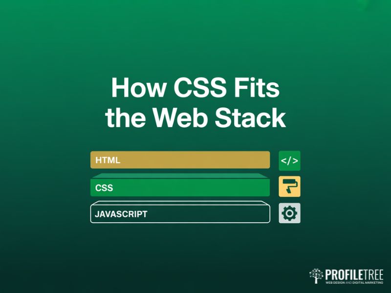
Before using CSS effectively, you need a clear picture of what the language actually controls and where it sits in the modern web stack. CSS is the presentation layer. HTML defines structure, JavaScript handles behaviour, and CSS dictates how everything looks across screen sizes, browsers, and devices.
CSS Syntax and Structure
A CSS rule consists of a selector and a declaration block. The selector targets the elements you want to style, while the declaration block contains one or more declarations separated by semicolons. Each declaration includes a property and a value, written as the property name followed by a colon and then the value. Get this anatomy wrong and the browser silently ignores your code, which is one of the most common reasons beginners think their styles are broken when they’re simply malformed. Our website design services start with this foundation on every project, because clean syntax is the precondition for everything that follows.
How CSS Connects to HTML
To style HTML elements, you can integrate CSS in three different ways: inline through the style attribute, internally inside style tags placed in the page head, or externally by linking to a separate dot css file. Our preference at ProfileTree is external CSS for production sites, because it keeps stylesheets organised, separates structure from presentation, and lets the browser cache files between page loads. We’ll cover the trade offs in detail in the next section.
The Box Model
Each element in CSS is treated as a box, with layers of padding, border, and margin wrapping the content. Understanding the box model is essential for layout control because it determines the actual rendered width and height of every element on the page. When a designer asks why a 300px wide card is overflowing its 300px container, the answer is almost always padding pushing the box wider than expected. Setting box sizing to border box on every element solves this in one line and is the standard reset we apply to every WordPress website build we deliver.
CSS Preprocessors and Their Role
Preprocessors like Sass and Less extend CSS with variables, nesting, and mixins, then compile back into standard CSS the browser can read. They reduce repetition and make large stylesheets manageable, which matters once a project grows past a handful of pages. That said, native CSS has caught up substantially in recent years. CSS now supports custom properties (variables) and nesting natively, so on smaller projects a preprocessor may add complexity you don’t need.
The Three Ways of Using CSS in HTML
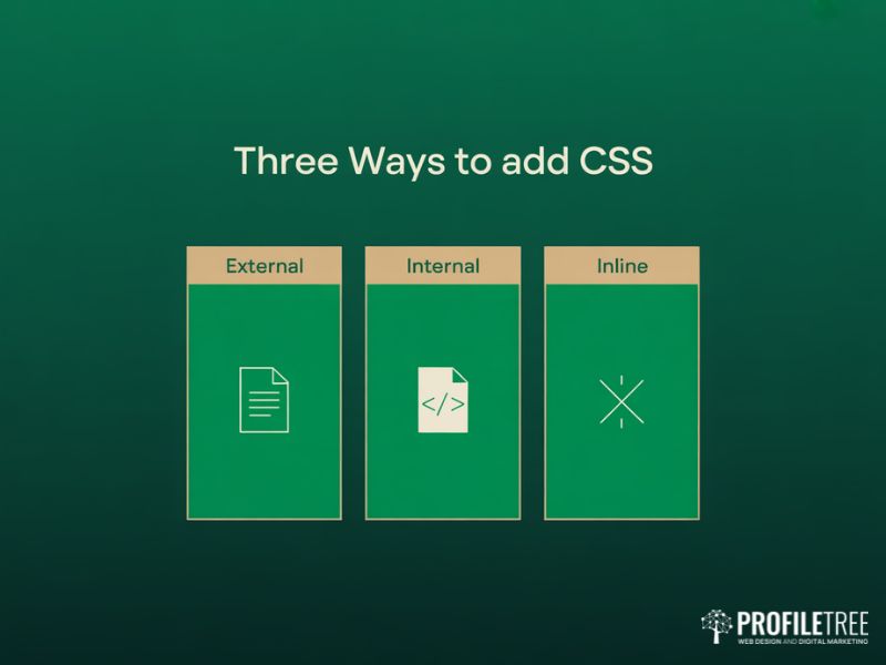
Web browsers read HTML from the top down and apply CSS rules as they encounter them. There are three official methods for adding CSS to a page, and choosing the right one is a real decision with real performance consequences, not a matter of taste.
External CSS: The Production Standard
External CSS is the most efficient method for using CSS on any site with more than one page. You write your rules in a separate dot css file and link to it from the HTML head using a link element. This is what we use on virtually every WordPress build at ProfileTree, and it’s how nearly every major site on the web handles styling.
Why use external CSS? You can control the look of hundreds of pages from a single file. If a client asks us to change a brand colour across a 50 page site, we update one variable in one file. Browsers also cache external stylesheets, so returning visitors load the file once and reuse it on every subsequent page, which improves Core Web Vitals scores measurably. This is also why our website hosting and management plans include automatic stylesheet caching at server level on top of browser caching.
Internal CSS: For Single Page Templates
Internal CSS, sometimes called embedded CSS, places your styling rules directly inside the HTML document within style tags located in the page head. The styles only apply to that single page, which makes this approach suitable for one off landing pages, single page templates, or pages with genuinely unique styling requirements.
Because the CSS loads as part of the HTML file, the browser doesn’t need to make a secondary network request, which can shave milliseconds off the initial render for pages where speed is critical. The trade off is zero reusability across pages, so this method becomes painful the moment your single page turns into five.
Inline CSS: For Quick Fixes and Email
Inline CSS applies a unique style to one specific HTML element using the style attribute on the element itself. It overrides everything else and gives you complete control over a single element.
In standard web development, using inline CSS is generally discouraged. It mixes structure with presentation, makes maintenance miserable, and creates specificity headaches when other rules try to override it. Imagine changing a colour value across 100 individual heading tags by hand.
There’s one major exception: HTML email development. Many email clients, particularly older versions of Outlook, strip out head tags and external links for security reasons. Inline CSS is the only reliable way to guarantee your styles will render correctly in a recipient’s inbox, which is why every responsible email template framework, from Mailchimp’s MJML to Litmus’s templates, inlines CSS automatically before sending. The same principle applies to broader content marketing campaigns where email is part of the distribution mix.
Choosing the Right Method
Here’s the decision framework we use with clients:
| Project Type | Recommended Method | Reason |
|---|---|---|
| Multi page website | External CSS | Reusability, caching, maintenance |
| One off landing page | Internal CSS | Eliminates extra HTTP request |
| HTML email | Inline CSS | Email client compatibility |
| Component override | Inline CSS (sparingly) | Targeted exception only |
| WordPress site | External CSS via theme files | Cache friendly, theme compatible |
Working with the CSS Cascade and Specificity
If you’ve ever written a CSS rule that simply refused to apply, the answer is almost always the cascade. The C in CSS stands for cascading, and understanding how the browser decides which rule wins when several rules target the same element is the most important skill you’ll develop after the basics.
How Specificity Actually Works
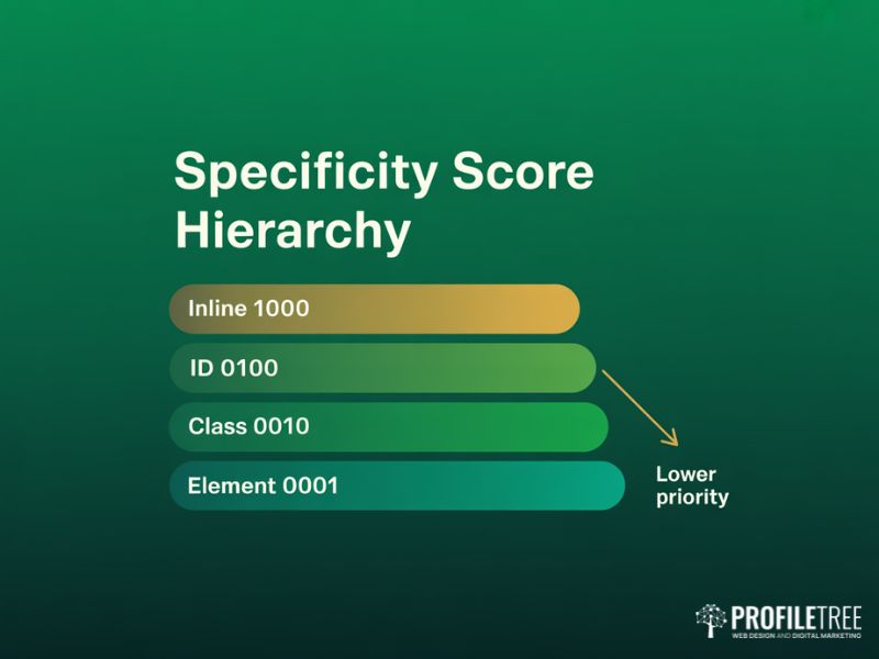
CSS specificity is a scoring system. When two rules target the same element, the one with the higher specificity score wins regardless of which appears first in the file. The scoring runs across four levels, usually written as four numbers separated by commas, for example 0,1,2,1.
Inline styles score 1,0,0,0. IDs score 0,1,0,0 each. Classes, attributes, and pseudo classes score 0,0,1,0 each. Element selectors and pseudo elements score 0,0,0,1 each. A rule that combines an ID with a class and an element selector scores 0,1,1,1, which beats a rule using two classes and an element selector scoring 0,0,2,1, even if the second rule appears later in the stylesheet.
This is why beginners often resort to the important keyword to force a style to apply. Marking a rule as important overrides specificity entirely, but it creates a maintenance debt. The next time something doesn’t apply, the only way to override an important rule is another important rule, and within months the codebase becomes unmaintainable. Teams enrolled on our hands on digital training courses consistently rate this as one of the most useful concepts they take away.
CSS Inheritance Rules
Certain CSS properties naturally inherit values from their parent elements in the document tree, such as font size, colour, and font family. Layout properties like margin, padding, and width do not inherit. A solid grasp of inheritance can save time and reduce the number of declarations, making stylesheets cleaner and more efficient.
You can force inheritance with the inherit keyword, or reset a property to its default with initial. The unset value is particularly useful because it resets a property to its inherited value if it inherits naturally, or to its initial value if it doesn’t.
Troubleshooting When CSS Won’t Apply
When using CSS on a real project, the most common reasons styles fail to render are predictable. Run through this checklist before assuming the browser is broken:
- A higher specificity rule elsewhere in the stylesheet is overriding your declaration. Open DevTools and inspect the element to see which rules are crossed out.
- A typo in a property name or value. Browsers silently ignore unrecognised CSS without warning.
- A missing semicolon at the end of a declaration, which causes the browser to skip the next rule.
- Cached stylesheets. Hard refresh with Ctrl plus F5 (Cmd plus Shift plus R on Mac) or disable cache in DevTools.
- The selector targeting the wrong element. A class selector matches class attributes, not ID attributes.
- A parent element with display none or visibility hidden masking your styled child.
“Most CSS bugs aren’t bugs at all. They’re misunderstandings of specificity. Once you can read the cascade in DevTools, you can fix anything in minutes that would otherwise eat half a day.”
Stephen McClelland, Digital Strategist, ProfileTree
How CSS Affects Page Speed and SEO
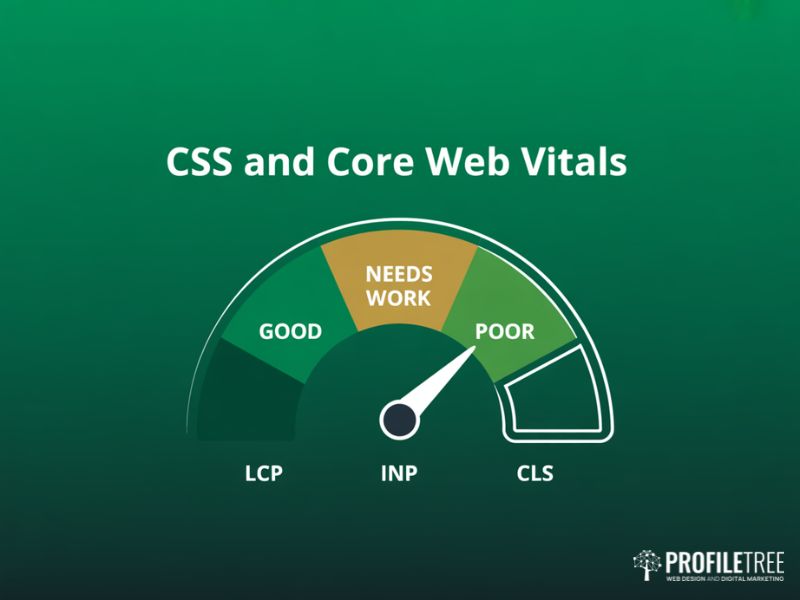
This is the section most CSS tutorials skip, and it’s where using CSS well stops being an academic exercise and starts paying for itself in rankings, conversions, and client retention. Google’s Core Web Vitals are now a confirmed ranking signal, and your CSS implementation directly affects two of the three main metrics.
Render Blocking CSS Explained
By default, external stylesheets are render blocking. The browser will not paint a single pixel of your page until it has downloaded, parsed, and applied all linked CSS. On a fast connection this happens in milliseconds, but on a 4G mobile connection in a rural area it can stretch to several seconds, during which the user sees a blank screen.
Largest Contentful Paint, or LCP, is the Core Web Vitals metric most affected by CSS delivery. A bloated stylesheet linked from the head will push your LCP into the red zone, and according to Google’s official Core Web Vitals documentation on web.dev, pages with poor scores see measurably lower rankings on competitive queries. Our SEO services treat CSS audit as part of every technical review for this exact reason.
Critical CSS Strategy
The technique that solves this is critical CSS. You identify the styles needed to render the above the fold content, inline those directly into the HTML head, then load the remaining stylesheet asynchronously so it doesn’t block the initial paint. The user sees a styled page immediately, and the rest of the CSS arrives quietly in the background.
Tools like Critical, used by build pipelines on most modern WordPress and Next.js projects, automate this extraction. We implement critical CSS on every performance sensitive build at ProfileTree, particularly for service pages and landing pages where slow LCP would torpedo conversion rates. For sites where speed has become a commercial bottleneck, our digital strategy consultations typically begin with a Core Web Vitals diagnosis.
Minification and File Size
A production CSS file should be minified, meaning stripped of whitespace, comments, and unnecessary characters. Minification typically cuts file size by 20 to 30 percent and is built into every modern build tool, from WordPress plugins like WP Rocket to Webpack and Vite. There’s no good reason to ship un minified CSS to production in 2026, and it’s one of the first things our SEO audits flag on slow client sites.
Beyond minification, watch for unused CSS. Many WordPress themes ship with stylesheets covering features you’ll never use, and that dead weight bloats every page load. Tools like PurgeCSS scan your HTML and remove the rules nothing references, often cutting CSS bundle size by 60 to 80 percent on theme heavy sites.
CSS and Mobile Performance
Mobile users now account for over 60 percent of web traffic globally, and Google indexes mobile first. Using CSS responsively isn’t optional. It’s the baseline. Media queries let you serve different layouts at different breakpoints, but the modern best practice is mobile first writing: define the small screen styles as your default, then layer on enhancements for larger viewports using minimum width queries. This approach produces less code and faster mobile rendering. The same logic applies to video production for the web, where CSS controls how embedded video players render on phones, tablets, and desktops.
Modern CSS Frameworks and Approaches
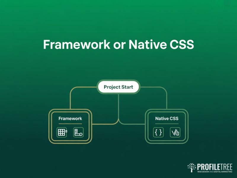
You don’t have to write every line of CSS from scratch. Frameworks and methodologies exist for good reasons, and choosing the right one can save weeks of development time on the right project.
Bootstrap and Component Libraries
Bootstrap is the most widely used CSS framework, providing pre built components, a 12 column grid system, and a consistent design language out of the box. It’s particularly useful for internal tools, prototypes, and projects where shipping fast matters more than design distinctiveness. The trade off is that Bootstrap sites tend to look like Bootstrap sites unless heavily customised, which is fine for a SaaS dashboard but limiting for a client who wants a unique brand presence.
Tailwind CSS and Utility First
Tailwind CSS takes a different approach. Instead of pre built components, it provides low level utility classes you compose directly in your HTML. This is closer to inline CSS philosophically, but with the benefits of a design system, build time purging of unused classes, and easy responsive variants.
Tailwind has become the dominant choice for component driven projects in React, Vue, and similar frameworks because it eliminates the cognitive overhead of naming things. We use Tailwind on most of our React based client builds at ProfileTree, particularly for AI chatbot interfaces and bespoke web applications, because the development velocity is genuinely faster than writing custom CSS for every component.
Native CSS Features Replacing Frameworks
Modern browsers now support features that previously required preprocessors or frameworks: custom properties (CSS variables), nesting, container queries, the has selector, and CSS Grid. For many projects, especially smaller marketing sites, native CSS is now sufficient on its own. Before reaching for a framework, consider whether you actually need it, or whether you’ve added complexity by reflex.
CSS in WordPress Specifically
Most of our client work runs on WordPress, and using CSS within WordPress has its own conventions. Theme stylesheets live in the active theme folder. Custom CSS for individual sites typically goes through Appearance, then Customise, then Additional CSS for small overrides, or through a child theme for larger changes. Plugins like Elementor and the block editor (Gutenberg) inject their own CSS, which can conflict with theme styles in ways that confuse developers new to the platform.
The rule we follow on every WordPress build: never edit the parent theme directly. Use a child theme or the customiser, because parent theme files get overwritten on every update. The same discipline carries over to AI marketing automation builds where styled email templates and dashboard interfaces need to survive software updates without manual repair.
“The teams that ship the best websites aren’t the ones who know the most CSS properties. They’re the ones who know which CSS to write and which to leave out. Every line of CSS is a line you have to maintain, debug, and ship to every visitor. Treat it like code, not decoration.” – Ciaran Connolly, Director, ProfileTree
How ProfileTree Uses CSS in Client Work
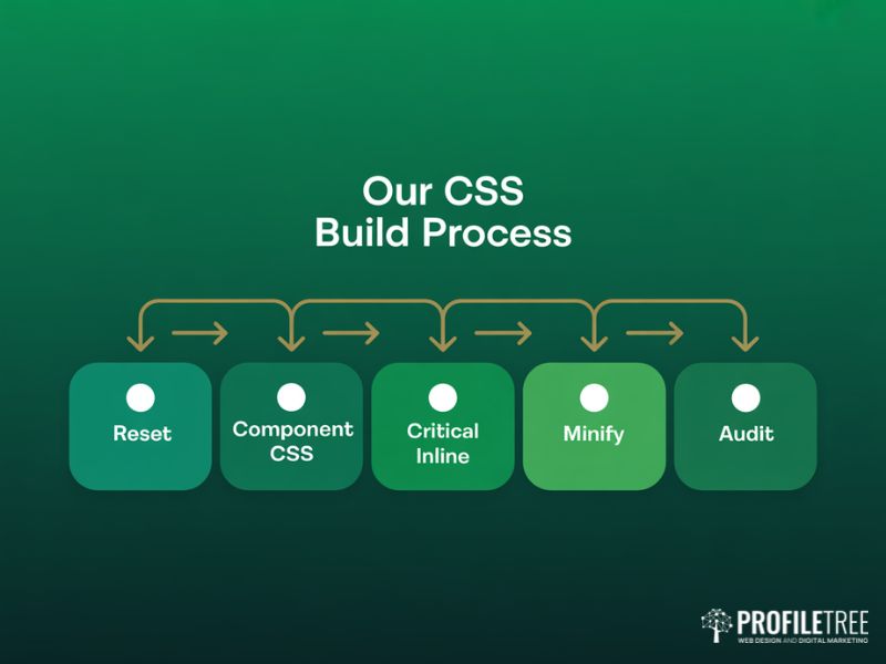
Across more than 1,000 client projects, our approach to using CSS has settled into a few consistent patterns. We start with a base reset to normalise browser defaults. We use external stylesheets organised by component. We inline critical CSS for above the fold content. We minify and purge unused styles in the build. We test rendering across browsers before launch, and we audit Core Web Vitals after launch using Google’s PageSpeed Insights.
For clients commissioning a new build, this is invisible. They see a fast site that ranks well and converts visitors. The CSS architecture underneath is what makes that possible, and getting it right at the start prevents the “we need to rebuild because the site is too slow” conversation eighteen months later.
Next Steps
Audit your current site’s CSS using Google’s PageSpeed Insights to identify render blocking stylesheets, unused CSS, and Core Web Vitals issues. If the diagnosis points to deeper architectural problems, those are usually the ones worth fixing first, before any cosmetic changes.
FAQs
What does CSS stand for and what does it do?
CSS stands for Cascading Style Sheets. It’s the language web browsers use to apply visual styling to HTML documents, controlling layout, colour, typography, spacing, animations, and responsive behaviour across different screen sizes.
Should I use inline, internal, or external CSS?
Use external CSS for any multi page website because it allows browser caching and centralised maintenance. Use internal CSS for genuine one off pages where eliminating an extra HTTP request matters. Use inline CSS only for HTML email development or as a targeted exception when overriding a single element.
Why isn’t my CSS applying to the element?
The most common causes are higher specificity rules elsewhere overriding your declaration, typos in property names, missing semicolons, browser caching of an older stylesheet, or the selector targeting the wrong element. Open browser DevTools, inspect the element, and check which rules appear crossed out to identify the conflict.
Does CSS affect SEO and page speed?
Yes, directly. Render blocking CSS delays Largest Contentful Paint, which is one of Google’s Core Web Vitals ranking signals. Bloated stylesheets, un purged unused CSS, and stylesheets loaded synchronously in the head all hurt page speed scores. Critical CSS, minification, and async loading techniques mitigate these issues.
What’s the difference between Bootstrap and Tailwind CSS?
Bootstrap provides pre built components and a consistent design language, suiting projects that need to ship fast with established patterns. Tailwind provides low level utility classes you compose in your HTML, suiting component driven projects where bespoke design and development velocity both matter. Bootstrap sites look similar by default. Tailwind sites can look like anything.
Can I learn CSS without a framework first?
Yes, and we recommend it. Frameworks are easier to use once you understand what they’re abstracting away. Spend a few weeks writing native CSS, learning the box model, cascade, flexbox, and grid before adopting Tailwind or Bootstrap. The fundamentals translate everywhere. Structured programmes such as our content marketing training often build CSS literacy alongside writing and editorial workflow, because front end teams increasingly cross both roles.
Is CSS still relevant given AI generated websites?
Absolutely. Even when AI tools generate site code, that code is HTML and CSS. Understanding how to read, debug, and modify CSS is becoming more valuable, not less, because it’s the layer where AI generated code most often needs human refinement to meet brand and performance standards.