Micro-Interactions, Animations and Anti-Design in Web Experience
Table of Contents
The web has entered its most expressive era yet. Every cursor movement triggers subtle responses, every scroll reveals choreographed animations, and deliberate imperfection replaces sterile corporate aesthetics. This isn’t design evolution – it’s revolution. Websites no longer simply display information; they perform, react, and engage in continuous dialogue with users through micro-interactions that transform passive browsing into active participation.
ProfileTree embraces this paradigm shift, creating digital experiences that pulse with life through carefully crafted micro-animations and bold anti-design principles. Our Belfast-based team understands that modern users expect websites to feel alive, responsive, and distinctly human. The days of static, template-driven designs are ending as businesses discover that memorable interactions drive engagement far more effectively than perfect pixels.
The convergence of micro-interactions and anti-design represents web design’s most significant philosophical shift since responsive design. Where previous generations pursued minimal perfection, today’s designers embrace controlled chaos, intentional friction, and delightful surprises. This approach doesn’t abandon usability – it enhances it through emotional connection and memorable moments that keep users returning.
Understanding the New Rules of Web Experience
Micro-interactions are the subtle design elements that guide users without them even realising it. From a hover effect on a button to a loading animation, these details improve usability and create a smoother flow. In modern web design, they’ve become essential for making digital experiences feel more human and engaging.
The Psychology of Subtle Movement
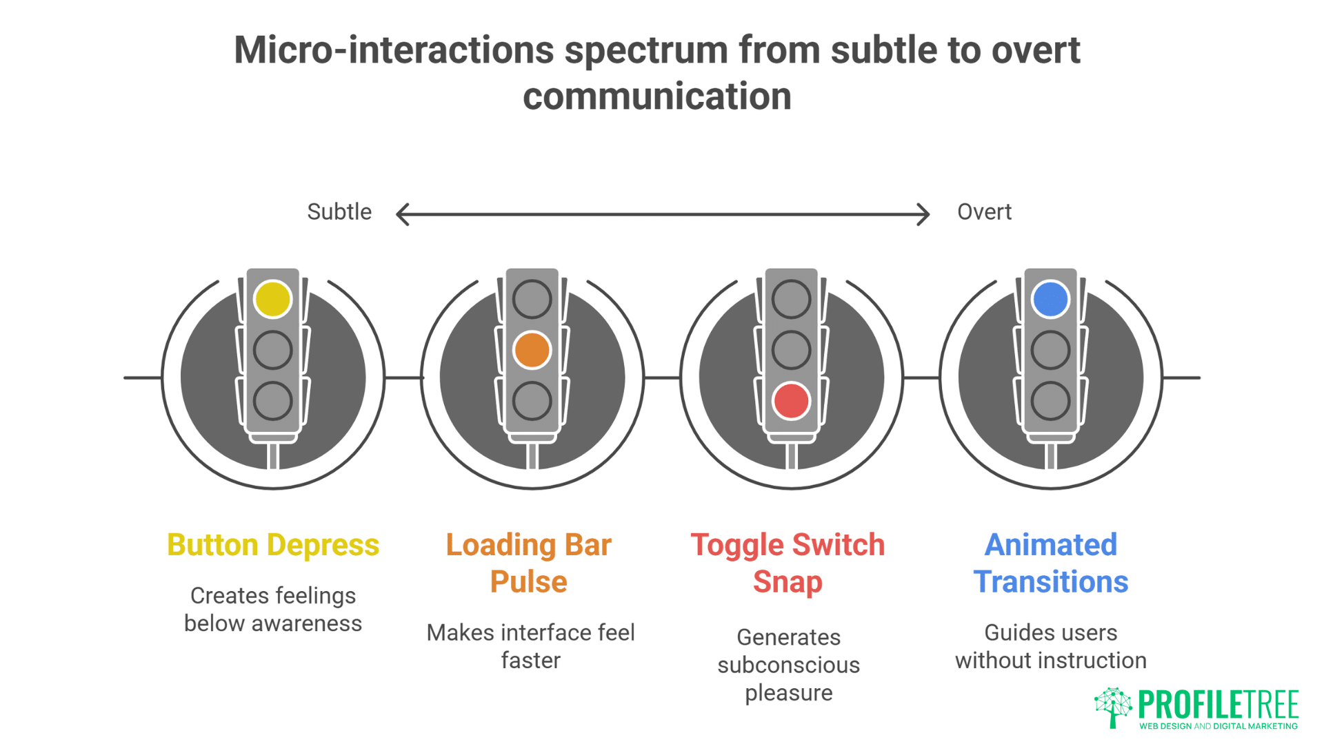
Micro-interactions operate below conscious awareness, creating feelings rather than thoughts. When buttons subtly depress on hover, when loading bars pulse with organic rhythm, when form fields gently shake to indicate errors – these moments communicate more effectively than any written instruction. Human brains evolved to notice and interpret movement, making motion our most powerful communication tool.
The principle of perceived performance demonstrates why micro-animations matter beyond aesthetics. Users perceive animated interfaces as 20% faster than identical static versions, even when actual load times remain unchanged. A skeleton screen with shimmer animation feels faster than a spinning loader, though both mask identical wait times. This psychological impact transforms user satisfaction without touching backend performance.
Emotional design through micro-interactions creates bonds between users and digital products. The slight bounce when reaching scroll limits, the satisfying snap of toggle switches, the gentle fade of disappearing elements – these details generate subconscious pleasure that accumulates into preference. Users can’t always articulate why they prefer certain websites, but micro-interactions often provide the answer.
Cognitive load reduction through motion design guides users without explicit instruction. Animated transitions between states help users maintain context during navigation. Elements sliding from their origin to destination preserve spatial memory. Staggered animations create visual hierarchy without static emphasis. Movement becomes instruction without words.
ProfileTree’s website design services incorporate psychological principles into every micro-interaction, ensuring animations serve purpose beyond decoration.
Types of Micro-Interactions That Matter
Hover states evolved from simple colour changes into complex choreographies. Modern hover effects might trigger parallax shifts, reveal hidden information, morph shapes, or initiate particle effects. Each variation communicates different brand personalities – playful brands might use bouncy animations while luxury brands prefer smooth, minimal transitions.
Loading transitions transform necessary waits into engaging experiences. Rather than hiding load times, creative loading animations celebrate them. Progress bars that fill with liquid animation, dots that dance while processing, skeletons that gracefully resolve into content – these moments turn frustration into anticipation.
Form feedback animations replace static error messages with dynamic communication. Fields that shake their heads “no” for invalid input, success checkmarks that draw themselves, password strength meters that grow and change colour – these interactions make form filling less tedious and more intuitive.
Scroll-triggered animations reward exploration and create narrative flow. Elements fade in as they enter viewport, parallax layers create depth, progress indicators show reading position, and triggered animations surprise and delight. These interactions transform scrolling from navigation into discovery.
Button and click feedback confirms actions without requiring page refreshes. Ripple effects emanating from click points, buttons that transform into progress indicators, icons that morph to show state changes – these confirmations reduce uncertainty and increase confidence.
Navigation transitions maintain spatial context during site exploration. Menus that slide from their triggers, pages that transition with directional logic, breadcrumbs that animate to show hierarchy – these movements help users understand where they are and how they got there.
Technical Implementation Strategies
CSS animations provide performant micro-interactions without JavaScript overhead. Transform and opacity changes run on GPU, ensuring smooth 60fps animations even on modest hardware. Modern CSS features like custom properties enable dynamic, themeable animation systems that respond to user preferences.
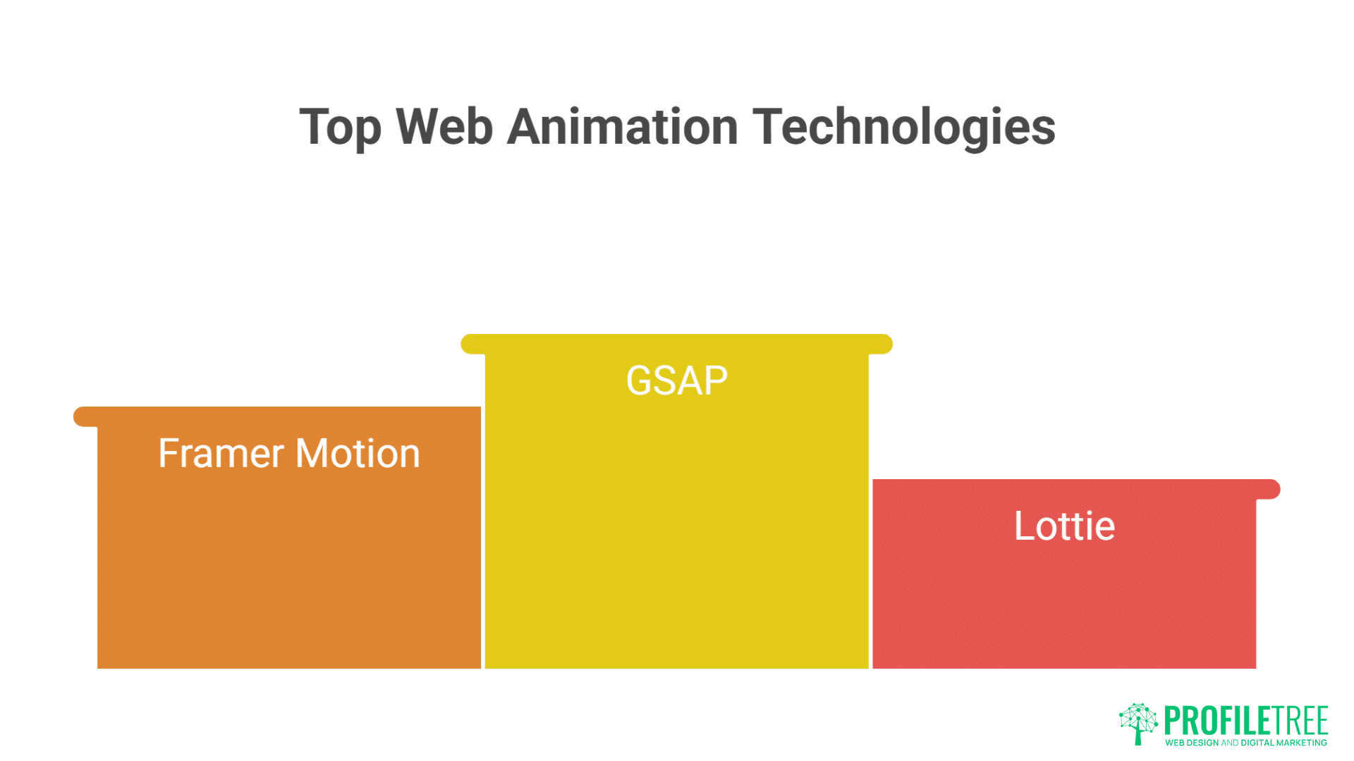
JavaScript libraries like GSAP, Framer Motion, and Lottie enable complex animations while maintaining performance. These tools abstract browser inconsistencies, provide timeline control, and enable physics-based animations that feel natural. Choosing appropriate libraries balances capability with bundle size.
Performance budgeting for animations ensures enhancement without degradation. Every animation carries computational cost that compounds on slower devices. Establishing animation budgets – limiting simultaneous animations, reducing complexity on mobile, respecting reduced motion preferences – ensures inclusive experiences.
Progressive enhancement approaches ensure animations enhance rather than gate content. Core functionality works without animations, which layer on for capable browsers. This strategy ensures accessibility while enabling rich experiences for modern browsers.
Reduced motion accommodation respects user preferences and accessibility needs. The prefers-reduced-motion media query allows users to opt out of animations that might cause discomfort. Thoughtful reduced motion experiences maintain visual hierarchy and feedback without triggering vestibular disorders.
Website development approaches from ProfileTree ensure animations enhance rather than hinder user experience, balancing delight with performance across all devices.
The Rise of Anti-Design Philosophy
Anti-design breaks away from the polished, predictable layouts we’ve come to expect in digital spaces. It embraces bold choices, asymmetry, and raw aesthetics to stand out in an oversaturated web. This philosophy challenges convention and invites users to experience design in a more authentic, less structured way.
Breaking the Grid: Intentional Imperfection
Anti-design rebels against decades of grid worship and Swiss minimalism. Where traditional design seeks order, anti-design embraces chaos. Asymmetrical layouts create tension that demands attention. Overlapping elements break expected boundaries. Text runs off screens, images crop unexpectedly, and white space becomes irregular and organic.
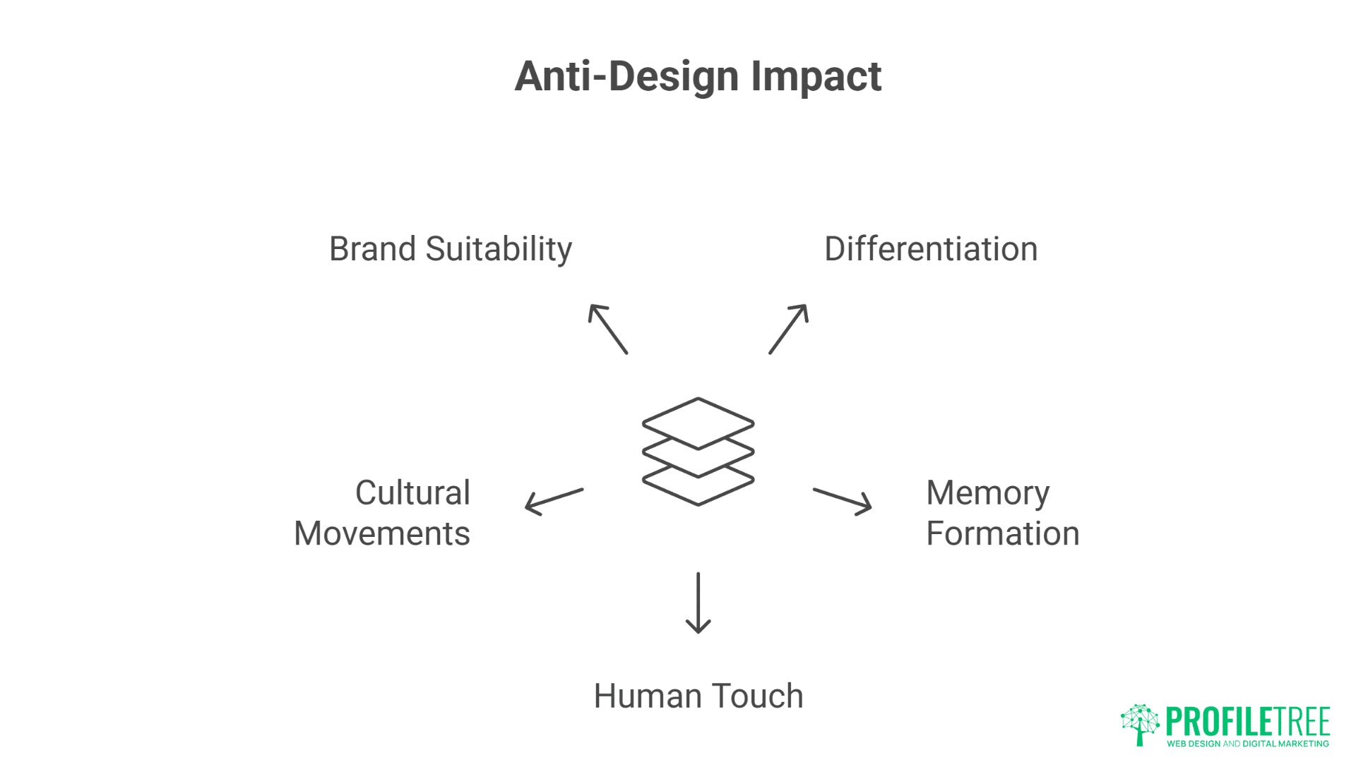
This intentional rule-breaking serves purpose beyond provocation. In an ocean of template-driven websites, anti-design creates instant differentiation. Users remember sites that surprised them, that made them look twice, that refused to behave predictably. Memory formation requires novelty – anti-design provides it abundantly.
The human touch anti-design provides counters AI-generated perfection increasingly flooding the web. Wonky lines drawn by actual hands, typography that breaks mathematical rhythm, colours that clash according to theory but sing in practice – these imperfections signal human creation in an increasingly automated world.
Cultural movements driving anti-design reflect broader societal shifts. Gen Z‘s embrace of authenticity over perfection, the DIY aesthetic of independent creators, punk’s continued influence on design rebellion – these forces converge in anti-design’s deliberate roughness.
Brand differentiation through anti-design particularly suits disruptor brands, creative agencies, and businesses targeting younger demographics. When competitors pursue safe, tested designs, anti-design becomes competitive advantage. The risk of alienating traditional users becomes worthwhile when targeting audiences that value authenticity over authority.
Maximalist Typography and Visual Excess
Typography in anti-design explodes traditional constraints. Massive headlines dominate entire viewports. Multiple typefaces clash within single words. Text overlaps, underlaps, and wraps impossibly. Variable fonts stretch and compress beyond recognition. This typographic excess makes statements impossible to ignore.
Colour usage abandons harmony for impact. Neon gradients meet muddy earth tones. Colours vibrate against each other creating optical illusions. Backgrounds shift through rainbow spectrums. This chromatic chaos energises designs that would feel flat in traditional palettes.
Texture and noise return after years of flat design dominance. Grain effects, scan lines, print misregistration, digital artifacts – these imperfections add tactility to digital surfaces. The cleanliness of vector graphics gives way to bitmap roughness and photocopy aesthetics.
Layering and depth create visual complexity that rewards examination. Elements stack without clear hierarchy, creating archaeological dig sites of content. Transparency and blend modes create unexpected interactions. Every visit reveals previously unnoticed details.
Information density increases as anti-design rejects minimalism’s white space worship. Screens fill with content, sidebars return, and footer areas expand into rich resource collections. This density serves users who want more, not less – who appreciate abundance over austerity.
Brutalist Web Design and Raw Aesthetics
Brutalist web design strips away comfort in favour of confrontation. Raw HTML aesthetics, default system fonts, and aggressive layouts challenge users rather than coddle them. This approach suits brands that value function over form, or whose form is deliberately unformed.
Exposed functionality becomes aesthetic choice. Navigation presented as raw lists, forms without styling, buttons that look clickable only through convention – these choices make websites feel like tools rather than brochures. Users who appreciate this honesty become fierce advocates.
Monospace typography and terminal aesthetics appeal to technical audiences who associate these styles with authenticity and capability. Code-inspired layouts, ASCII art elements, and command-line interfaces as navigation metaphors – these choices signal technical competence through aesthetic selection.
Raw materials aesthetic extends beyond digital brutalism. Websites that feel unfinished, under construction, or deliberately broken create intrigue. Error messages as design elements, glitch effects as transitions, 404 pages as features rather than failures – these inversions challenge web conventions.
Digital strategy consultation helps businesses determine whether anti-design approaches align with brand values and audience expectations.
Implementing Dynamic Cursor Experiences
Dynamic cursors transform a simple pointer into an interactive design element that reacts to user behavior. They can highlight clickable areas, trigger subtle animations, or add personality to a website. By enhancing feedback and playfulness, they turn ordinary browsing into a more engaging, memorable experience.
Custom Cursor Design and Behaviour
Cursor customisation transforms the most fundamental interaction element into brand expression. Custom cursors might change shape based on hoverable elements, leave trails of particles, distort underlying content, or become characters in themselves. These modifications make every moment of interaction branded and intentional.
Context-aware cursors communicate functionality without labels. Cursors that transform into eyes over images suggest viewing, into hands over draggable elements, into crosses over closeable modals – these transformations reduce cognitive load while adding delight.
Magnetic cursors that snap to interactive elements reduce targeting effort while creating satisfying interactions. Buttons that pull cursors toward their centres, sliders that guide movement along their tracks, navigation items that expand their hit areas as cursors approach – these assists make interfaces feel intelligent and responsive.
Cursor physics and inertia create natural-feeling interactions. Cursors that ease to stops, that have weight and momentum, that respond to “gravity” from interface elements – these physics-based behaviours make digital interactions feel tactile and real.
Multi-cursor effects for collaborative or playful experiences expand interaction beyond single-user paradigms. Showing other users’ cursors in real-time, creating cursor echoes that follow with delay, splitting cursors into multiple instances – these experiments push interaction boundaries.
Trail Effects and Particle Systems
Particle trails following cursor movement create magical, engaging experiences. Stars that sparkle in cursor wakes, dots that fade like phosphorescent trails, geometric shapes that spin and dissipate – these effects make simple browsing feel special.
Responsive particles that react to velocity and acceleration add physical realism. Fast movements might scatter more particles, sudden stops might cause particle pile-ups, circular movements might create vortexes – these responses reward playful exploration.
Interactive particle fields that respond to cursor proximity create ambient life. Background particles that flee from cursors, that gravitate toward them, that change colour or size based on distance – these systems make websites feel alive and responsive.
Performance optimisation for particle systems requires careful balance. Limiting particle counts, using CSS transforms rather than position changes, pooling and recycling particle objects, reducing effects on mobile – these optimisations maintain smooth experiences.
Accessibility considerations for cursor effects ensure inclusive experiences. Providing toggles to disable effects, ensuring effects don’t interfere with cursor visibility, maintaining standard cursor feedback alongside custom effects – these accommodations respect diverse user needs.
Scroll-Triggered Animation Sequences
Scroll-triggered animations use movement to guide users through content at their own pace. As elements animate into view, they create rhythm, highlight key messages, and keep the journey visually engaging. This technique turns passive scrolling into an interactive storytelling experience.
Parallax Evolution and Modern Techniques
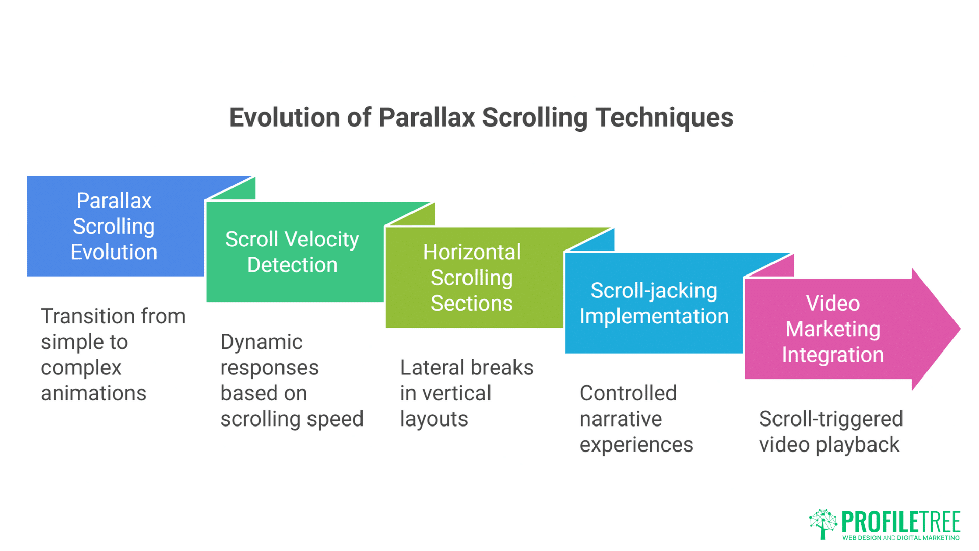
Parallax scrolling evolved beyond simple layer movement into complex choreographed experiences. Modern parallax might include 3D transforms, time-based animations triggered by scroll position, elements moving along curved paths, or entire scene transformations. These evolved techniques create cinematic experiences from simple scrolling.
Scroll velocity detection enables dynamic responses to user behaviour. Fast scrolling might blur backgrounds or streak elements, while slow scrolling reveals fine details and triggers different animations. This velocity awareness makes scrolling feel more physical and responsive.
Horizontal scrolling sections within vertical layouts break monotony and create surprise. These lateral breaks might showcase galleries, timelines, or process flows. The unexpected axis change refreshes attention and creates memorable moments.
Scroll-jacking, when implemented thoughtfully, creates controlled narrative experiences. Rather than arbitrary control seizure, modern scroll-jacking guides users through story beats, ensures important content isn’t missed, and creates presentation-like experiences. The key lies in maintaining user agency within guided experiences.
Video marketing integration with scroll-triggered playback creates rich multimedia narratives. Videos that play as they enter viewport, that scrub through timeline based on scroll position, that transition seamlessly into static content – these techniques blur boundaries between web and video.
Progressive Reveal and Storytelling
Staggered animations create visual hierarchy through temporal spacing. Elements appearing in sequence guide attention, establish reading order, and create rhythm. This choreography transforms information dumps into digestible sequences.
Scroll-based storytelling uses position as narrative timeline. Each scroll depth reveals plot points, character development, or argument progression. This linear control helps complex stories unfold comprehensibly.
Interactive scrollytelling combines scrolling with user choices. Branch points triggered by scroll depth, alternate paths based on interaction, scroll-triggered polls or quizzes – these combinations create personalised narrative experiences.
Data visualisation animations triggered by scroll make statistics memorable. Charts that build as users scroll, numbers that count up, comparisons that animate into place – these techniques make data feel discovered rather than presented.
Ambient animations that loop independently of scroll create living backgrounds. Clouds that drift, particles that float, gradients that shift – these autonomous movements provide life without requiring interaction.
Creating Memorable Loading Experiences
Loading screens are no longer just placeholders—they’re opportunities to engage and entertain users. With clever animations, playful visuals, or subtle progress cues, loading states can ease frustration and maintain attention. Done right, they transform waiting time into a memorable part of the overall experience.
Beyond the Spinner: Creative Loading States
Loading animations now tell stories, play games, or provide value during wait times. Loading screens might display tips, show brand stories, run mini-games, or preview coming content. These experiences transform dead time into engagement opportunities.
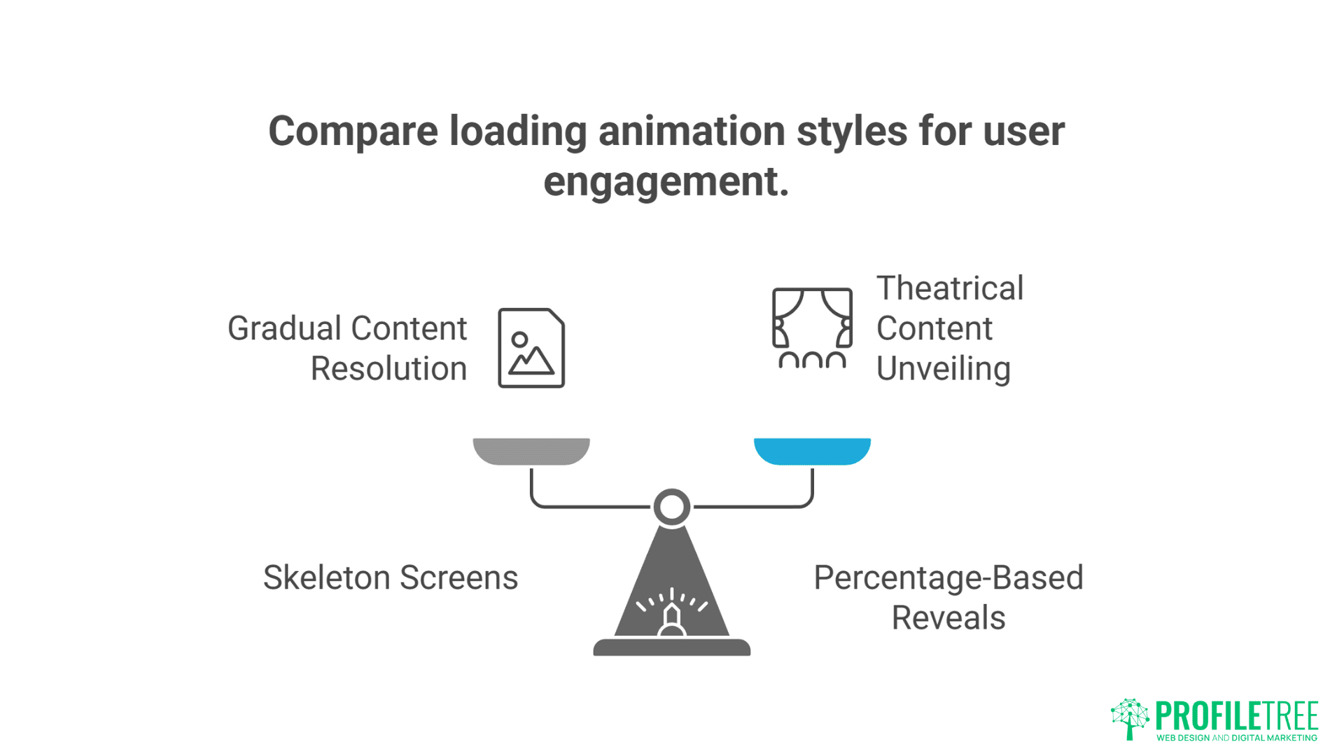
Skeleton screens that progressively resolve create anticipation while showing progress. These content placeholders maintain layout stability while communicating that content is coming. The gradual resolution from grey boxes to full content feels more satisfying than sudden appearance.
Percentage-based reveals that uncover content like curtains drawing back create theatrical moments. These reveals might follow cursor movement, respond to device orientation, or animate based on actual load progress.
Brand personality expression through loading animations differentiates experiences. Playful brands might use bouncing mascots, professional services might use elegant progress bars, creative agencies might use generative art – these choices reinforce brand identity during every wait.
Educational loading sequences teach users about products or features. Loading times become onboarding opportunities, feature discovery moments, or skill-building exercises. This value addition makes waiting feel worthwhile.
Performance Perception Management
Optimistic UI updates make interactions feel instant by assuming success. Interfaces update immediately while server requests process in background. If requests fail, interfaces roll back gracefully. This optimism eliminates perceived latency for most interactions.
Progressive image loading with blur-up effects maintains visual continuity. Low-resolution placeholders appear instantly, gradually sharpening as full images load. This technique eliminates jarring image pops while maintaining performance.
Lazy loading with entrance animations makes deferred loading feel intentional. Content appearing just before users need it, animated entrances that feel choreographed rather than delayed – these techniques hide performance optimisation behind experiential design.
Preloading critical interactions ensures instant response when needed. Hovering might trigger preloading of linked content, approaching form fields might preload validation logic, scroll proximity might begin loading below-fold images – these predictions eliminate waiting when actions occur.
Balancing Innovation with Usability
Pushing creative boundaries is essential, but innovation should never compromise usability. Designs that are too experimental risk confusing or alienating users. The key is striking a balance where fresh ideas enhance, rather than hinder, the overall experience.
When to Break Rules vs When to Follow Them
E-commerce sites require careful balance between innovation and convention. While product galleries might feature creative interactions, checkout processes should remain predictable. Users tolerate experimentation during browsing but demand familiarity during transactions.
B2B websites can embrace anti-design in moderation. Hero sections might feature bold typography and broken grids, while service descriptions and contact forms maintain professional clarity. This balance communicates creativity without sacrificing credibility.
Accessibility requirements don’t prevent innovation but guide it. Anti-design can coexist with screen reader compatibility, keyboard navigation, and colour contrast requirements. The challenge becomes creating experiences that feel rebellious while remaining inclusive.
Mobile considerations often require simplified versions of desktop innovations. Complex cursor interactions become touch gestures, particle systems reduce density, anti-design layouts restructure for small screens. These adaptations maintain spirit while respecting constraints.
Website hosting and management services from ProfileTree ensure innovative designs perform reliably across all platforms and conditions.
Testing and Iteration Strategies
User testing reveals whether innovations enhance or hinder experience. What designers find delightful, users might find frustrating. Regular testing throughout development prevents investment in ineffective innovations.
A/B testing comparing traditional and innovative approaches provides data-driven validation. Conversion rates, engagement metrics, and user feedback determine whether innovations justify their implementation costs.
Progressive rollout allows testing innovations with willing audiences before full deployment. Beta features, opt-in experiences, or geographical rollouts reduce risk while gathering real-world feedback.
Analytics interpretation for experimental designs requires adjusted expectations. Innovative designs might show different engagement patterns – longer visits might indicate confusion or delight, higher bounce rates might reflect polarisation or technical issues.
Iteration based on feedback refines innovations into usable experiences. The first version of any innovation rarely perfects the balance. Continuous refinement based on user behaviour and feedback evolves experiments into established patterns.
Tools and Technologies for Modern Web Interactions
Behind every seamless interaction is a toolkit of powerful design and development technologies. From animation libraries to no-code platforms, these tools help creators bring interactive ideas to life. Choosing the right technology stack ensures both creativity and performance stay at the core of modern web experiences.
Animation Libraries and Frameworks
GSAP (GreenSock Animation Platform) remains the gold standard for complex web animations. Its timeline control, plugin ecosystem, and performance optimisation make it ideal for ambitious animation projects. The learning curve pays dividends in capability and reliability.
Framer Motion brings React components to life with declarative animations. Its gesture support, layout animations, and exit animations integrate seamlessly with modern React applications. The API design makes complex animations surprisingly approachable.
Lottie enables After Effects animations on the web without video files. Designers create in familiar tools while developers implement with simple APIs. This workflow bridges design and development gaps.
Three.js powers 3D experiences that push web boundaries. While complex, it enables experiences impossible with traditional web technologies. The community and documentation make 3D web development increasingly accessible.
CSS Houdini promises future animation capabilities by exposing browser rendering engines. Custom paint worklets, animation worklets, and layout worklets will enable currently impossible effects. Early adoption positions businesses for next-generation web experiences.
Performance Monitoring and Optimisation
Chrome DevTools Performance panel reveals animation bottlenecks with frame-by-frame analysis. Understanding paint, layout, and composite operations enables targeted optimisation. This granular view transforms performance from mystery to science.
Lighthouse CI integrates performance testing into development workflows. Automated testing catches performance regressions before deployment. This continuous monitoring prevents incremental degradation.
Web Vitals tracking ensures animations don’t damage core performance metrics. Monitoring Largest Contentful Paint, First Input Delay, and Cumulative Layout Shift during animation development maintains balance.
GPU acceleration techniques ensure smooth animation performance. Transform3d hacks, will-change declarations, and layer promotion optimise rendering pipelines. These techniques require careful application to avoid memory issues.
Bundle size monitoring prevents animation libraries from bloating applications. Tree-shaking, code splitting, and lazy loading ensure users download only necessary animation code. This discipline maintains performance while enabling rich interactions.
Industry Applications and Case Studies
Real-world examples show how interactive design principles translate into measurable success. From e-commerce platforms to educational sites, brands are using micro-interactions, animations, and bold design choices to captivate users. These case studies highlight the practical impact of modern web experiences across industries.
Creative Agencies Leading Innovation
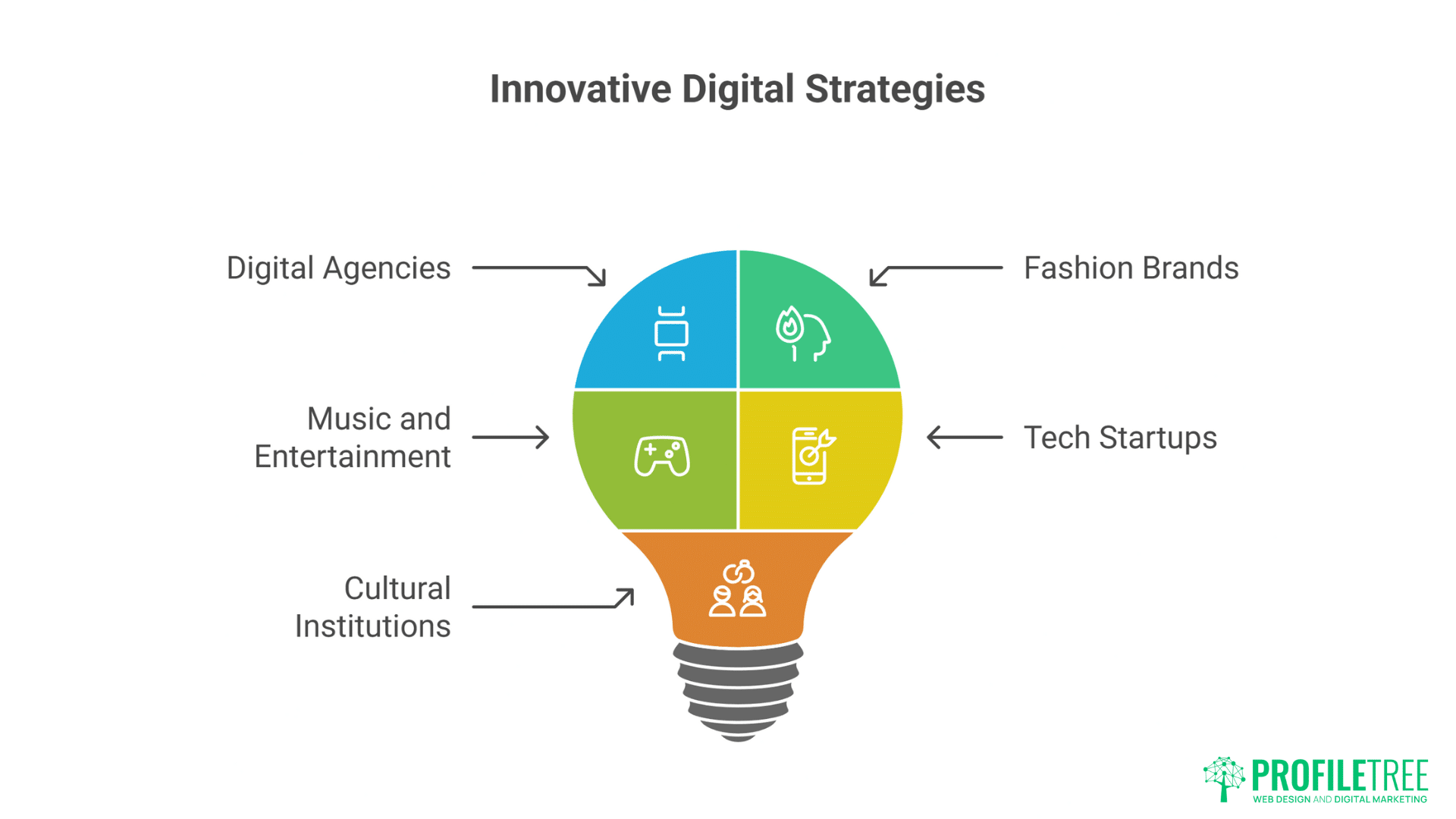
Digital agencies use anti-design and micro-interactions to demonstrate capability. Agency websites become portfolios of possibility, showcasing technical and creative prowess. These experimental playgrounds attract clients seeking innovative partners.
Fashion brands embrace anti-design’s rebellion against beauty standards. Deliberately ugly websites for beautiful products create cognitive dissonance that captures attention. This contrast strengthens brand narratives about challenging conventions.
Music and entertainment sites use micro-interactions to create immersive experiences. Album launches become interactive journeys, artist sites respond to music, tour announcements trigger celebratory animations – these experiences extend entertainment beyond content.
Tech startups differentiate through distinctive interactions. In crowded markets, memorable websites become competitive advantages. Unique interactions make products feel innovative before users even try them.
Cultural institutions balance innovation with accessibility requirements. Museums, galleries, and theatres create engaging digital experiences while maintaining inclusive access. These constraints inspire creative solutions.
Corporate Evolution Toward Expression
Financial services carefully introduce micro-interactions without sacrificing trust. Subtle animations guide complex processes, making banking feel less intimidating. These gentle introductions modernise without alienating conservative users.
Healthcare websites use calming micro-interactions to reduce anxiety. Gentle transitions, soft colour shifts, and organic movements create reassuring experiences. These details matter when users are stressed or vulnerable.
Educational platforms gamify learning through interactive design. Progress animations, achievement celebrations, and playful feedback make education engaging. These techniques improve retention and completion rates.
Real estate sites use parallax scrolling and animations to showcase properties dynamically. Virtual tours triggered by scroll, floor plans that animate into 3D, neighbourhood maps that reveal amenities – these interactions provide value beyond static images.
Social media marketing incorporates web innovations to create shareable moments. Interactive experiences generate social buzz, driving organic reach through user-generated content.
Future Directions and Emerging Trends
Web design continues to evolve as new technologies and user expectations shape digital experiences. Emerging trends like AI-driven personalisation, immersive 3D elements, and AR integration are pushing boundaries even further. Staying ahead means embracing change while keeping usability at the heart of innovation.
AI-Influenced Generative Interactions
Machine learning enables animations that adapt to user behaviour. Interfaces that learn preferences, adjust timing based on user speed, or generate unique animations for each visitor – these personalised experiences represent interaction’s future.
Generative design systems create infinite visual variations within defined parameters. No two visits produce identical experiences, yet brand consistency maintains. This generative approach scales creativity beyond human limitations.
Predictive interactions anticipate user needs before conscious awareness. Interfaces preparing probable next actions, preloading likely destinations, adjusting complexity based on expertise – these predictions make interfaces feel telepathic.
Emotional response detection through interaction patterns enables empathetic interfaces. Frustrated users might receive simplified interfaces, engaged users might unlock advanced features – these adaptations create more human digital relationships.
Augmented Reality Web Experiences
WebXR brings augmented reality to browsers without apps. Product visualisation, virtual try-ons, and spatial interfaces become possible through standard web technologies. This accessibility democratises AR experiences.
Camera-based interactions use device capabilities for innovative inputs. Hand tracking, face detection, and environment mapping create controller-free interactions. These natural inputs reduce interface friction.
Spatial computing principles influence traditional web design. Z-axis navigation, 3D layouts, and depth-based interactions prepare users for spatial computing futures. These experiments establish patterns for emerging platforms.
Voice and Gesture Integration
Voice-triggered animations respond to spoken commands without traditional inputs. Speaking might trigger searches, navigate content, or control playback. These voice interactions serve accessibility while enabling hands-free use.
Gesture recognition through cameras enables touch-free interaction. Hand waves might scroll, pinches might zoom, points might select – these gestures become relevant as hygiene concerns persist.
Multi-modal interactions combine voice, gesture, touch, and traditional inputs. Users choose interaction methods based on context, capability, or preference. This flexibility creates truly inclusive experiences.
FAQs
Don’t all these animations and effects slow down websites significantly?
When properly implemented, micro-interactions actually improve perceived performance. Modern techniques like CSS transforms, GPU acceleration, and progressive enhancement ensure smooth experiences. The key lies in performance budgeting – limiting animation complexity based on device capability and connection speed.
How do anti-design principles work for professional B2B companies?
B2B companies can selectively apply anti-design principles without sacrificing professionalism. Bold typography in hero sections, asymmetrical layouts for case studies, or playful 404 pages add personality while maintaining credibility. The key is knowing where to push boundaries and where to maintain conventions.
Will these design trends age poorly and quickly look dated?
Design trends cycle, but the principles behind micro-interactions and anti-design – creating emotional connections, standing out from competitors, and making interfaces feel alive – remain timeless. Specific implementations might age, but the core concepts adapt to new aesthetics.
How do we ensure accessibility when adding complex interactions?
Accessibility enhances rather than restricts creativity. Every animation should respect prefers-reduced-motion preferences, maintain keyboard navigation, and provide alternative experiences for screen readers. Testing with actual users with disabilities ensures inclusive innovation.
What’s the ROI of investing in these advanced design approaches?
Memorable experiences drive measurable business results. Increased engagement rates, longer session durations, higher conversion rates, and improved brand recall justify investment. Companies report 20-40% improvement in key metrics after implementing thoughtful micro-interactions.
Can existing websites be retrofitted with these features, or do they require complete rebuilds?
Many micro-interactions and anti-design elements can be progressively added to existing sites. Start with hover states and loading animations, gradually introducing more complex features. Complete rebuilds aren’t necessary unless fundamental architecture prevents innovation.
Implementing the Future Today
The convergence of micro-interactions, animations, and anti-design represents web design’s most exciting evolution. These approaches transform websites from static documents into living, breathing experiences that forge emotional connections with users.
Success requires balancing innovation with usability, expression with accessibility, and creativity with performance. The best implementations feel effortless despite their complexity, delighting users without confusing them.
ProfileTree’s website design team creates digital experiences that push boundaries while respecting user needs. Our Belfast studio combines technical expertise with creative vision, delivering websites that stand out in increasingly homogeneous digital landscapes.
For businesses ready to explore web design’s cutting edge, ProfileTree’s development services transform ambitious visions into functional realities. We understand that modern websites must perform flawlessly while expressing unique brand personalities.
The future of web design isn’t about choosing between usability and creativity – it’s about synthesising both into experiences users remember, share, and return to. Companies embracing these principles today position themselves as innovators, attracting audiences that value originality and engagement over safe predictability.
Watch our comprehensive guide on mastering design theory to understand the principles underlying effective modern web design. The journey toward more expressive, interactive web experiences begins with understanding why movement and rebellion matter in digital design.