Mobile SEO Services: Optimising for Mobile-First Search
Table of Contents
ProfileTree provides professional mobile SEO services helping businesses across Northern Ireland, Ireland, and the UK ensure their websites perform optimally for mobile searchers. With mobile-first indexing now standard, your mobile experience determines your search rankings across all devices.
Mobile isn’t optional anymore—it’s primary. Google now uses the mobile version of your website as the primary basis for indexing and ranking. If your mobile experience is poor, your rankings suffer on desktop too. With over half of all searches happening on mobile devices, optimising for mobile users isn’t just about rankings—it’s about reaching the majority of your potential customers.
Understanding Mobile SEO
What mobile SEO involves and why it matters:
The Mobile-First Reality
How mobile has transformed search:
Mobile Search Statistics:
| Statistic | Implication |
| 60%+ of searches on mobile | Majority of searchers use mobile |
| Mobile-first indexing standard | Google primarily crawls mobile versions |
| Mobile conversions growing | Users complete actions on mobile |
| Local searches heavily mobile | “Near me” searches almost entirely mobile |
What Mobile-First Indexing Means:
| Aspect | Impact |
| Primary crawling | Google crawls mobile version first |
| Ranking basis | Mobile content determines rankings |
| Desktop impact | Poor mobile affects desktop rankings too |
| Content parity | Mobile must have same content as desktop |
Mobile SEO vs Desktop SEO
Key differences in mobile optimisation:
Mobile-Specific Factors:
| Factor | Mobile Consideration |
| Screen size | Content must work on small screens |
| Touch interaction | Buttons and links must be tap-friendly |
| Connection speed | Often slower than desktop |
| User intent | Often more immediate, local |
| Attention span | Shorter, more task-focused |
Technical Differences:
| Element | Mobile Requirement |
| Page speed | Critical—users abandon slow pages |
| Layout | Responsive or mobile-specific |
| Navigation | Touch-friendly, simplified |
| Content | Readable without zooming |
| Forms | Easy to complete on mobile |
Core Web Vitals and Mobile
Google’s mobile performance metrics:
Core Web Vitals:
| Metric | What It Measures | Target |
| Largest Contentful Paint (LCP) | Loading performance | Under 2.5 seconds |
| Interaction to Next Paint (INP) | Interactivity | Under 200 milliseconds |
| Cumulative Layout Shift (CLS) | Visual stability | Under 0.1 |
Why Core Web Vitals Matter:
| Reason | Impact |
| Ranking factor | Affects search positions |
| User experience | Poor vitals = frustrated users |
| Conversion impact | Slow sites lose conversions |
| Competitive advantage | Better vitals than competitors |
Our Mobile SEO Services
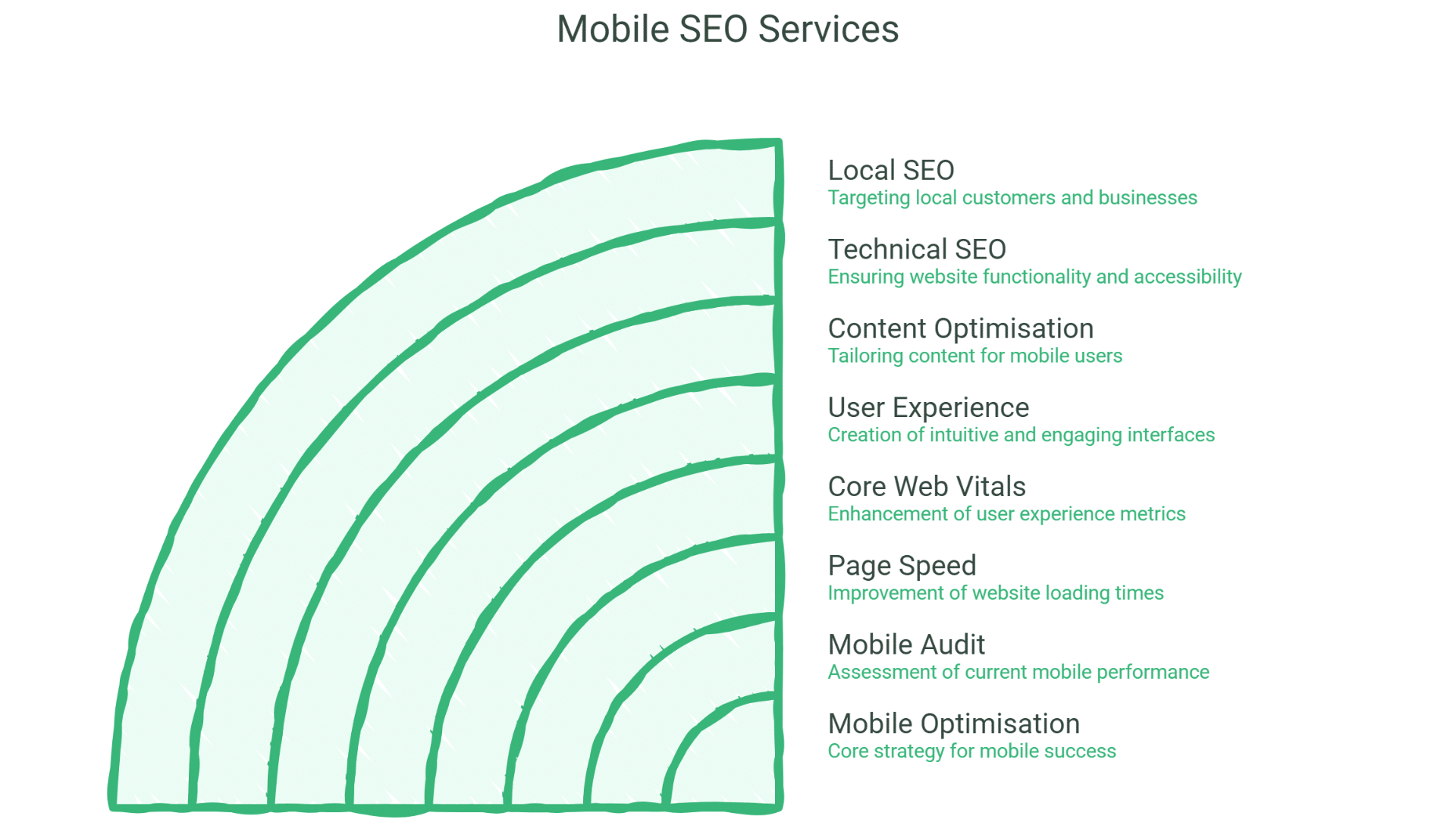
Comprehensive mobile optimisation:
Mobile SEO Audit
Assessing your mobile performance:
Audit Components:
| Component | Assessment |
| Mobile usability | Touch targets, font sizes, viewport |
| Page speed | Loading performance metrics |
| Core Web Vitals | LCP, INP, CLS analysis |
| Content parity | Mobile vs desktop content comparison |
| Technical setup | Mobile configuration review |
| User experience | Mobile journey analysis |
Audit Tools and Methods:
| Tool/Method | Purpose |
| Google Search Console | Mobile usability issues |
| PageSpeed Insights | Performance scoring |
| Chrome DevTools | Detailed technical analysis |
| Real device testing | Actual mobile experience |
| User testing | Real user feedback |
Audit Deliverables:
| Deliverable | Contents |
| Mobile audit report | Complete mobile assessment |
| Issue documentation | All problems identified |
| Priority framework | What to fix first |
| Fix specifications | How to resolve issues |
| Performance benchmarks | Current vs target metrics |
Mobile Page Speed Optimisation
Improving mobile loading performance:
Speed Optimisation Areas:
| Area | Optimisation |
| Image optimisation | Compression, modern formats, lazy loading |
| Code optimisation | Minification, unnecessary code removal |
| Server response | TTFB improvement |
| Caching | Browser and server caching |
| Critical path | Prioritising above-fold content |
| Third-party scripts | Reducing external script impact |
Image Optimisation:
| Technique | Benefit |
| Compression | Smaller file sizes |
| WebP/AVIF formats | Better compression than JPEG/PNG |
| Responsive images | Appropriate sizes for devices |
| Lazy loading | Only load when needed |
| Image CDN | Optimised delivery |
Code Optimisation:
| Technique | Benefit |
| CSS minification | Smaller stylesheets |
| JavaScript minification | Smaller scripts |
| Unused code removal | Eliminate bloat |
| Code splitting | Load only what’s needed |
| Async/defer scripts | Non-blocking loading |
Server Optimisation:
| Technique | Benefit |
| Server response time | Faster TTFB |
| CDN implementation | Global content delivery |
| Compression (Gzip/Brotli) | Smaller transfer sizes |
| HTTP/2 or HTTP/3 | Faster protocol |
| Caching headers | Reduce repeat requests |
Core Web Vitals Optimisation
Improving Google’s key metrics:
LCP Optimisation:
| Issue | Solution |
| Large images | Optimise, compress, lazy load |
| Slow server response | Server and CDN optimisation |
| Render-blocking resources | Defer non-critical CSS/JS |
| Client-side rendering | Server-side rendering or pre-rendering |
INP Optimisation:
| Issue | Solution |
| Long JavaScript tasks | Break into smaller tasks |
| Heavy event handlers | Optimise interaction code |
| Large DOM size | Reduce DOM complexity |
| Third-party scripts | Audit and reduce impact |
CLS Optimisation:
| Issue | Solution |
| Images without dimensions | Specify width and height |
| Ads and embeds | Reserve space |
| Web fonts | Font display strategy |
| Dynamically injected content | Reserve space in advance |
Mobile User Experience Optimisation
Improving mobile usability:
Touch Target Optimisation:
| Element | Requirement |
| Button size | Minimum 48×48 pixels |
| Link spacing | Adequate space between links |
| Form fields | Easy to tap and fill |
| Navigation | Touch-friendly menus |
Readability Optimisation:
| Element | Requirement |
| Font size | Minimum 16px base size |
| Line height | Adequate spacing |
| Contrast | Sufficient colour contrast |
| Content width | No horizontal scrolling |
Navigation Optimisation:
| Element | Approach |
| Menu design | Mobile-friendly navigation |
| Search functionality | Easy to access and use |
| Breadcrumbs | Mobile-appropriate implementation |
| CTAs | Prominent, easy to tap |
Form Optimisation:
| Element | Approach |
| Input types | Appropriate keyboard types |
| Field labels | Clear, visible labels |
| Validation | Helpful error messages |
| Autofill | Support browser autofill |
| Simplification | Minimum required fields |
Mobile Content Optimisation
Ensuring content works on mobile:
Content Parity:
| Requirement | Implementation |
| Same content | Mobile has all desktop content |
| Same metadata | Title tags, meta descriptions |
| Same structured data | Schema markup on mobile |
| Same internal links | Navigation and linking |
Mobile Content Best Practices:
| Practice | Benefit |
| Scannable formatting | Easy to read on small screens |
| Shorter paragraphs | Better mobile readability |
| Expandable sections | Content organisation |
| Prioritised content | Important content first |
Mobile-Specific Considerations:
| Element | Approach |
| Tables | Responsive or scrollable |
| Images | Appropriately sized |
| Videos | Mobile-friendly players |
| PDFs | HTML alternatives where possible |
Mobile Technical SEO
Technical mobile configuration:
Viewport Configuration:
<meta name=”viewport” content=”width=device-width, initial-scale=1″>
Mobile Technical Checklist:
| Element | Requirement |
| Viewport meta tag | Properly configured |
| Responsive design | Works on all screen sizes |
| No intrusive interstitials | Avoiding popup penalties |
| HTTPS | Secure connection |
| Robots access | Mobile version crawlable |
Structured Data for Mobile:
| Requirement | Implementation |
| Same schema as desktop | All structured data present |
| Mobile-specific schema | FAQ, How-to visible on mobile |
| Testing | Validation on mobile version |
Mobile Local SEO
Optimising for mobile local searches:
Mobile Local Considerations:
| Factor | Importance |
| “Near me” searches | Heavily mobile-based |
| Click-to-call | Easy phone contact |
| Directions | Quick access to maps |
| Local content | Location-relevant information |
Mobile Local Optimisation:
| Element | Implementation |
| Click-to-call buttons | Prominent, functional |
| Address formatting | Map-linkable |
| Local schema | LocalBusiness markup |
| Google Business Profile | Mobile-optimised presence |
Mobile SEO by Website Type
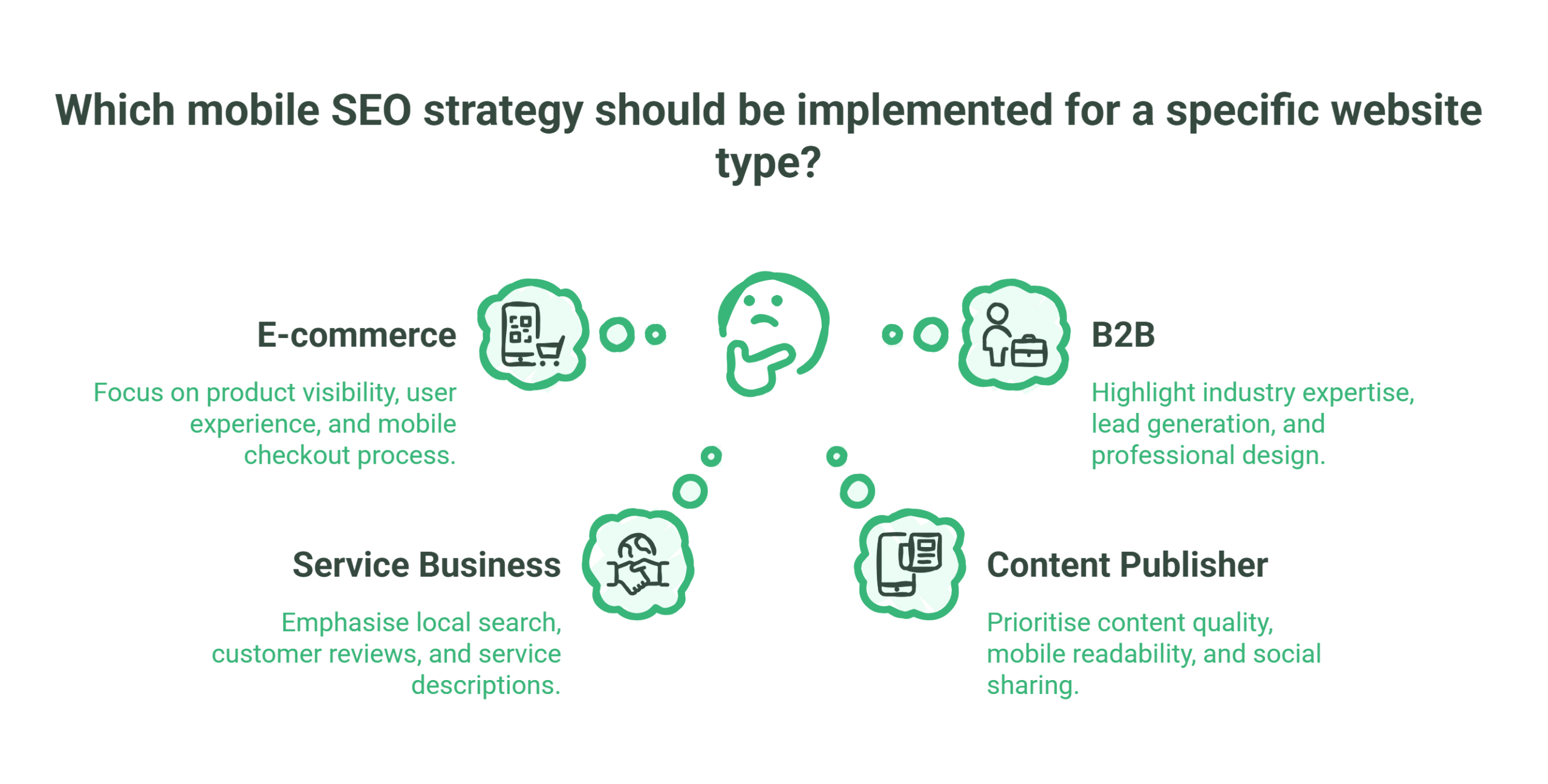
Strategies for different sites:
E-commerce Mobile SEO
Optimising online stores for mobile:
E-commerce Mobile Priorities:
| Priority | Approach |
| Product pages | Fast loading, easy to browse |
| Category pages | Filterable, navigable |
| Checkout | Simplified mobile checkout |
| Search | Effective product search |
| Images | Optimised product images |
Mobile E-commerce Optimisation:
| Element | Optimisation |
| Product images | Multiple views, zoom capability |
| Add to cart | Easy, prominent buttons |
| Filtering | Mobile-friendly filters |
| Payment | Mobile payment options |
| Cart | Easy to view and edit |
Service Business Mobile SEO
Optimising service websites:
Service Mobile Priorities:
| Priority | Approach |
| Contact access | Easy to call, enquire |
| Service information | Clear on mobile |
| Local visibility | Location-focused |
| Trust signals | Reviews, credentials visible |
Service Mobile Optimisation:
| Element | Optimisation |
| Phone number | Click-to-call, prominent |
| Contact forms | Short, mobile-friendly |
| Service descriptions | Scannable content |
| Testimonials | Mobile-readable format |
Content Publisher Mobile SEO
Optimising content-heavy sites:
Publisher Mobile Priorities:
| Priority | Approach |
| Article readability | Easy to read on mobile |
| Navigation | Easy content discovery |
| Ad balance | Ads don’t overwhelm content |
| Load speed | Fast despite content volume |
Publisher Mobile Optimisation:
| Element | Optimisation |
| Article formatting | Mobile-optimised typography |
| Images | Responsive, optimised |
| Related content | Easy navigation |
| Social sharing | Mobile-friendly sharing |
B2B Mobile SEO
Optimising business websites:
B2B Mobile Priorities:
| Priority | Approach |
| Professional appearance | Mobile credibility |
| Lead capture | Mobile-friendly forms |
| Content access | Resources accessible |
| Contact options | Multiple contact methods |
B2B Mobile Optimisation:
| Element | Optimisation |
| Lead forms | Simplified for mobile |
| Resources | Downloadable/viewable |
| Case studies | Mobile-readable format |
| Contact | Multiple options available |
Mobile SEO Technical Implementation
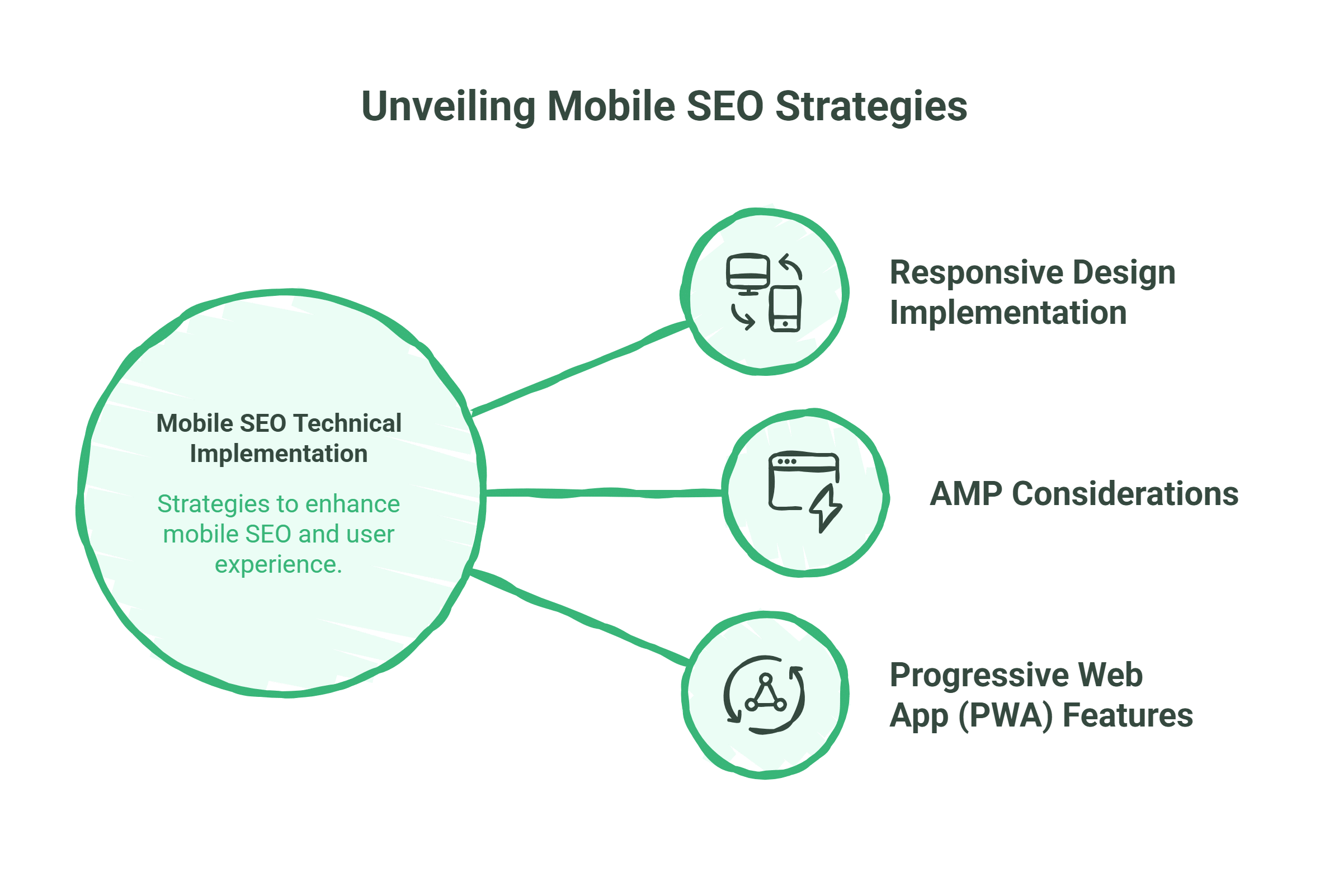
Implementing mobile optimisation:
Responsive Design Implementation
Building for all devices:
Responsive Principles:
| Principle | Implementation |
| Fluid grids | Percentage-based layouts |
| Flexible images | Max-width: 100% |
| Media queries | Breakpoint-based styling |
| Mobile-first CSS | Build up from mobile |
Breakpoint Strategy:
| Breakpoint | Target |
| 320px | Small phones |
| 480px | Large phones |
| 768px | Tablets |
| 1024px | Small desktops |
| 1200px+ | Large desktops |
AMP Considerations
Accelerated Mobile Pages evaluation:
AMP Status:
| Consideration | Current Reality |
| Not required | Not a ranking factor |
| Speed benefits | Can improve performance |
| Limitations | Restricted functionality |
| Use cases | Publishers, news sites |
When AMP Makes Sense:
| Scenario | Consideration |
| News publishers | Top Stories carousel |
| Content-heavy sites | Speed improvement |
| Simple pages | Where limitations acceptable |
Progressive Web App (PWA) Features
App-like mobile experiences:
PWA Benefits:
| Benefit | Value |
| Offline capability | Works without connection |
| Add to home screen | App-like access |
| Push notifications | Re-engagement |
| Fast performance | Cached resources |
PWA SEO Considerations:
| Consideration | Approach |
| Crawlability | Ensure content accessible |
| Server-side rendering | Content available to crawlers |
| URL structure | Crawlable URLs |
Measuring Mobile SEO Success
Tracking mobile performance:
Mobile-Specific Metrics
Key mobile measurements:
Performance Metrics:
| Metric | Target |
| Mobile page speed score | 90+ |
| LCP | Under 2.5s |
| INP | Under 200ms |
| CLS | Under 0.1 |
| Mobile usability | No issues |
Traffic Metrics:
| Metric | Tracking |
| Mobile organic traffic | Volume and trends |
| Mobile vs desktop split | Device distribution |
| Mobile rankings | Position on mobile SERPs |
| Mobile conversions | Actions on mobile |
Engagement Metrics:
| Metric | Tracking |
| Mobile bounce rate | Engagement quality |
| Mobile time on site | Content engagement |
| Mobile pages per session | Site exploration |
| Mobile conversion rate | Goal completion |
Mobile Reporting
Tracking and reporting mobile performance:
Monthly Mobile Report:
| Section | Contents |
| Performance summary | Core Web Vitals status |
| Traffic analysis | Mobile traffic trends |
| Ranking performance | Mobile ranking positions |
| Usability status | Mobile usability issues |
| Conversion analysis | Mobile conversion performance |
| Recommendations | Improvement priorities |
Tools for Mobile SEO
Essential mobile SEO tools:
Testing Tools:
| Tool | Purpose |
| Google Search Console | Mobile usability, performance |
| PageSpeed Insights | Performance scoring |
| Chrome DevTools | Detailed analysis |
| Mobile-Friendly Test | Basic mobile check |
| Real device testing | Actual experience |
Monitoring Tools:
| Tool | Purpose |
| Search Console | Ongoing issue monitoring |
| Analytics | Traffic and behaviour |
| Performance monitoring | Speed tracking |
| Rank tracking | Mobile ranking positions |
Common Mobile SEO Issues
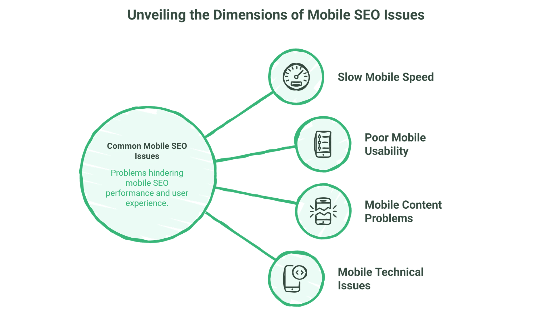
Addressing typical problems:
Slow Mobile Speed
Common Causes:
| Cause | Solution |
| Unoptimised images | Compression, modern formats |
| Too many resources | Reduce requests, combine files |
| Render-blocking | Defer non-critical resources |
| Large JavaScript | Code splitting, optimisation |
| Slow server | Server optimisation, CDN |
Poor Mobile Usability
Common Issues:
| Issue | Solution |
| Text too small | Minimum 16px font size |
| Touch targets too small | Minimum 48x48px buttons |
| Content wider than screen | Responsive design fix |
| Links too close together | Adequate spacing |
Mobile Content Problems
Common Issues:
| Issue | Solution |
| Content hidden on mobile | Ensure content parity |
| Blocked resources | Allow CSS, JS, images |
| Different content | Same content mobile and desktop |
| Intrusive interstitials | Remove or minimise popups |
Mobile Technical Issues
Common Issues:
| Issue | Solution |
| Missing viewport tag | Add proper viewport meta |
| Faulty redirects | Fix redirect chains |
| Mobile-only errors | Test and fix mobile-specific issues |
| Blocked crawling | Ensure mobile version crawlable |
Why Choose ProfileTree for Mobile SEO
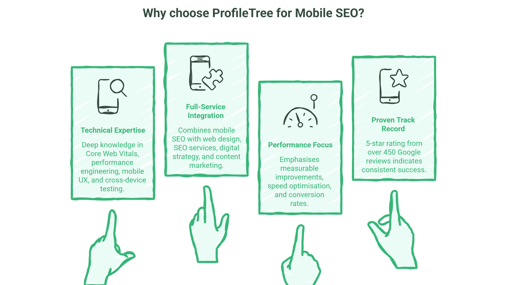
What differentiates our mobile services:
Technical Expertise
Deep mobile technical knowledge:
- Core Web Vitals optimisation
- Performance engineering
- Mobile UX best practices
- Cross-device testing
Full-Service Integration
Mobile SEO with broader services:
- Web design for mobile-first design
- SEO services for comprehensive optimisation
- Digital strategy for mobile strategy
- Content marketing for mobile content
Performance Focus
Results-oriented approach:
- Measurable improvements
- Core Web Vitals targets
- Speed optimisation
- Conversion focus
Proven Track Record
Our 5-star rating from over 450 Google reviews demonstrates consistent delivery across technical SEO implementations.
FAQs
Is mobile SEO different from regular SEO?
Mobile SEO shares core principles with desktop SEO but has additional considerations—page speed is more critical, touch usability matters, and mobile-first indexing means Google primarily uses your mobile site for ranking. Good SEO now requires excellent mobile experience.
How important is page speed for mobile SEO?
Very important. Mobile users have less patience for slow sites, and Google uses Core Web Vitals as ranking factors. Slow mobile pages lose both rankings and users. Page speed optimisation is one of the highest-impact mobile SEO activities.
Do we need a separate mobile site?
No, responsive design is now the recommended approach. A single site that adapts to all devices is easier to maintain and avoids duplicate content issues. Separate mobile sites (m.example.com) are now outdated and can cause problems.
What are Core Web Vitals and do they matter?
Core Web Vitals are Google’s metrics for page experience: LCP (loading), INP (interactivity), and CLS (visual stability). They are confirmed ranking factors and affect both mobile and desktop rankings. Meeting Core Web Vitals targets should be a priority.
How do we test mobile SEO?
Use Google Search Console for mobile usability issues, PageSpeed Insights for performance, and Chrome DevTools for detailed analysis. Also test on real devices—emulators don’t catch everything. Regular monitoring catches issues before they impact rankings.
Does mobile SEO affect desktop rankings?
Yes. With mobile-first indexing, Google uses your mobile site as the primary version for ranking on all devices. If your mobile site is poor, your desktop rankings will also suffer. Mobile optimisation improves rankings across all devices.
How long does mobile SEO take to improve?
Technical improvements like speed optimisation can show results within weeks once implemented. Ranking improvements from better mobile experience typically appear within 1-3 months. Core Web Vitals improvements may take time to reflect in Search Console data.
Conclusion
Mobile isn’t optional—it’s primary. Google uses your mobile site as the basis for all rankings. Over half of searches happen on mobile. Poor mobile experience means poor rankings and lost customers.
Mobile SEO requires technical excellence—fast loading, Core Web Vitals compliance, touch-friendly usability—combined with content that works perfectly on small screens. It’s not separate from SEO; it’s fundamental to SEO.
ProfileTree provides professional mobile SEO services, helping businesses across Northern Ireland, Ireland, and the UK ensure their websites perform optimally for mobile searchers and mobile-first indexing.
Ready to optimise for mobile-first search? Contact ProfileTree to discuss mobile SEO for your website.