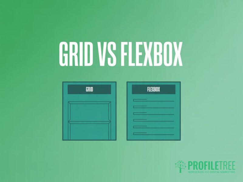
CSS Grid and Flexbox: Advanced Layout Strategies
Table of Contents
The question that comes up constantly among front-end developers is this: Should I use CSS Grid or Flexbox? In most real projects, the answer is both. CSS Grid and Flexbox together form a complementary system, not a competition. Grid handles macro-level structure across two dimensions; Flexbox manages one-dimensional alignment inside the components that sit within that structure.
Most guidance on this topic stalls at the “1D versus 2D” explanation, which is accurate but incomplete. This guide goes further, covering hybrid layout patterns, Container Query integration, accessibility pitfalls that most tutorials skip, and performance considerations for real client work. Whether you’re working independently or as part of a team delivering professional web development, the architectural decisions you make with CSS Grid and Flexbox have lasting consequences.
The Modern Mental Model: When to Switch Tools
Understanding when to reach for Grid versus Flexbox comes down to one practical question: are you laying out a two-dimensional structure, or aligning items along a single axis? That question shapes almost every layout decision in modern CSS. Many developers default to one tool for everything, and the resulting code is either brittle or needlessly complex.
Macro-Layouts with CSS Grid
CSS Grid is purpose-built for page-level structure. It gives you explicit control over both rows and columns, which makes it the right tool for defining where large sections of a page sit in relation to each other. A typical use case is a content layout with a main article area, a persistent sidebar, and a header spanning the full width. Trying to achieve that with Flexbox requires nesting and workarounds that make the code harder to maintain.
Grid’s grid-template-areas Property is particularly useful here. You can map out your layout visually in CSS. The intent is clear to anyone reading the code later:
.page-wrapper {
  display: grid;
  grid-template-columns: 1fr 300px;
  grid-template-rows: auto 1fr auto;
  grid-template-areas:
    "header header"
    "main sidebar"
    "footer footer";
}
This defines a three-row, two-column layout where the header and footer span both columns. Changing it at a breakpoint is a single grid-template-areas redeclaration inside a media query, rather than a cascade of Flexbox property changes.
Micro-Layouts with Flexbox
Once the page structure is in place, Flexbox takes over inside individual components. A navigation bar, a card footer with a button and a price, or a form row where labels and inputs need to align: these are all one-dimensional alignment problems, and Flexbox handles them with less code than Grid would require.
The flex-grow, flex-shrink, and flex-basis properties give you fine-grained control over how items expand and contract. A navigation bar where one item takes all remaining space is a natural fit:
.nav { display: flex; align-items: center; gap: 1rem; }
.nav__spacer { flex-grow: 1; }
The spacer element pushes any items after it to the far end of the bar, which would require absolute positioning or a hack in older CSS.
CSS Grid vs Flexbox: Decision Matrix
| Feature | CSS Grid | Flexbox |
|---|---|---|
| Dimensions | Two-dimensional (rows AND columns) | One-dimensional (row OR column) |
| Best for | Page-level layouts, complex sections | Navigation bars, button groups, card internals |
| Alignment control | Both axes simultaneously | Main axis + cross axis independently |
| Overlapping items | Yes, via grid-area placement | Not natively supported |
| Item wrapping | auto-fill / auto-fit | flex-wrap: wrap |
| Browser support | Full, including subgrid (all major browsers) | Full, universally supported |
| Container Queries | Works inside @container blocks | Works inside @container blocks |
Advanced Hybrid Patterns: Real-World Scenarios
The real power of using CSS Grid and Flexbox together becomes clear when you move beyond textbook examples. The patterns below represent common layout challenges where a hybrid approach produces cleaner, more maintainable code than relying on either tool alone. They’re also where you’ll see the “CSS flexible grid” model shine: Grid sets the structural frame, Flexbox fills it with precision.
The Bento Grid with Flex-Controlled Content
The bento grid pattern is widely used in product and SaaS interfaces: a collection of cards of varying sizes arranged in a tight grid, each containing its own internal layout. Grid defines card positions and sizes; Flexbox inside each card controls alignment. This is a textbook case of using grid and flexbox together, with each tool doing exactly what it’s best at.
.bento-grid {
  display: grid;
  grid-template-columns: repeat(3, 1fr);
  grid-auto-rows: minmax(200px, auto);
  gap: 1.5rem;
}
.bento-card { display: flex; flex-direction: column; justify-content: space-between; padding: 1.5rem; }
.bento-card--wide { grid-column: span 2; }
The grid handles macro placement; the card’s internal Flexbox layout ensures content, icon, and CTA button are always properly distributed. Adding a tall card is a grid-row: span 2 declaration, not a layout refactor.
Sticky Footers and Fluid Sidebars
Keeping a footer pinned to the bottom of the viewport when content is short, while allowing it to push down naturally when content is long, is a problem Grid solves elegantly. Combine a Grid outer wrapper with min-height: 100dvh and grid-template-rows: auto 1fr auto. The middle row takes all remaining space. The footer is pushed down without JavaScript.
Watch out for layout shift (CLS) in this pattern. If your sidebar loads content asynchronously after the initial render, the grid will recalculate row heights and trigger a measurable CLS impact. Structure your HTML so that sidebar content is server-rendered or skeleton-loaded to hold its space. This directly affects how layout choices affect your website performance in Google’s Core Web Vitals scoring.
Using Flexbox Inside Grid Items
One of the most useful hybrid techniques is using Flexbox inside grid items that need to distribute their own content independently. Grid’s align-items and justify-items affect all items uniformly. If individual cells need different internal alignment, Flexbox on the cell itself gives you that control.
A common example: most cards in a grid stack content vertically, but a featured card centres its content both ways. Applying display: flex with align-items and justify-content set to centre on that specific grid item overrides the grid’s default behaviour for that cell alone. This is exactly the kind of fine-tuning that makes flexbox inside grid such a practical combination, rather than fighting the grid to do something it wasn’t designed for.
Container Queries and Hybrid Layouts

Container Queries are the most important evolution in responsive CSS since media queries arrived. Where media queries respond to the viewport size, Container Queries let a component respond to the size of its own container. This changes how you approach hybrid Grid and Flexbox layouts, particularly in component-based frameworks like React or Vue.
Moving Beyond Media Queries
The limitation of media-query-based responsiveness is that a grid item’s rendered size is determined by the grid’s column definition, not the viewport directly. A three-column grid at 1200px gives each item 400px of width. A two-column grid at the same viewport gives each item 600px. Media queries can’t distinguish between these two cases, which makes maintenance difficult.
Container Queries solve this directly:
.card-wrapper { container-type: inline-size; container-name: card; }

@container card (min-width: 400px) {
  .card__inner { display: flex; flex-direction: row; gap: 1rem; }
}
Below 400px, the card stacks vertically. Above it, the component switches to a Flexbox row. That behaviour is completely independent of the viewport width. The same component works correctly whether it’s a grid inside flexbox arrangements, narrow sidebar cells, or wide main content columns.
Building Self-Aware Components
Browser support for Container Queries is now solid across all major browsers. For projects that must support older environments, the progressive enhancement approach is to define the default layout as Flexbox stacking, then use @supports (container-type: inline-size) to layer in the container-aware version.
The combination of Grid for the outer layout and Container Queries on grid items makes your component library viewport-agnostic. A card component built this way can sit in any column configuration on any page and behave correctly without modification. This is the architectural decision that separates maintainable code from code that needs constant intervention, and it’s central to how experienced web developers approach front-end architecture at scale.
Accessibility and Source Order in the UK Context
Accessibility isn’t an optional enhancement in Grid and Flexbox work. Both tools can visually reorder elements without changing their position in the DOM, and that creates a genuine risk for users who tab through a page with a keyboard or who rely on a screen reader.
In the UK, public sector websites must meet WCAG 2.2 at Level AA under the Public Sector Bodies Accessibility Regulations 2018. Private sector sites face increasing scrutiny under the Equality Act 2010. If your layout reordering makes the tab order illogical, you’re potentially creating a compliance issue in addition to a usability one. These aren’t minor technical edge cases; they’re the kind of issues that surface in accessibility audits.
Managing Tab Order in Complex Grids
The danger with Grid layouts is the order property and grid-template-areas combined with visual-first thinking. Consider a layout where the design calls for a featured item to appear first visually, but the HTML has it third in the source. Using grid-column: 1; grid-row: 1; moves it visually to the top-left, but keyboard users encounter it third when tabbing. Screen readers follow DOM order, not visual order.
The best practice is to structure your HTML in the logical reading and navigation order first, then use CSS Grid and Flexbox purely to adjust visual presentation. If the design requires an element to appear first both visually and logically, move it first in the HTML. Don’t use the CSS order Property as a substitute for the correct source order.
WCAG 2.2 Compliance for Responsive Layouts
WCAG 2.2 Success Criterion 1.3.2 (Meaningful Sequence) requires that if the order of content affects meaning, that sequence can be programmatically determined. Flexbox’s flex-direction: row-reverse and Grid’s grid-auto-flow: dense Both reorder content visually without changing the DOM sequence, and both can violate this criterion.
Avoid grid-auto-flow: dense on layouts where grid items represent sequential content: steps, chronological events, ranked items. It fills gaps in the grid by placing items out of source order, which breaks logical tab sequences. Use it only on decorative image grids or non-sequential content where order carries no meaning.
For UK developers building component libraries or design systems, treating accessibility as part of the initial architecture rather than a post-build audit makes the process far less disruptive. Getting the source order right from the start costs minutes; fixing it after a full build can mean revisiting every template. The essential skills for web designers increasingly include this kind of structural thinking, particularly on projects with government or large enterprise clients.
Creating a Layout Design System
The most durable outcome of combining CSS Grid and Flexbox well is a layout system rather than a collection of one-off solutions. A layout system defines a small set of grid configurations and Flexbox patterns that cover the majority of your interface needs, documents them clearly, and applies them consistently. This is how web design services at scale remain maintainable as teams and projects grow.
What a Practical Layout System Includes
In practice, a layout system for most projects needs five components. First, a base page grid, typically 12 columns with a defined gap. Second, three or four named layout templates are definedgrid-template-areas, covering your main page types. Third, a standard Flexbox pattern for horizontal component rows: navigation bars, card footers, form rows. Fourth, a vertical Flexbox pattern for card internals where content distributes from top to bottom. Fifth, a Container Query breakpoint for each reusable component so it responds to its own container rather than the viewport.
That set covers the vast majority of layout scenarios without requiring custom solutions for every new page. When a new design requirement arrives, the question becomes: which existing pattern does this extend? Rather than building from scratch each time, developers are composing from a defined vocabulary. This is where using CSS Grid and Flexbox together intentionally pays off most clearly.
Applying It in Client Projects
ProfileTree’s front-end projects use this architectural approach to reduce time spent on layout debugging and to make it straightforward for client development teams to maintain sites after handover. When the layout rules are documented and systematic, changes are predictable rather than speculative. A developer joining a project months later can read the grid configuration and understand the intent without reverse-engineering a series of one-off layout decisions.
The performance benefit is also real. Fewer layout contexts, defined gap systems, and reused Flexbox patterns mean fewer browser recalculations. A layout system built on Grid and Flexbox is not just easier to maintain; it’s faster to render and more accessible by default, because the source order decisions get made once and applied consistently.
FAQs
1. Can you use CSS Grid and Flexbox together?
Yes, and in most real projects you should. CSS Grid and Flexbox are complementary, not alternatives. The standard pattern is to use Grid for two-dimensional page-level layout and Flexbox for one-dimensional alignment within individual components. A Grid-defined card uses Flexbox internally to distribute its content. A Grid page layout uses Flexbox in the navigation bar. There’s no conflict between the two; they operate at different levels of the layout hierarchy.
2. When should I use Flexbox over Grid?
Flexbox is the better choice when you’re aligning or distributing items in a single direction, and the number or size of those items isn’t known in advance. Navigation menus, button groups, tag clouds, and card footers are all natural Flexbox use cases. If you find yourself writing flex-wrap: wrap and spending time managing how items break onto new rows, that’s often a signal that a Grid auto-fill would handle it more cleanly. Use Flexbox for content that needs to flow; use Grid for content that needs to be placed.
3. Is CSS Grid faster than Flexbox?
In practical terms, the performance difference between CSS Grid and Flexbox is negligible for typical layouts. Both use the browser’s layout engine, and neither introduces meaningful overhead on modern hardware. The more relevant question is whether your layout triggers avoidable reflow on scroll or interaction, which is a concern regardless of which tool you use. Focus on avoiding animated box-model properties and deeply nested layout contexts; they have a measurable impact, whereas the Grid-versus-Flexbox choice doesn’t.
4. How do I fix the tab order issue in CSS Grid?
Tab order follows DOM order, not visual order. If your Grid layout places an element visually first, but it appears later in the HTML, keyboard users will encounter it in the DOM order. The fix is to write your HTML in the correct logical order first and use Grid purely for visual presentation. Avoid relying on order, grid-row, or grid-column to reposition elements that have a meaningful sequence. Test tab order manually on any layout that uses visual reordering.
5. Should I use Container Queries instead of media queries in Grid layouts?
Container Queries and media queries serve different purposes. Media queries respond to the viewport; Container Queries respond to the component’s own container size. In a Grid layout, the same component can appear in cells of very different widths depending on the grid configuration, and media queries can’t distinguish between those cases. Container Queries solve that by making components genuinely self-contained. For new component-based projects targeting modern browsers, they’re the better choice for component-level responsiveness. Media queries remain appropriate for page-level layout changes where the viewport size is the relevant factor.