
Microinteractions in UX: A Practical Guide for Better Web Design
Table of Contents
Most visitors will never consciously notice a good microinteraction. They will notice when one is missing. The slight hesitation after clicking a button with no visual feedback, the form that submits silently with no confirmation, the loading state that gives no indication of progress, these small gaps add friction without the user being able to name exactly why the experience felt off.
Microinteractions are the small, single-purpose moments built into a user interface that respond to a specific action. They are not decorative. They are functional signals: confirmation that something worked, guidance when something went wrong, and the quiet visual language that makes a website feel professional rather than assembled.
For businesses investing in web design, microinteractions are often the difference between a site that converts and one that merely looks the part.
What Is a Microinteraction?
A microinteraction is a contained design event triggered by a single user action or system condition. Dan Saffer, who formalised the concept in his 2013 book Microinteractions: Designing with Details, defined them as “the details, the small moments, that exist inside and around features.”
The pull-to-refresh gesture on a mobile feed is a microinteraction. So is the colour shift on a button when hovered, the inline error message on a form field, the progress ring around an uploading file, and the brief animation when a message is sent. Each one handles one thing.
Microinteractions vs. Macro-Interactions
| Microinteraction | Macro-Interaction | |
|---|---|---|
| Scope | Single task or state change | Full feature or user journey |
| Duration | Milliseconds to seconds | Seconds to minutes |
| Purpose | Feedback, guidance, status | Task completion |
| Example | Button changes colour on click | Completing a checkout process |
| Frequency | Dozens per session | Once or a few times per session |
The distinction matters for design budgeting. Businesses often invest heavily in macro-flows, the checkout, the contact form, the booking journey, while leaving microinteractions as afterthoughts. In practice, those smaller details shape whether the macro-flow feels trustworthy.
The Four Parts of a Microinteraction
Every microinteraction is built from the same four components, regardless of medium or complexity.
Triggers
The trigger is what starts the microinteraction. It is either user-initiated (a click, tap, hover, or swipe) or system-initiated (a notification, an error condition, a completed background process). Identifying the right trigger is the first design decision: when does the user need feedback, and what action produces it?
Rules
Rules define what happens next. When a user submits a contact form on a Belfast SME’s website, the rule might be: display a green confirmation message, clear the form fields, and disable the submit button to prevent duplicate submissions. Rules can be simple or conditional, but they must be clearly thought through before implementation. Vague rules produce inconsistent behaviour across browsers and devices.
Feedback
Feedback is what the user sees, hears, or feels in response to the trigger. This is the most visible element of any microinteraction. Visual feedback (colour, motion, icon change) is most common on the web. Audio feedback suits mobile applications. Haptic feedback vibration on a touchscreen is used in mobile banking and retail apps to confirm transactions. Good feedback is immediate, proportionate, and unmistakably clear.
Loops and Modes
A loop controls how long a microinteraction runs and whether it repeats. A loading spinner continues to spin until the task completes. A success animation plays once. A mode is a change in how the interface behaves: a toggle that switches dark mode on changes the rules for every subsequent interaction until toggled off.
Why Microinteractions Matter for Business Websites
The business case for microinteraction design is grounded in three measurable outcomes: reduced errors, lower abandonment, and improved brand perception.
Reducing Cognitive Load and User Error
Every time a user has to guess what happened after an action, the cognitive load increases. On a contact form without inline validation, a user submits their details, receives a page-level error listing five problems at once, and has to work backwards to fix each one. On a form with microinteraction-driven field validation, the user sees the problem as they type and corrects it immediately.
For SME websites where the primary goal is generating enquiries, the form completion rate is a direct commercial metric. Reducing the friction between intent and submission increases the number of leads generated.
Conversion and Abandonment
Button states, loading feedback, and cart confirmation animations in e-commerce all affect whether a user trusts the process enough to complete it. A checkout button that appears unresponsive for 2 seconds after a click, even when the transaction is processing, creates doubt. A clearly animated processing state removes that doubt.
ProfileTree’s web design work addresses these details during the UX planning phase, not as a retrospective fix. Decisions about which states need feedback, which errors need inline messaging, and which actions need confirmation are made before a line of code is written.
Brand Personality Through Detail
A solicitor’s firm and a children’s activity platform both use form validation, but the experience of that validation should differ. Calm, understated transitions suit professional services. Playful, bouncy feedback suits consumer brands targeting families. Microinteractions are among the few places where brand personality can be expressed through behaviour rather than just visual styling.
Microinteractions and UK Accessibility Law
This is the section most web design guides skip. For businesses in Northern Ireland and across the UK, it is not optional.
The UK Public Sector Bodies (Websites and Mobile Applications) Accessibility Regulations 2018 require public sector websites and apps to meet WCAG 2.1 Level AA. WCAG 2.2, released in October 2023, has extended these requirements and is the current standard for new builds. Several of the new success criteria directly affect microinteraction design.
The prefers-reduced-motion Media Query
WCAG 2.3.3 (Animation from Interactions, Level AAA) recommends that motion-based microinteractions, transitions, scroll animations, and parallax effects can be disabled by users who have set their operating system’s motion reduction preference. The CSS prefers-reduced-motion Media query makes this straightforward to implement.
@media (prefers-reduced-motion: reduce) {
  .button-feedback {
    transition: none;
  }
}
For users with vestibular disorders, epilepsy, or ADHD, motion that cannot be disabled is not a minor inconvenience; it is a barrier to use. Building reduced-motion support into a design system from the start is significantly easier than retrofitting it.
Focus States and Keyboard Navigation
Microinteractions triggered by hover must also be reachable via keyboard. A dropdown menu that opens on hover with a smooth animation must also open via the Tab key and show a visible focus state. This is a WCAG 2.4.7 requirement and a common failure on websites built without keyboard navigation testing.
ARIA and State Communication
Visual microinteractions communicate state to sighted users. Screen reader users need that same information communicated through ARIA attributes. A toggle that changes from off to on must update its aria-checked state or aria-pressed attribute to match the visual state. An inline form validation message needs a aria-live region so screen readers announce the error without requiring the user to navigate to it.
Ten Microinteraction Examples Worth Studying
These are real, observable interactions from live products, not invented case studies.
1. The ‘like’ button state change. Colour shift plus a brief scale animation on click. Confirms the action without leaving the content. Simple, immediate, consistent.
2. Pull-to-refresh on mobile. A user-initiated trigger with a visual loop (spinner or custom animation) that communicates the system is working. Sets expectation for a short wait.
3. Inline form validation. Real-time feedback as the user types, rather than on submission. Green check for valid input, red underline with descriptive text for invalid input. Reduces submission errors.
4. Password strength indicator. A looping bar that updates as the user types. Communicates complexity requirements without a lengthy instruction list.
5. Add-to-basket confirmation. A brief animation showing the product thumbnail moving towards the basket icon, followed by a badge count update. Confirms the action without a full page reload.
6. Scroll progress indicator. A bar across the top of a long article that fills as the user scrolls. Reduces uncertainty about article length and time commitment.
7. Skeleton loading screens. Grey placeholder shapes that match the layout of incoming content. Perceived loading time is lower than a blank white screen or a generic spinner.
8. Toggle switches. The toggle’s movement, the track’s colour shift, and the updated label all communicate the new state simultaneously. Multiple feedback channels for a single action.
9. Button loading state. The submit button changes to a spinner or a “Sending…” label after a click, preventing duplicate submissions and confirming that the action was registered.
10. Error shake animation. A brief horizontal shake on a form field when the entered data is invalid. Borrows a physical metaphor (shaking the head) to communicate rejection.
Microinteractions in Web Design Projects: What to Expect
When commissioning a web design project, microinteraction decisions come up at several stages of the process.
During UX planning, the interaction states for forms, buttons, navigation, and error conditions should be defined explicitly. A design brief that says “contact form” without specifying the confirmation state, error states, or loading state will produce inconsistent results.
During prototyping, tools such as Figma allow interaction states to be demonstrated before development begins. Reviewing a prototype with realistic microinteractions is significantly more useful than reviewing static screens, because static screens cannot show how a form feels to complete or how a navigation menu behaves on mobile.
During development, the front-end implementation needs to match the prototyped behaviour across devices and browsers. Animation timing, feedback delay thresholds, and reduced-motion support are all technical decisions that affect the end result.
ProfileTree’s [web design services] include interaction design as a defined stage of every project, covering state design, prototype review, and accessibility compliance before the build phase begins.
The Role of AI in Microinteraction Design
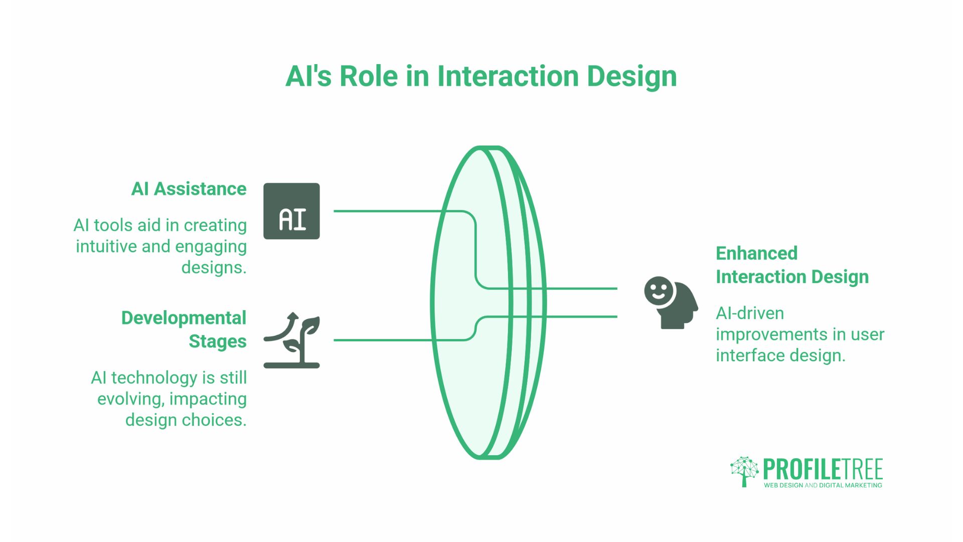
AI is beginning to change how interaction design decisions are made, though the technology is still developing.
The most practical current application is AI-assisted prototyping. Tools such as Figma AI and Framer can generate interaction states from a text description, reducing the time required to produce multiple prototype variations for testing. This does not remove the need for a designer to evaluate and refine the output, but it changes the starting point.
The more speculative development is predictive microinteractions: triggering a system-initiated response before the user completes an action, based on behavioural signals. A cursor moving towards a form submit button could trigger the button’s hover state a fraction of a second early. Dwell time on a product page could trigger a soft prompt. These patterns exist in limited commercial implementations but are not yet standard practice in web design.
ProfileTree’s [AI implementation work] for SMEs includes evaluating where AI-assisted tools deliver genuine value in design and development workflows, separate from where they introduce risk or inconsistency.
Five Questions to Ask Before Adding a Microinteraction
Before adding any animated or interactive feedback element to a website, these five questions help distinguish purposeful design from visual noise.
Does it confirm something the user needs confirmed? If the user already knows the action worked, the feedback is redundant.
Does it communicate faster than text? An animation that takes longer to parse than reading a word is slower, not faster.
Does it work without motion? If the interaction relies entirely on animation to convey meaning, it will fail for users with reduced-motion preferences or slow connections.
Does it work on all screen sizes? Hover states are irrelevant on touchscreens. Microinteractions designed only for desktop require a mobile-specific equivalent.
Is it consistent with every other interaction on the same site? A form that validates inline on one page and only on submission on another page creates a confusing mental model.
Common Microinteraction Mistakes
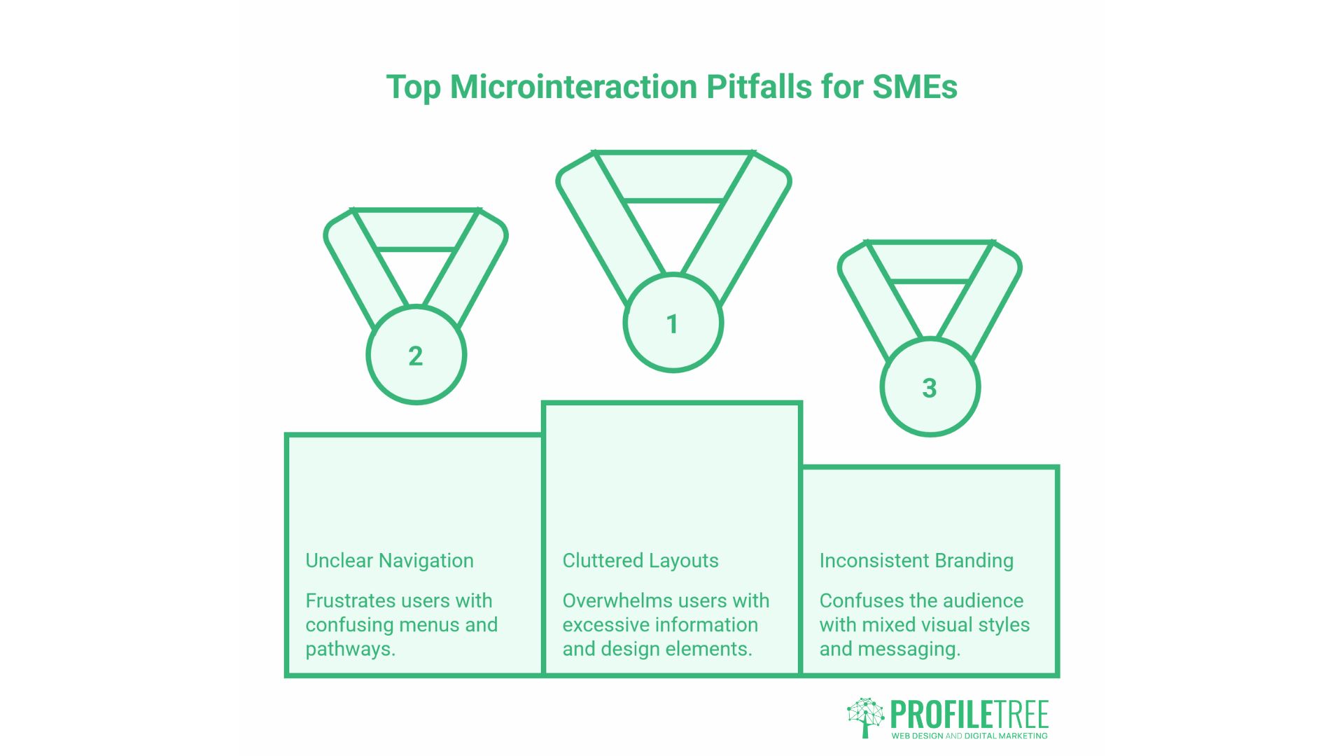
Even well-intentioned interaction design produces poor results when the execution misses in predictable ways. These are the most frequent mistakes seen in SME websites.
Animating without purpose
The most common mistake is adding motion because it looks polished, not because it solves a problem. A hero section where every element fades in on scroll, buttons that bounce on hover, and nav items that slide in from the left all add visual complexity without communicating anything useful. Motion that does not carry information is noise. Users habituate to it quickly, and it slows perceived performance on lower-powered devices and slower connections.
Every animated element should be testable against one question: what would the user misunderstand or miss without this motion?
Missing states
A design that covers the default and success states but not the loading, error, or disabled states is incomplete. These gaps tend to surface only in development or, worse, in production. A submit button with no loading state gets clicked multiple times. A form with no error state leaves users unsure whether their input was rejected or the page froze.
Desktop-only design
Hover is not available on touchscreens. Any microinteraction that relies on a hover trigger a tooltip that appears on hover, a button label that reveals on hover, a card that flips on hover — is invisible to mobile users. Given that mobile accounts for the majority of web traffic across most UK SME sectors, designing interaction states for desktop first and treating mobile as an edge case results in a broken experience for most visitors.
The correct approach is to design touch-first interaction states and then add hover enhancements for pointer devices, not the other way around.
Inconsistency across pages
A form that validates inline on the contact page, but only on submission on the quote request page, creates two different mental models on the same site. Users who complete the contact form first expect the same behaviour everywhere. When it differs, the inconsistency is treated as a bug, even if both implementations technically work.
Microinteraction patterns should be documented in a design system or interaction specification and applied consistently. Ad hoc decisions made page by page produce sites that feel patched together, regardless of how good each individual page looks.
Ignoring performance cost
CSS transitions are lightweight. JavaScript-driven animations, particularly those that trigger on scroll or involve DOM manipulation, carry a performance cost that compounds quickly. A page with twelve scroll-triggered animations, a parallax header, and a JavaScript-powered loading sequence may score poorly on Core Web Vitals, specifically Interaction to Next Paint (INP) and Cumulative Layout Shift (CLS), even if each individual effect looks fine in isolation.
Performance testing with realistic device and connection conditions, not just on a developer’s machine, should be part of any interaction design review. The guide to [interactive scrolling effects] covers the performance trade-offs for scroll-based interactions in more detail.
Conclusion
Microinteractions are a design discipline, not a finishing touch. The decisions made about feedback states, error handling, and motion design during a web project determine whether the finished site feels considered or cobbled together. For SMEs in Northern Ireland and across the UK, those details affect whether visitors trust the site enough to make an enquiry, complete a purchase, or return.
Getting the details right requires planning at the design stage, not as a retrofit after launch. If your current website lacks clear interaction states or accessibility-compliant motion handling, that is worth addressing. [Get in touch with ProfileTree] to discuss what a UX review or redesign project would involve.
FAQs
What is a microinteraction in simple terms?
A microinteraction is a small design event that responds to one user action — a button changing colour on click, a form field flagging an error as you type, a spinner showing a file is uploading. Each one handles a single moment and nothing more.
How do microinteractions improve UX?
They remove uncertainty. When a user sees immediate feedback after an action, they do not have to wonder whether it worked. This reduces errors, lowers abandonment on forms and checkouts, and makes the interface feel reliable.
What is the difference between a microinteraction and an animation?
Animation is the technique; microinteraction is the functional event. A button that animates on click is using animation as feedback. A looping background video is just decoration; it does not respond to user actions or communicate a state change.
Are microinteractions accessible?
They can be, if built correctly. Key requirements: support prefers-reduced-motion so users can disable animation, ensure keyboard users can trigger the same interactions as mouse users, and use ARIA attributes to communicate state changes to screen readers. Never rely on colour alone to convey meaning.