
How to Create an Infographic That Earns Links and Traffic
Table of Contents
Knowing how to create an infographic is mostly a content problem rather than a design one: settle on one controlling idea, verify your data, pick a format that matches the information, and sketch the layout on paper before you open a design tool. The software you build it in matters far less than that planning stage, which is where most infographics are won or lost.
This guide covers what an infographic actually is, which topics suit the format and which do not, the seven planning steps that come before design, how to decide between building it yourself and commissioning a designer, and how to distribute the finished piece so it earns links rather than a single day of social engagement. ProfileTree is a Belfast-based web design and digital marketing agency, and ProfileTree’s content marketing team produces visual content for SMEs across Northern Ireland, Ireland, and the UK.
A well-structured visual that simplifies a complex idea and carries your brand consistently can generate backlinks, shares, and search traffic for years. A poorly planned one, overstuffed with text, built on stock icons, and posted once to Instagram, does nothing at all.
What Is an Infographic?
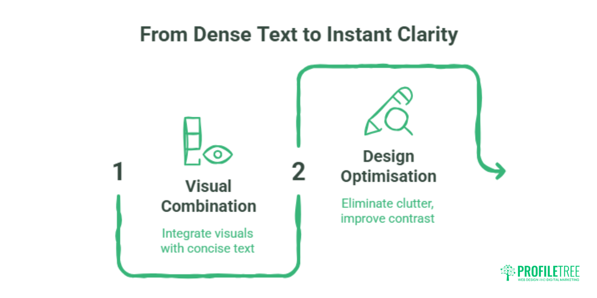
An infographic is a single visual asset that combines charts, icons, layout and short text to explain information faster than prose can. The defining feature is compression: a reader should grasp the main point in seconds, without reading a paragraph to get there.
The speed advantage is real but often overstated in marketing writing. Research led by Mary Potter at MIT, published in Attention, Perception, & Psychophysics, found that people could identify images shown for as little as 13 milliseconds, far quicker than the 100 milliseconds previously assumed. That tells you the brain extracts meaning from an image very fast. It does not tell you a reader will remember your quarterly figures better as a doughnut chart.
The practical version is simpler. Clutter, too many data points, weak colour contrast, or unclear hierarchy all cancel the benefit. Readers abandon a confusing infographic faster than they abandon a confusing paragraph, because instant clarity is the expectation the format sets.
When to Create an Infographic (and When Not To)
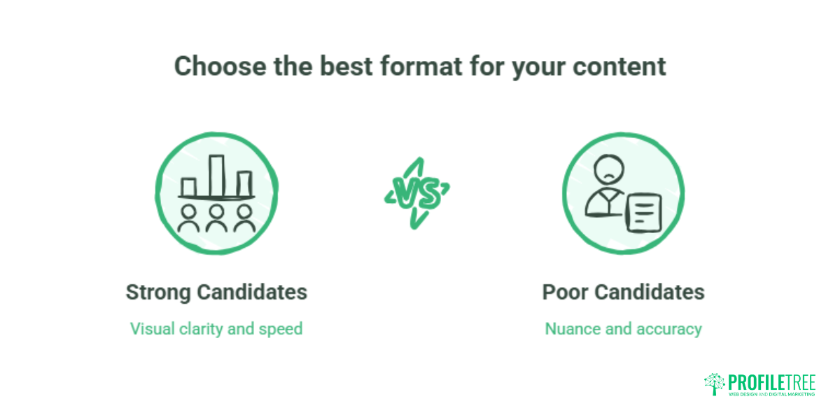
Not every topic suits the format. The subjects that work share one characteristic: the information is genuinely clearer as a visual than as text.
Strong candidates include statistical comparisons where bar charts or percentage breakdowns do more work than a sentence; process walkthroughs where order matters and each step connects to the next; side-by-side comparisons of features, options or approaches against clear criteria; timelines covering historical sequences, project schedules or regulatory changes; and relationship maps showing hierarchies or cause-and-effect chains that prose makes harder to follow.
Poor candidates are just as identifiable. Topics needing nuance and qualification suffer, because infographics flatten complexity and can mislead. Content with no visual hook produces a list with a logo on it. Dense regulatory or financial material, where accuracy matters more than speed, needs prose with proper attribution.
A useful test before briefing anything: can the core message be understood in ten seconds without reading the supporting text? If yes, the topic works. If not, an article or an explainer video will serve the reader better.
The Anatomy of an Effective Infographic
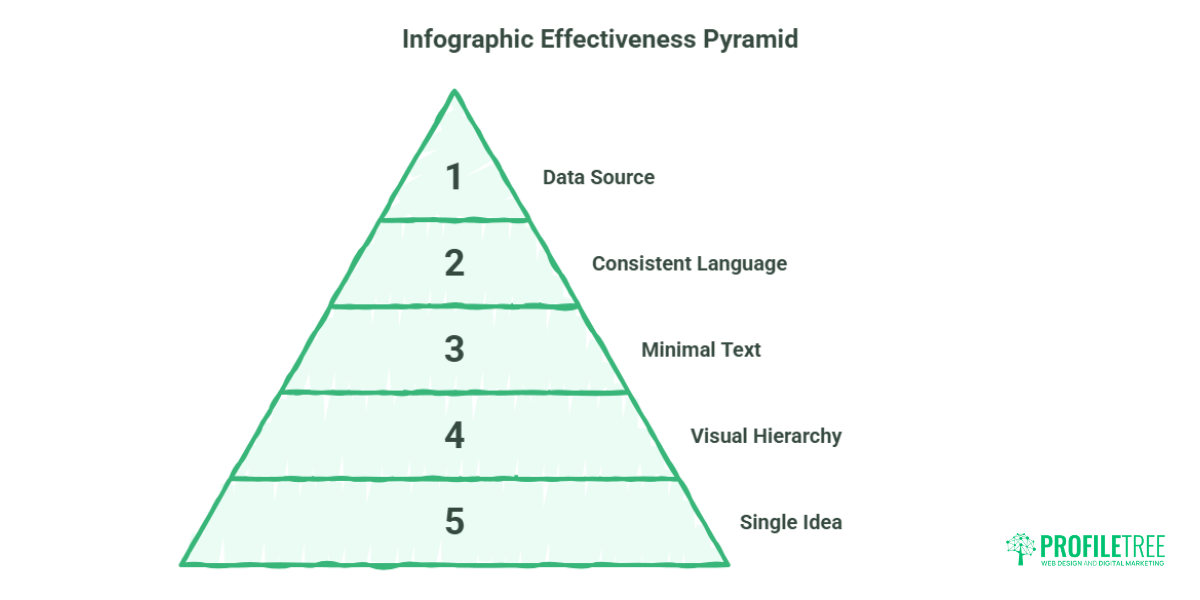
Five structural elements separate infographics that perform from those that sink.
A single controlling idea. Every element should support one main point. Infographics that try to communicate five ideas communicate none of them clearly. Decide the one thing a reader should take away before planning anything else.
A clear visual hierarchy. The reader’s eye needs to know where to start and where to go next. Size, colour weight and placement direct attention. The headline or key statistic should be the most prominent element on the canvas, with supporting points visibly subordinate to it.
Minimal text. Every word competes with the visual. Short labels, single-sentence callouts and concise headings work. Full paragraphs do not. If an explanation runs past two lines, it belongs in the surrounding blog copy rather than inside the graphic.
Consistent visual language. Colour, typography and icon style should be uniform throughout. Mixing design styles signals low production quality and undermines trust, which matters commercially for professional services firms.
A named data source. Any statistic or factual claim needs attribution. This protects the brand if a claim is challenged and signals to journalists and publishers that the content is reliable enough to embed.
How to Plan an Infographic
Planning before designing saves hours and produces better results. The sequence below applies whether you are briefing an agency or building it yourself in Canva.
Step 1: Define the objective. What should the reader understand, do, or feel differently about afterwards? Lead generation, brand awareness and link building each demand different content and different distribution.
Step 2: Identify the audience. A process infographic aimed at a marketing manager looks different from one aimed at a managing director. Vocabulary, data complexity and assumed knowledge all shift.
Step 3: Select the core message. Reduce the topic to a single controlling idea. Everything else serves it.
Step 4: Gather and verify your data. Only use sources you can name and link to. Infographics circulating with unverifiable statistics damage whoever published them. If credible data does not exist, drop the claim.
Step 5: Choose the infographic type. Match format to content: statistical, process, timeline, comparison, geographic or hierarchical. The wrong format forces data into a structure it was never suited to.
Step 6: Sketch the layout before opening a design tool. A rough wireframe on paper takes ten minutes and prevents an hour of repositioning elements later. Decide where the headline sits, where the data panels go, and where supporting text lives.
Step 7: Write the text transcript at the same time. Most teams do this afterwards, if at all. Drafting the written summary alongside the layout forces you to check that the visual actually says what you think it says, and it gives you the indexable copy the page will need anyway.
“The infographics that generate backlinks and genuine traffic are almost always the ones where the brief was clear before any design work started,” says Ciaran Connolly, founder of ProfileTree. “When the message is muddled in the planning stage, no amount of design skill rescues it.”
DIY vs Professional Design: How to Decide
This is the question most SME marketing teams skip, usually because they have already defaulted to one answer without examining it.
DIY tools such as Canva, Piktochart and Visme are the right call when the infographic is internal (team training, process documentation, meeting summaries), when the audience is existing customers who already trust the brand, when the data is simple, when speed matters more than polish, or when you have a strong template and clear brand guidelines to work within.
These tools have improved a great deal and produce serviceable results for straightforward content. The skill ceiling is real, though. Template-based design produces template-looking output, which carries less authority when the piece is meant to earn backlinks, appear in a publication, or represent the brand in a competitive context.
Professional design is worth commissioning when the infographic will be pitched to journalists or industry sites for embedding, when the data is complex or proprietary and its visual interpretation carries commercial weight, when the piece anchors a campaign with budget behind it, when brand consistency across the graphic and surrounding content is a priority, or when the subject needs custom illustration rather than icon libraries.
The financial case deserves honesty. A professionally designed infographic costs more upfront than a Canva template. One high-authority backlink from a relevant publication, earned because the design and data were credible enough to publish, can return SEO value over years rather than weeks. That trade only pays off if the distribution plan exists before the design brief does.
Infographic Types and When to Use Each
Choosing the right type is a content decision before it is a design decision.
| Type | Best For | Main Risk |
|---|---|---|
| Statistical | Survey results, market data, performance benchmarks | Cherry-picking figures to fit a pre-decided conclusion |
| Process | How-to content, service explanations, onboarding | Steps that are not genuinely sequential |
| Timeline | Project schedules, regulatory changes, brand histories | Uneven time intervals that distort the story |
| Comparison | Platform choices, pricing structures, feature breakdowns | Criteria chosen to favour one option |
| Geographic | Regional market analysis, service areas, local statistics | Map area read as data volume |
| Hierarchical | Organisational structures, decision trees, priority rankings | Complexity outgrowing the format |
Comparison infographics are one of the highest-performing formats for commercial investigation queries, where readers are weighing options before a purchase decision. Geographic infographics suit Northern Ireland and UK businesses well, since regional data points serve content marketing and local search at the same time. ProfileTree uses process infographics in digital training materials to explain multi-step workflows to business owners new to the concepts.
How to Use Infographics in Content Marketing
An infographic published once and forgotten is a poor return on the time invested. The value comes from distribution and repurposing.
Embed it within a blog post. An infographic sitting inside a relevant article increases time on page and gives the visual the context it needs to surface in image search. Surround it with keyword-rich copy and place the text transcript below it. Google cannot crawl text inside an image, so the surrounding content carries the search weight. Most guides skip this entirely.
Post it to LinkedIn as a document. LinkedIn retired the native organic carousel in 2023. What replaced it, and what people still call a carousel, is the document post: upload a multi-page PDF and each page renders as a swipeable card. It remains one of the strongest organic formats for B2B reach, because the swipe interaction increases dwell time. Design at 1080 x 1350 pixels (4:5) rather than the square 1080 x 1080 that older guides recommend, since the portrait ratio takes up more vertical space in a mobile feed. Export as PDF; PowerPoint and Word uploads lose fonts and alignment in conversion.
Atomise it across social. A single infographic becomes several assets: individual panels for Instagram or X, one summary statistic as a standalone post, a thumbnail for a related video. Treating the piece as a content system rather than a single deliverable multiplies its value without proportional extra cost, and it is the same logic behind the cross-promotion strategies that let one asset work across owned channels. Planning the panel breakdown before design is easier than retrofitting it afterwards, which is one reason social media strategy support tends to start at the content stage rather than the scheduling stage.
Use a cropped panel in email. A full-size infographic renders badly on mobile in most email clients. A cropped, high-contrast panel as the opening visual, linking to the full graphic on your site, performs better and drives traffic back to the page.
Pitch it to relevant publications. A well-designed infographic presenting original data or a genuinely useful visual summary can earn editorial placements and backlinks from industry sites. This is the highest-value outcome available and the clearest argument for custom design over templates. ProfileTree’s SEO services team builds infographic-led link building into outreach campaigns where visual content suits the sector.
Infographic SEO: What Most Guides Get Wrong
The standard advice, “add alt text”, is necessary and nowhere near sufficient.
Alt text should describe what the infographic shows, not restate the title. Around 120 characters covering the primary keyword and the key data point serves both accessibility and search. Screen readers rely on it, so accuracy matters beyond rankings.
File format and size. Save infographics as WebP. Google’s own figures put lossy WebP files 25 to 34 per cent smaller than comparable JPEGs at equivalent quality, and lossless WebP 26 per cent smaller than PNG. Large image files remain one of the most common causes of slow page loads, which affects both user experience and Core Web Vitals. Anything over 500KB for a standard infographic is too heavy.
Descriptive filename. Name the file something like infographic-content-marketing-strategy-uk.webp, not IMG_2847.jpg. Filenames are one signal Google uses in image indexing.
Text transcript. Place a written summary of the key data points below the image in the body copy. This is the most underused tactic for visual content. The text becomes indexable, supports the page’s keyword coverage, and makes the content available to anyone who cannot see the image, including AI systems that read the page rather than the graphic.
Structured data. For infographics in editorial contexts, ImageObject schema tells Google the image’s name, description and content URL, which improves the odds of appearing in image search and in AI answers that draw on visual content.
Animated Infographics and Motion Graphics
Static infographics communicate clearly. Animated ones, where data appears progressively, arrows move, or figures count up, hold attention longer.
Animation suits content where sequence or progression carries the meaning: a process unfolding in stages, a statistical trend growing over time, a comparison building to a conclusion. It also competes better in social feeds, where a moving image sits alongside video rather than losing to it.
The production threshold is higher. Animated infographics need motion graphics software, usually After Effects, or a design platform with animation features. The output is typically MP4 or GIF, which behaves differently to a static image in file size, accessibility and embedding options. For businesses already producing video, animated infographics fit naturally into existing production schedules rather than requiring a separate workflow.
Accessibility and UK Compliance
Accessibility is not optional for infographics aimed at public audiences in the UK and Ireland. WCAG 2.2, published by the W3C in October 2023 and approved as an international standard, ISO/IEC 40500:2025, in October 2025, is the current benchmark. UK public sector bodies are bound by it through the Public Sector Bodies (Websites and Mobile Applications) Accessibility Regulations 2018. Private businesses have no equivalent statutory duty, though the Equality Act 2010 requires reasonable adjustments, and Level AA is the practical yardstick. For companies trading into the Republic of Ireland, the European Accessibility Act adds a further layer.
The failures that show up most often in infographic design are predictable.
Colour contrast. Level AA requires at least 4.5:1 for normal text and 3:1 for large text. Light text on mid-tone backgrounds fails this constantly. Check ratios with a free contrast tool before publishing, not after.
Colour alone carrying meaning. Red and green to distinguish two data series fails for readers with colour blindness. Pair colour with pattern fills or direct labels so the distinction survives without colour perception.
Text size. Body copy inside an infographic should be no smaller than 12pt at standard display size. Labels shrinking below legibility to fit a layout need the layout rethinking, not the type shrinking further.
Alternative text and transcripts. A descriptive alt attribute and a written transcript below the image make the content available to screen reader users. This is a compliance requirement for public sector content and straightforward good practice everywhere else.
Measuring Infographic Performance
Most businesses publish an infographic, watch the first day of social engagement, and never look at it again. Measuring properly changes what you commission next.
Backlinks earned. Use Google Search Console or a backlink tool to track which sites link to the page hosting the infographic. This is the primary signal of whether the content was credible enough for others to reference. A strong data topic can keep earning links for years after publication.
Organic image traffic. The Search Console Performance report lets you filter by image search. Visibility there confirms the alt text, filename and surrounding copy are doing their job.
Time on page. An infographic embedded in a blog post should lift average time on page against text-only articles of similar length. If it does not, readers are scrolling past it.
Engagement quality. Shares and saves matter more than likes. A saved LinkedIn document or a pinned graphic keeps driving reach long after the post leaves the feed. Track referral sessions back to the page.
Lead attribution. Where the infographic sits behind a form as a downloadable asset, GA4 event tracking can attribute form completions to it, connecting content spend to pipeline rather than to impressions.
Where to Start
Pick one topic where the data is genuinely clearer as a picture, write the transcript and the controlling idea before you touch a design tool, and decide who you are pitching it to before you decide what it looks like. Build the first one yourself in Canva to test whether the topic holds up. If it earns attention, that is the piece worth commissioning properly and building an outreach campaign around.
FAQs
Why are infographics important in content marketing?
Infographics are read faster than text, which suits how people scan online, and they are one of the few formats that earn backlinks without outreach. A well-designed graphic presenting original data gets embedded by journalists and bloggers who found it useful. That unsolicited linking is valuable for search visibility, and appearing in third-party publications builds credibility that paid promotion cannot replicate.
Are infographics good for SEO?
Yes, but not automatically. An infographic with no surrounding text, weak alt text and a heavy file size slows the page down and contributes nothing indexable. Done properly, with a text transcript, an optimised file format, a descriptive filename and keyword-rich surrounding copy, it strengthens the page by increasing dwell time, earning links, and adding indexable content through the transcript.
How do I promote an infographic?
Start with the page hosting it: optimise the surrounding copy for your target keywords, add the transcript, and request indexing in Search Console. Then distribute across LinkedIn as a PDF document post, email as a cropped header panel linking back to the page, and any social channels your audience actually uses. For pieces built on original data, pitch directly to relevant journalists and industry publications as a visual resource they can embed.
How do I make an infographic for marketing?
Plan the message before opening any design tool. Define the single controlling idea, identify the audience, gather verified data, choose the type that matches the information, sketch the layout, and draft the text transcript. Then either build it in a tool like Canva using your brand colours and fonts, or brief a design team if the output needs to meet a professional publishing standard.
When should a small business commission a professional infographic design?
When the piece is intended to earn media coverage, third-party backlinks, or represent the brand in a formal commercial context. DIY tools handle internal content, social filler and simple process visuals for existing customers perfectly well. For content that has to compete with established publishers, survive editorial scrutiny, or carry custom illustration rather than icon library assets, professional design produces measurably better outcomes.
How much does an infographic cost in the UK?
Cost depends on data complexity, whether illustration is custom or icon-based, and how many panel variations you need for distribution. A single-panel graphic built from an existing template sits at the low end. A multi-panel piece with original illustration, data visualisation and a set of social crops costs considerably more, and is priced as a campaign asset rather than a graphic. Ask any supplier whether the quote includes the source file, social crops and a text transcript, because those three items are where quotes most often diverge.
How effective are infographics compared to text content?
They serve different purposes. Long-form text ranks better for complex informational queries and builds topical authority. Infographics earn backlinks more reliably than most text content, perform better in image search, and suit social formats such as LinkedIn document posts that articles cannot fill. The strongest content programmes run both: infographics as link-earning and social assets, long-form content as the foundation they sit inside.
Can infographics help with LinkedIn marketing?
Yes. Converting a multi-panel infographic into a PDF and uploading it as a LinkedIn document post is among the highest-reach organic formats available for B2B audiences. Design each page at 1080 x 1350 pixels for mobile, keep the first page as a strong cover since it doubles as the thumbnail, and aim for five to twelve pages. The swipe interaction increases dwell time, which LinkedIn rewards with wider distribution.
What’s the best file format for publishing an infographic online?
WebP for web pages, since lossy WebP files are 25 to 34 per cent smaller than comparable JPEGs at the same quality. For LinkedIn, export as a PDF with each panel on its own page. For email, JPEG still renders most consistently across clients. Always compress before uploading: a 2MB file slows the page and cancels out the search benefit the visual was meant to deliver.