Design for Different Generations: A Practical Guide
Table of Contents
Most digital products are built for an imaginary average user. In practice, your website, app, or platform is visited by people spanning five or six decades of lived experience, each with different expectations, different comfort levels with technology, and different physical needs. Getting design for different generations right isn’t a niche accessibility concern. This is the baseline for any digital product that wants to reach the broadest possible audience.
This guide covers the user experience principles that apply across every generational cohort, from Baby Boomers to Gen Alpha. Designing for different generations doesn’t mean building a separate interface for each age group. It means understanding how generational design choices affect accessibility, navigation, and trust, then applying those findings through a single age-inclusive framework that serves everyone.
The Generational Cohorts: Who Are You Designing For?
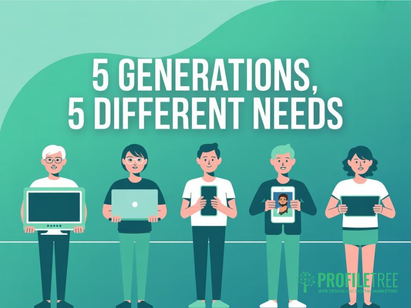
Before applying any generation design or generational design principle, it helps to understand who sits at each end of the age spectrum. Designing for different generations isn’t about stereotyping. It’s about recognising patterns in how people at different life stages interact with digital products, and using those patterns to make better user experience decisions.
| Generation | Birth Years | Primary Device | Core Design Need |
|---|---|---|---|
| Baby Boomers | 1946–1964 | Desktop, tablet | Clarity, large text, simple navigation |
| Generation X | 1965–1980 | Desktop and mobile | Efficiency, depth of content |
| Millennials | 1981–1996 | Mobile and desktop | Speed, personalisation, familiarity |
| Gen Z | 1997–2012 | Mobile-first | Authenticity, ethical UX, visual content |
| Gen Alpha | 2013–present | Tablet and mobile | Gamification, voice, privacy-aware |
Baby Boomers and the Silent Generation
Baby Boomers came of age before the internet and have adopted digital tools later in life. They’re often highly capable digital users, but they expect interfaces to be self-explanatory. When navigation is unclear or font sizes are too small, they’re more likely to abandon a task than seek out a workaround.
Generation X
Generation X sits between the pre-digital and post-digital worlds. They are comfortable on both desktop and mobile, they value efficiency above novelty, and they respond well to interfaces that offer depth without burying it behind unnecessary steps. They’re often the decision-makers in B2B contexts, which makes them a commercially valuable audience for many Northern Ireland and UK businesses.
Millennials
Millennials grew up alongside the internet and are generally at ease with complex digital environments. They expect seamless cross-device user experiences, respond well to personalisation, and they’ll leave quickly if a site is slow or feels outdated. They are now the largest segment of the workforce and a primary target for most consumer and professional digital products.
Gen Z
Gen Z (born 1997 to 2012) has never known a world without smartphones. Their user experience expectations are shaped by platforms like TikTok and Instagram: fast, visual, and unambiguous. Critically, Gen Z is also the most aware of dark patterns and manipulative UX. Interfaces that obscure unsubscribe options, manufacture urgency, or use deceptive toggles actively damage trust with this cohort. For Gen Z, ethical design is a baseline requirement, not a bonus. Designing for Gen Z means honest interfaces first.
Gen Alpha
Gen Alpha (born from 2013 onwards) is the first generation for whom tablet and voice interaction have always been the norm. They’re comfortable with gamified interfaces, they expect visual and audio-first content, and they’re growing up in a regulatory environment that places real weight on digital privacy. Products that will serve users over the next decade need to account for this cohort’s preferences now. Designing for different generations with a ten-year view means Gen Alpha can’t be an afterthought.
The UK and Ireland Context
Ofcom’s Connected Nations reports consistently show that UK smartphone adoption among the 55–64 age group has risen sharply. As of 2024, 79% of adults aged 55–64 owned a smartphone, up from 50% a decade earlier. This matters for generational design: assuming older users will only access your site via desktop is increasingly outdated. Mobile-first design is now the baseline for all age groups in the UK, not just younger cohorts.
Design Priorities by Generation
Each generation brings distinct preferences to digital interactions. The sections below outline the most commercially relevant generational design decisions for each cohort, with practical guidance on how to address them without building separate interfaces. The goal throughout is a user experience that works for everyone, with age-inclusive choices made at every stage.
Baby Boomers and Seniors: Accessibility as a Foundation
Designing for different age groups starts here. The user experience decisions you make for Baby Boomers and older users produce the widest-reaching improvements across all generations. The core priorities are readable typography, high colour contrast, clear navigation labels, and keyboard-accessible interactions.
The Web Content Accessibility Guidelines (WCAG 2.2) provide the technical baseline. The minimum body font size for web content is 16px, with headings and critical calls to action using larger sizes. Colour contrast ratios should meet the AA standard at a minimum (4.5:1 for normal text). These aren’t optional extras for UK-based organisations. They’re legal requirements under the Equality Act 2010, and they’re the foundation of any age-inclusive web design approach.
Navigation works best when labels are explicit rather than clever. Menu structures should be flat (no more than two levels), and forms should use real-time validation with clear error messages.
The cognitive load principle is especially relevant in generational design for older users. Reduce the number of decisions a user must make on any single screen. One primary action per page is the target, and multi-step processes should always show clear progress indicators.
Gen X and Millennials: Efficiency and Depth
Gen X and Millennials share a preference for efficiency but diverge on depth. In generational design terms, Gen X users typically want to find what they need quickly, and they’re willing to scan dense content once they’re confident they’re in the right place. Millennials want the same speed, but they expect the user experience to feel intuitive rather than effortful.
For both cohorts, mobile-first responsive design isn’t negotiable. Pages that require horizontal scrolling on mobile, use small tap targets, or load slowly because desktop assets haven’t been optimised for smaller screens will lose these users fast. Google’s Core Web Vitals (Largest Contentful Paint under 2.5 seconds, Cumulative Layout Shift below 0.1) are a reasonable technical benchmark for this audience.
Millennials in particular respond well to personalisation signals: content that acknowledges their context, remembers their preferences, and reduces the steps they need to take on a return visit. This can be as straightforward as remembering a user’s location for a service business, or surfacing the most relevant service first based on their browsing history.
Gen Z: Ethical Design and Visual Authenticity
Designing for Gen Z requires honesty. This generation has grown up surrounded by advertising, and they’ve developed a strong instinct for detecting when an interface is built to manipulate rather than assist. Dark patterns (deceptive unsubscribe flows, pre-ticked opt-ins, countdown timers that reset) aren’t just ineffective with Gen Z; they actively damage brand trust. Age-inclusive design for this cohort means building interfaces where the user’s interests are always visible.
Visually, Gen Z expects content that feels authentic rather than polished to the point of artificiality. The aesthetic of the platforms they use daily is deliberately less perfect: candid photography, direct-to-camera video, and real people rather than stock imagery. Applying this generational design insight to web development means favouring original photography and real testimonials over generic hero images, and using a design language that prioritises clarity over decoration.
When designing for Gen Z in most consumer contexts, mobile-first isn’t enough. Bottom navigation is more ergonomic than top hamburger menus for single-handed mobile use, a user experience decision that’s now well-established across major consumer apps. In professional contexts, Gen Z users are comfortable switching to desktop, but the mobile experience will always be their first impression when designing for different consumer generations.
Gen Alpha: The Emerging Frontier
Gen Alpha is only beginning to emerge as a consumer audience, but businesses with a ten-year view need to account for this cohort in their generational design decisions. The most notable characteristics to design for are an expectation of gamification, comfort with voice and touch-first interaction, and a heightened sensitivity to data privacy.
Gamification in a user experience context doesn’t mean games. It means progress indicators, reward signals, and an interface that communicates what’s happening at every step. These patterns benefit every age group but are particularly important for retaining Gen Alpha’s attention in learning contexts.
At ProfileTree, a Belfast-based digital agency, we’ve worked with businesses across Northern Ireland, Ireland, and the UK on web projects that serve audiences from senior citizens to school-age users. The consistent result across those 1,000+ projects is that the generational design decisions that work best for older users almost always improve the user experience for younger users too.
The Universal Design Framework: One Interface for All Ages
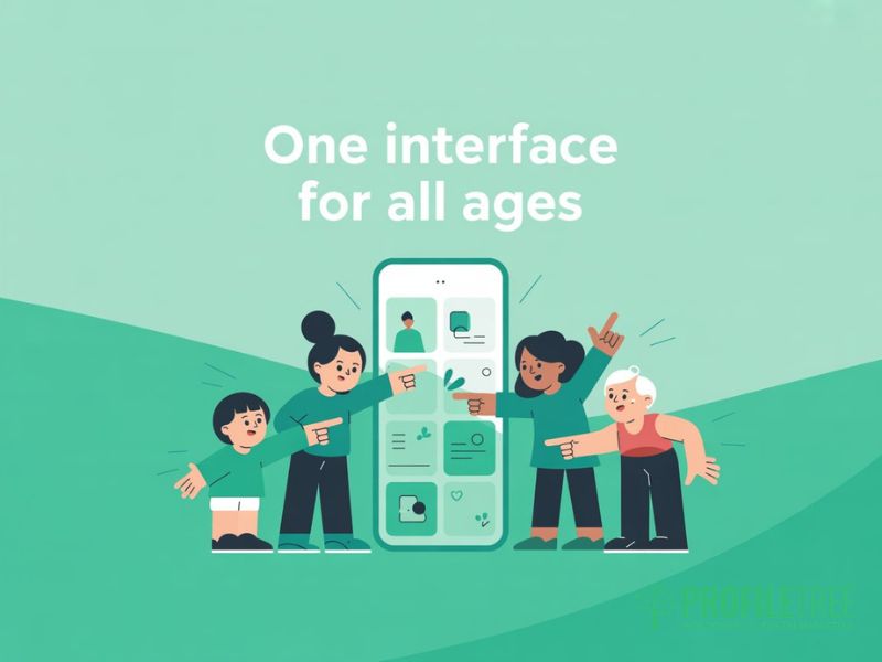
The case for Universal Design in generational design is both practical and strategic. Building separate interfaces for different age groups is expensive, difficult to maintain, and almost always unnecessary. The principles that make a user experience work for a 70-year-old (clarity, speed, predictability, and visible affordances) are the same principles that make it work for a 20-year-old in a hurry. Design for different generations, and you design well for everyone.
The Age-Inclusive Design Checklist for Web Teams
These are the user experience decisions that make the biggest difference in generation design, applied in the right order when designing for different age groups.
- Typography: minimum 16px body text, scalable without layout breakage, high contrast against all background colours.
- Navigation: maximum two levels, explicit labels, keyboard-accessible, consistent placement across every page.
- Tap targets: minimum 44x44px for all interactive elements on mobile. This is Apple’s Human Interface Guideline standard, and it works for users of all ages.
- Colour: never rely on colour alone to communicate a state. Use icons, labels, or patterns alongside colour.
- Forms: inline validation with specific error messages, clear labels above every field, and no placeholder text as a substitute for labels.
- Loading speed: Core Web Vitals targets as a baseline for all users, not just mobile.
- Content structure: Bottom Line Up Front. The most important information is at the top of every section, with supporting details below.
Bridging the Desktop-Mobile Divide
Responsive design is the technical solution, but it doesn’t by itself guarantee a good user experience across different generations. The generational design decisions that matter most are layout hierarchy (is the most important action still prominent on a small screen?), image handling (do images add meaning or just slow the page down?), and touch-target sizing (are interactive elements large enough for users with limited dexterity?).
ProfileTree’s web design services approach every project with a mobile-first audit before any visual design decisions are made. This means the constraints of the smallest screen define the information architecture, and enhancements are layered on top for larger displays, rather than the reverse, which produces mobile experiences that feel like shrunken desktop sites. It’s a generational design principle that benefits every age group from the outset.
Personalisation Without Complexity
Personalisation is often positioned as a technology problem, but much of it is a user experience problem. Designing for different generations doesn’t require personalisation engines for most small and medium businesses. It requires a clear information hierarchy so each type of user can quickly find what they need, and content that speaks to different age groups without excluding others.
Where technology-led personalisation is appropriate (surfacing relevant services based on a user’s industry, for example), ProfileTree’s digital strategy team can advise on proportionate solutions. The most effective personalisation for most SMEs is good information architecture: putting the right content in front of the right user through thoughtful navigation and page structure.
Incorporating Video and Multimedia
Intergenerational design decisions are especially visible in video. Video works across all age groups, though how it’s consumed varies. Baby Boomers and Gen X tend to watch longer-form content on larger screens and appreciate closed captions. Millennials watch on mobile with sound off for the first few seconds, so captions and a strong opening visual are essential. Gen Z and Gen Alpha are native short-form video consumers, but they’ll watch longer content if it delivers genuine value quickly. Understanding these generational design differences determines how you structure and present video content.
Video should never autoplay with sound, should always include captions, and should be optimised for both mobile and desktop viewing. Hosting on YouTube or Vimeo keeps page load times manageable and provides built-in accessibility controls.
What Good Intergenerational Design Looks Like in Practice
The best real-world illustration of Universal Design working well is the GOV.UK design system. It serves users ranging from school-age children to pensioners accessing pension records, through a single design language built on explicit typography, high contrast, clear labels, and navigation a first-time visitor can use without any instructions. The age-inclusive user experience it produces comes from designing for the most demanding users at both ends of the age spectrum.
For commercial websites, the equivalent is a site that doesn’t require a user to already know what they’re looking for. Clear service descriptions, a navigation structure that reflects user intent rather than internal business structure, and calls to action that say exactly what will happen when you click them. These are the hallmarks of design for different generations done well.
For businesses looking to improve their digital marketing reach across all age groups, ProfileTree’s search engine optimisation services combine technical SEO with digital marketing content strategy to attract the right audience.
Where to Start
Effective design for different generations starts with honest usability testing across the age groups you actually serve. If your analytics show a sizeable proportion of users over 50, test with that group explicitly. If you’re building for a younger audience, involve real users in reviewing your information architecture before you invest in visual design.
Designing for different age groups throughout the build is far less costly than retrofitting accessibility after launch. ProfileTree’s web design team works with SMEs across Northern Ireland, Ireland, and the UK to build age-inclusive digital products that perform well for every visitor, regardless of generation.
FAQs
1. What does design for different generations mean?
Design for different generations means making deliberate user experience decisions that account for the different expectations, digital literacy levels, and physical needs of each age group. Rather than building separate interfaces, the goal is a single age-inclusive design that works well for Baby Boomers through to Gen Alpha. The generational design choices that benefit older users (clarity, larger text, simple navigation) almost always improve the experience for younger users too.
2. What are the design preferences of different generations?
Baby Boomers prioritise clarity, large, readable text, and simple navigation. Gen X values efficiency and depth of content. Millennials expect fast, cross-device user experiences with personalisation signals. Gen Z demands ethical, authentic design with no manipulative UX patterns. Gen Alpha is growing up with gamified, voice-first interfaces and strong privacy awareness. Designing for different age groups means acknowledging these differences without treating any cohort as a monolith.
3. Does age affect user experience design?
Yes, primarily through three factors: cognitive load, motor skills, and digital literacy. Older users benefit from reduced cognitive load per screen, larger tap targets, and explicit navigation labels. Younger users are more tolerant of complex interactions, but they’re quicker to leave experiences that feel inauthentic or manipulative. Designing for different generations within the constraints of the widest age range produces better user experience outcomes for all users, not just the target cohort.
4. What is age-inclusive design?
Age-inclusive design (also called intergenerational design or Universal Design) is a design philosophy that creates digital products usable by everyone without requiring adaptation or a specialised separate version. Rather than building a senior mode or a youth interface, age-inclusive generational design establishes a single baseline that meets the needs of the most demanding users at both ends of the age spectrum. Research consistently shows that what works for a 75-year-old first-time user also works better for a 25-year-old in a hurry. Designing for different age groups through this lens produces commercially stronger products.
5. How do you design a website for multiple generations?
Start with the Universal Design checklist: 16px minimum body text, flat navigation (no more than two levels), 44x44px minimum tap targets, high colour contrast, and inline form validation. Then audit your mobile user experience before your desktop layout, because mobile-first decisions determine how every generation encounters your content. Run usability testing with real users from at least two age groups. Designing for different generations doesn’t require separate builds. It requires designing for the constraints of your least tech-confident user and layering progressive enhancements on top for more experienced users.