Best Practices & Examples for Responsive Websites
Table of Contents
Responsive websites are no longer a mark of a polished build — they are the baseline expectation for any business that wants to be taken seriously online. If a site shifts, overflows, or forces a visitor to zoom on their phone, they leave. It is that simple.
With more than 60% of global web traffic now coming from mobile devices, the question is not whether your website needs to be responsive. It is whether the one you have actually is, and whether it holds up under the conditions your real customers use it in, not just the devices you tested it on.
This guide covers what makes a fully responsive website, how it differs from adaptive and mobile-friendly alternatives, what it costs to build one, and the practical checks that confirm it works across every screen your visitors use.
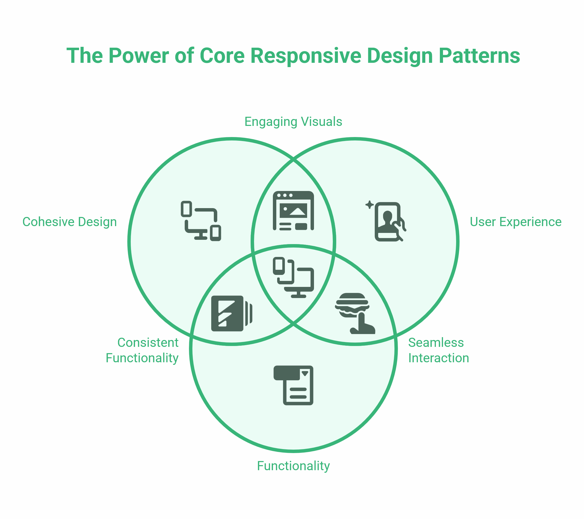
What Is Responsive Web Design?
Responsive web design is a development approach in which a website’s layout, images, and text automatically adjust to the device’s screen size. The same HTML content is served to every visitor; CSS handles how it is displayed.
The concept was formalised by Ethan Marcotte in 2010, and it has been the standard approach for professional web builds ever since. Before responsive design, developers often maintained separate desktop and mobile versions of a site—a resource-intensive approach that created inconsistencies and doubled the maintenance workload.
A fully responsive website has three defining characteristics. The layout uses proportional columns rather than fixed pixel widths, so elements resize relative to the screen. Images scale within their containers rather than overflowing them. And CSS media queries apply different style rules at defined screen widths, known as breakpoints, so a three-column layout on desktop might become a single column on mobile.
The result is one codebase, one URL structure, and one piece of content that works for every visitor, regardless of device.
Responsive vs Adaptive vs Mobile-Friendly: Key Differences
These three terms are often used interchangeably, but they describe different technical approaches with different implications for budget, flexibility, and long-term maintenance.
Responsive design uses fluid grids and media queries; the layout scales continuously to any screen size. Development costs are medium to high, but ongoing maintenance is low because a single codebase covers all devices. It is the right choice for most SMEs.
Adaptive design uses predefined layouts built for specific breakpoints — the server detects the device type and serves one of several fixed layouts. It costs more to build, takes longer to maintain, and creates gaps when new popular screen sizes emerge between the predefined breakpoints.
Mobile-friendly is the lowest tier. It typically means basic adjustments to ensure content is readable on a phone — often removing features rather than redesigning for mobile. It rarely meets modern Google standards and often results in a poor experience on mid-range devices.
For most businesses in Northern Ireland and the UK, a fully responsive build is the practical and cost-effective standard. The comparison table below summarises the key differences:
Approach / How It Works / Development Cost / Flexibility / Best For
Responsive — Fluid grids and media queries; layout scales continuously — Medium–High — High; works on any screen size, including future devices — Most websites, especially SMEs
Adaptive — Predefined layouts for specific breakpoints; server detects device — High — Lower; gaps between breakpoints cause issues — Complex applications needing device-specific behaviour
Mobile-Friendly — Basic adjustments for readability; features may be removed — Low — Low — Minimal budgets; not recommended for commercial sites
Why Responsive Design Matters for UK Businesses
A website that breaks on mobile is not a minor inconvenience — it is a commercial liability. UK consumers browse, research, and make purchasing decisions on their phones. If your site loads slowly, forces users to zoom, or serves a layout never designed for a small screen, most visitors will leave before reading a word.
Mobile-First Indexing and Core Web Vitals
Google has used mobile-first indexing since 2021, meaning it crawls and ranks your site based on its mobile version, not its desktop version. If your mobile layout is broken, missing content, or slow to load, that is what Google evaluates for ranking purposes — regardless of how polished the desktop version looks.
Two Core Web Vitals metrics are especially sensitive to responsive design decisions.
Cumulative Layout Shift (CLS) measures visual stability — how much page elements move unexpectedly as the page loads. Unoptimised images without declared dimensions are the most common cause of poor CLS scores on mobile. A responsive site built with properly sized, WebP-format images with explicit width and height attributes avoids this.
Interaction to Next Paint (INP), which replaced First Input Delay as a Core Web Vital in March 2024, measures how quickly a page responds to user input. Heavy JavaScript that blocks rendering — common on sites retrofitted for mobile rather than built responsively from the start — causes high INP scores and lower rankings.
A properly built responsive website avoids these problems by design, rather than requiring ongoing technical remediation.
WCAG 2.2 and UK Accessibility Requirements
The Web Content Accessibility Guidelines 2.2, published in October 2023, set the current standard for digital accessibility. In the UK, public sector websites are legally required to meet WCAG 2.1 AA under the Public Sector Bodies Accessibility Regulations 2018. Private sector businesses face increasing pressure through the Equality Act 2010, which requires reasonable adjustments for disabled users.
Responsive design is directly relevant to several WCAG 2.2 success criteria. Criterion 1.4.10 (Reflow) requires content to be readable without horizontal scrolling at 400% zoom or a viewport width of 320 CSS pixels — which essentially mandates fluid layout behaviour. Criterion 2.5.8, introduced in WCAG 2.2, requires interactive elements to have a minimum tap target size of 24×24 CSS pixels, with 44x44px recommended for comfortable use.
A site that forces mobile users to zoom or struggle with small buttons is likely failing multiple accessibility requirements, not just delivering a poor experience.
Conversion Rates and User Behaviour
Cart abandonment on mobile typically runs 10–15 percentage points higher than on desktop, according to research from the Baymard Institute. The primary causes are usability failures: small touch targets, forms that are difficult to complete on a phone, and checkout processes that break on smaller screens.
For service businesses in Northern Ireland, where many leads come through contact forms and enquiries, a responsive layout that works cleanly on mobile devices is not a cosmetic upgrade. It directly affects how many enquiries your site generates.
How a Responsive Website Works
The technical principles behind responsive design are straightforward, even if the implementation requires skill. Three components do most of the work: CSS media queries that apply different styles at different screen widths, fluid grids that scale layout proportionally rather than breaking at fixed pixel values, and responsive images that load at the right size and format for the device receiving them.
CSS Media Queries and Breakpoints
Media queries are the core mechanism of responsive design. They allow CSS to apply different style rules based on conditions—most commonly, the viewport width. A typical set of breakpoints covers four ranges: mobile (under 768px), tablet (768px to 1024px), desktop (1024px to 1280px), and large desktop (above 1280px).
A basic media query tells the browser to stack elements vertically when the viewport is narrower than 768 pixels. In practice, modern responsive builds apply multiple breakpoints to typography, spacing, navigation, images, and layout containers, giving designers precise control over how each element behaves at each screen width.
Fluid Grids and Flexible Layouts
Fixed pixel widths cause overflow problems on smaller screens. Fluid grids use percentage-based widths instead, so a column that is 33% of the page on desktop remains proportionate as the screen narrows. CSS Grid and Flexbox — both widely supported in all modern browsers — are the primary tools for building fluid layouts.
A three-column desktop grid collapses to a single column on mobile by applying a media query that overrides the column count. This is a more scalable approach than writing separate layout files for each device type, and it means a new screen size released three years from now will be handled correctly without any code changes.
Responsive Images
Images are the largest contributors to page weight and the most common cause of layout shift on mobile. Best practices for responsive images in 2026 include using WebP or AVIF formats, which are 25–35% smaller than JPEG at equivalent quality; using the HTML srcset attribute to serve different image sizes based on the device’s viewport width; and declaring explicit width and height attributes on all images so the browser reserves the correct space before the image loads.
For businesses on WordPress — which powers approximately 43% of all websites — most modern themes handle responsive images automatically. The risk area is legacy image files uploaded before responsive optimisation was in place, which require auditing and re-exporting in the correct format and dimensions.
Responsive Website Examples: What Good Looks Like
Rather than citing third-party brand case studies, the most transferable examples are the patterns that distinguish a well-built, responsive site from a patchwork site.
Navigation
On a desktop, a horizontal navigation bar with dropdown menus works well. On mobile, the same navigation should collapse into a clearly accessible alternative. Common failures include navigation that stays horizontal and forces horizontal scrolling, dropdown menus that are impossible to trigger on touch devices, and menus that overlap content when opened. A well-built responsive navigation handles all three scenarios without the user noticing any difference.
Typography
Body text should be a minimum of 16px on mobile. Line length — the number of characters per line — should stay between 50 and 75 characters for comfortable reading. Heading sizes should scale proportionally; a 48px H1 on desktop typically reduces to 28–32px on mobile. Typography that is not set responsively often produces either text that is too small to read without zooming, or text that breaks across lines awkwardly at mid-range viewport widths.
Forms and CTAs
Contact forms and call-to-action buttons are where many responsive builds fail commercially. Input fields should expand to full width on mobile. Labels should appear above fields, not inline, to avoid overlap on narrow screens. Buttons should meet the WCAG 2.2 minimum tap target of 44x44px and use high-contrast colours. A form that works perfectly on desktop but collapses into an unusable stack on a 375px-wide screen is one of the most common reasons SME websites lose mobile enquiries.
E-commerce Product Pages
Product images need to stack cleanly above product information on mobile, with a single prominent add-to-cart button visible without scrolling. Thumbnail galleries that use hover states on desktop need a swipe or tap interaction on mobile. Size and variant selectors need to be large enough to tap accurately without zooming.
ProfileTree’s web design team builds responsive layouts for SMEs across Northern Ireland, Ireland, and the UK, with particular attention to the conversion points — navigation, forms, and CTAs — that most commonly break on mobile.
How Much Does a Responsive Website Cost?
This is the question most guides deliberately avoid, because the platforms dominating the responsive websites search results — Wix, Webflow, Squarespace — want you to subscribe to their tools rather than understand the full market.
Here is a realistic breakdown for UK and Northern Ireland businesses in 2026.
DIY website builder (Wix, Squarespace) — £0–£30 per month — Template-based; responsive within the template’s constraints — Best for very early-stage businesses with minimal budget and simple requirements.
WordPress with a premium theme — £500–£2,000 one-off — Theme handles responsiveness; some customisation may require a developer — Best for small businesses needing a professional result on a limited budget.
Bespoke WordPress build (agency) — £3,000–£10,000 — Fully custom responsive layouts built to your specification — Best for SMEs needing custom functionality, strong SEO, or specific integrations.
Custom web application — £10,000–£50,000 and above — Responsive built into the design system from the outset — Best for e-commerce at scale, SaaS platforms, or complex portals.
The cost gap between a template site and a bespoke agency build reflects more than aesthetics. A bespoke build includes responsive design decisions made specifically for your content, your audience, and your conversion goals. Template sites apply a pre-built responsive logic that may not suit your layout needs — particularly for service businesses with complex navigation or e-commerce sites with large catalogues.
For most SMEs in Northern Ireland, the practical question is whether a well-configured WordPress build covers the requirements, or whether custom functionality — booking systems, configurators, API integrations — justifies a higher investment. That conversation is worth having before committing to a brief.
Pre-Launch Responsive Testing Checklist
Before a responsive website goes live, verify each of the following on real devices, not only browser emulators.
Layout: Three-column desktop layout collapses correctly at tablet and mobile breakpoints. No horizontal scrolling at any breakpoint. Images do not overflow their containers. Navigation collapses and functions correctly on touch.
Typography: Body text is a minimum of 16px on mobile. Heading sizes scale proportionally. Line length stays within 50–75 characters at all breakpoints. Text does not overlap images or UI elements.
Interactivity: All buttons and links meet the minimum tap target size of 44x44px. Forms are fully usable on mobile — fields expand, labels are visible, and the submit button is reachable without scrolling. Dropdown menus trigger correctly on touch. No hover-dependent interactions without a touch fallback.
Performance: Images are in WebP format with explicit width and height attributes. Core Web Vitals (CLS, INP, LCP) pass in Google PageSpeed Insights on mobile. No render-blocking scripts above the fold.
Accessibility: Passes WCAG 2.2 Criterion 1.4.10 (Reflow) at 400% zoom. Colour contrast meets AA standard — 4.5:1 ratio for body text. Focus states are visible on all interactive elements.
Useful testing tools: Google Mobile-Friendly Test at search.google.com/test/mobile-friendly; Google PageSpeed Insights at pagespeed.web.dev; BrowserStack or a real device lab for cross-device validation; Chrome DevTools responsive mode for initial breakpoint checks.
Conclusion
Your website is often the first interaction a potential customer has with your business. If that interaction happens on a phone — and the odds are good that it will — a layout that shifts, overflows, or forces the user to zoom sends them elsewhere before you have had a chance to make a case for your services.
Responsive design is not a feature to add later. It is the foundation of a professional website. Get it right from the start, and it supports everything else: your SEO, your accessibility compliance, your conversion rate, and your credibility with every visitor, regardless of the device they are using.
FAQs
What is a responsive website?
A responsive website automatically adjusts its layout, images, and content to fit any screen size. It uses CSS media queries and fluid grids to serve the right layout to every visitor without maintaining separate mobile and desktop versions.
How do I know if my website is responsive?
Drag your desktop browser window progressively narrower. A responsive site reflows continuously without content overflowing. You can also use Google’s Mobile-Friendly Test at search.google.com/test/mobile-friendly.
What is the difference between responsive and adaptive web design?
Responsive design uses fluid grids that scale continuously to any screen width. Adaptive design serves one of several fixed layouts based on the detected device. Responsive is more flexible and less expensive to maintain.
Is WordPress good for responsive websites?
Yes, provided the theme and any custom development are built responsively. Modern WordPress themes are responsive by default. The risk area is older themes, heavily customised page builder layouts, and plugins that inject non-responsive elements.
What is a responsive web design framework?
A pre-built CSS system providing a grid structure, breakpoints, and utility classes to speed up development. Bootstrap and Tailwind CSS are the most widely used. Custom builds without a framework can achieve better performance by avoiding unused CSS.