The Challenge Training Providers Face Online
Training organisations across Northern Ireland often come to us with the same core problem: a website that was built to display information rather than generate action. Content is scattered across pages, course listings are hard to filter, and mobile users have a poor experience. When a potential learner lands on the site, they cannot quickly answer the question, “Is there a course here for me?”
This is a problem that goes beyond aesthetics. A poorly structured training website loses enquiries to competitors even when the courses themselves are stronger. Employers sourcing apprenticeship partners or CPD providers will judge the organisation’s professionalism by what they find online. Funders and accreditation bodies look for clear, credible information that reflects the standards they expect.
From working with training organisations across Northern Ireland, the challenges we see most often are consistent:
- course information that is difficult to navigate,
- no filtering by sector or qualification level,
- a mobile experience that undermines trust, and
- registration pathways that place unnecessary friction between a motivated learner and their next step.
About People 1st: The Project
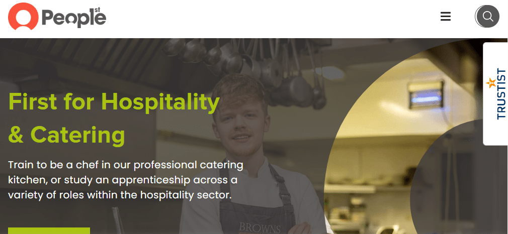
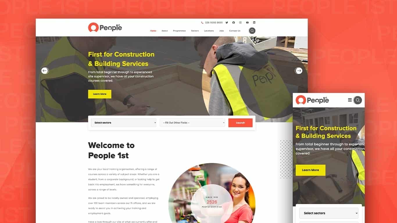
People 1st is a specialist professional and vocational training provider based in Northern Ireland. Their portfolio spans apprenticeships, employability programmes, and industry-specific qualifications across sectors including construction, hospitality, and social care.
The breadth of their offering created the central design problem. With dozens of courses across multiple sectors and audience types (school leavers, career changers, employed adults seeking qualifications) the website needed to do more than list what was available. It had to guide different users to the right pathway quickly.
Before approaching ProfileTree, People 1st were managing course information through disconnected processes. Content updates were slow and inconsistent, and the existing site did not reflect the organisation’s reach or reputation.
What We Did: The Web Design Approach
ProfileTree delivered a full website redesign on WordPress, structured around the user journey rather than the internal organisation of People 1st’s services. Every design decision followed from a user-first mapping exercise conducted at the start of the project.
Structure and Navigation
The first priority was information architecture. We mapped the full range of courses and programmes, then built a category structure that made sense from the learner’s perspective rather than from an administrative one. Sectors were clearly delineated, and users could navigate between them without losing context.
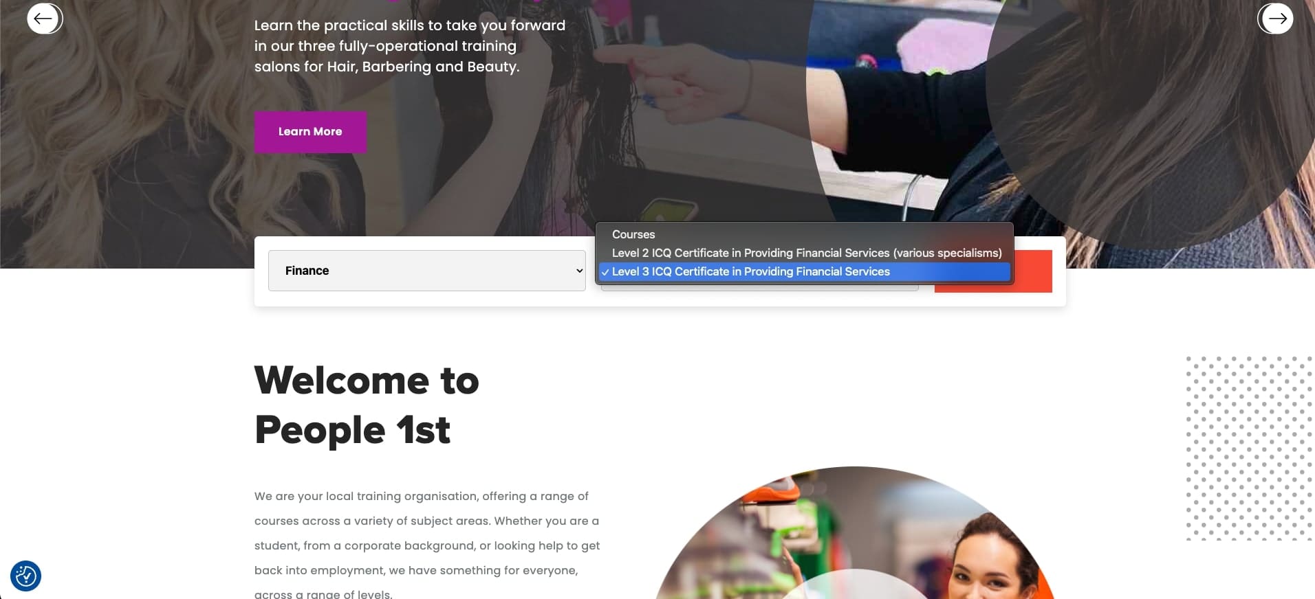
We introduced a course search and filter function so that visitors could narrow results by sector, qualification level, or delivery type. This reduced the number of steps between arrival and finding a relevant course.
Registration and Conversion
A streamlined registration pathway was built directly into the course pages. Rather than directing users to a separate contact form or asking them to call, the new design placed clear calls to action at the point of decision, immediately after course details and eligibility information.
This is a change that directly affects lead generation. When the next step is obvious and close to the information that prompted it, more users take it.
Mobile Responsiveness
A significant proportion of learners, particularly those exploring apprenticeships or retraining options, browse on mobile. The rebuilt site was fully responsive, with course listings, navigation, and registration forms all tested across device types. Text remained readable, buttons were accessible, and no key content was hidden or truncated on smaller screens.
Scalability
People 1st’s course offering changes as funding priorities, sector demand, and accreditation partnerships evolve. The WordPress build was structured so that new courses, sectors, or programme types can be added without requiring developer involvement for routine updates. The content management system was set up to allow the People 1st team to manage their own content going forward.
Results
The redesigned website gave People 1st a platform that accurately reflected their scale and professionalism. Course discovery improved significantly through the new filter and search functionality. The mobile experience was rebuilt from the ground up, removing barriers that had previously prevented on-the-go users from completing enquiries.
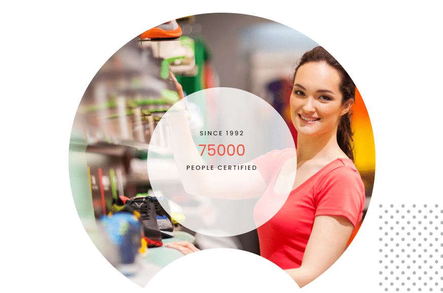
The organisation now has a CMS they can manage independently, reducing the delay between course information changing internally and that change appearing on the website. Since 1992, People 1st have certified over 75,000 people; the website now reflects that credibility in a way the previous version did not.
How ProfileTree Approaches Web Design for Training Providers
A training website is not a standard brochure site with a courses page added. It requires careful attention to the relationship between information volume and usability. The more courses an organisation offers, the more important the navigation and filtering structure becomes — and the easier it is for a poorly structured site to overwhelm and lose visitors.
ProfileTree’s approach starts with the learner journey, not the sitemap. We identify the three or four distinct user types a training provider serves, map the questions each type needs answered, and build the information architecture around those journeys. Design decisions follow from that structure rather than driving it.
For training providers in Northern Ireland, there is an additional consideration around credibility signals. Accreditation logos, sector body affiliations, and employer partnership references all contribute to the trust a potential learner or employer needs before making contact. These need prominent placement, not a footer mention.
If your training website is not generating enquiries at the rate your course quality warrants, the issue is usually structural rather than aesthetic. Our web design services for Northern Ireland businesses are built around outcomes, not just appearances.
“Training providers often underestimate how much a confusing website is costing them in missed enquiries. When a learner or employer can’t quickly find what they need and trust what they see, they move on. The fix is rarely about making the site look better; it’s about making it work better,” says Ciaran Connolly, founder of ProfileTree.
FAQs About Web Design for Training Providers
What should a training provider’s website include to generate enquiries?
Clear course listings with filtering by sector or level, visible accreditation and quality marks, straightforward registration or contact pathways on course pages, and a mobile-first design. Employers and funders also look for evidence of delivery track record and sector coverage.
How long does a training website redesign typically take?
For a provider with a large course catalogue, most redesign projects run between eight and sixteen weeks. The timeline depends on the volume of course content to be migrated or rewritten, integration requirements such as a learning management system, and how quickly the client can supply assets and approvals.
Do training providers need a separate LMS or can the website handle course delivery?
It depends on the delivery model. If courses are fully face-to-face or blended with external platforms, a well-structured WordPress site handles course information and enquiry management without a dedicated LMS. Providers delivering online learning directly through their site will need LMS integration.
Why is mobile responsiveness particularly important for training websites?
Learners exploring retraining options, apprenticeships, or part-time qualifications frequently browse on mobile outside working hours. If the site experience is poor on a phone (slow to load, difficult to navigate, or with forms that are hard to complete), those users leave before making contact.
Can ProfileTree help if our existing website just needs improvements rather than a full rebuild?
Yes. We carry out website audits for training providers that identify the specific changes with the most impact on enquiry rates and user experience. In some cases, targeted improvements to navigation, course pages, and conversion pathways deliver strong results without a full redesign.
Does ProfileTree work with training providers outside Belfast?
Yes. People 1st operates across Northern Ireland, and we work with training organisations across the region and further afield in Ireland and the UK. Our web design work in Northern Ireland covers providers in all major towns and cities.
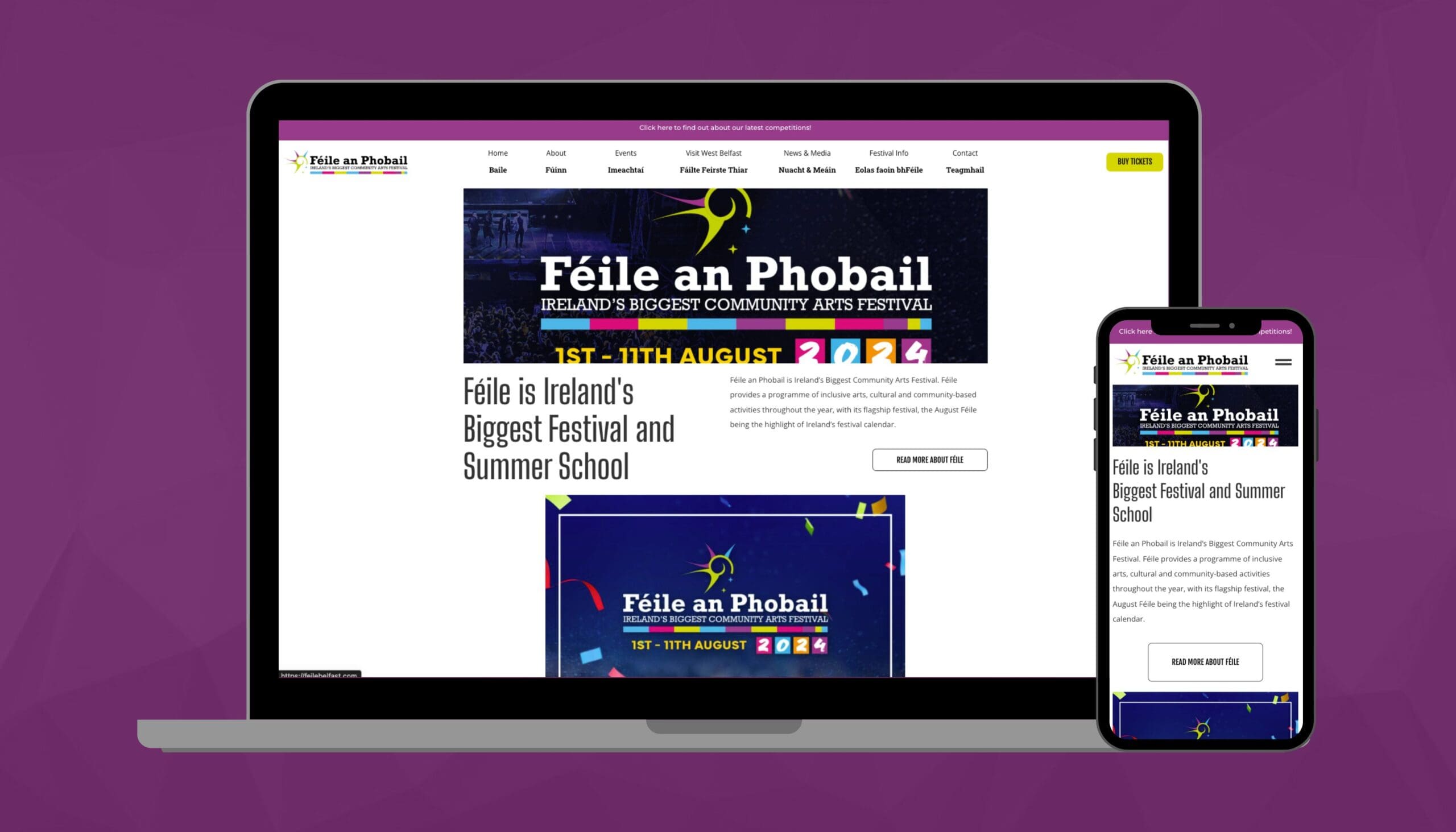
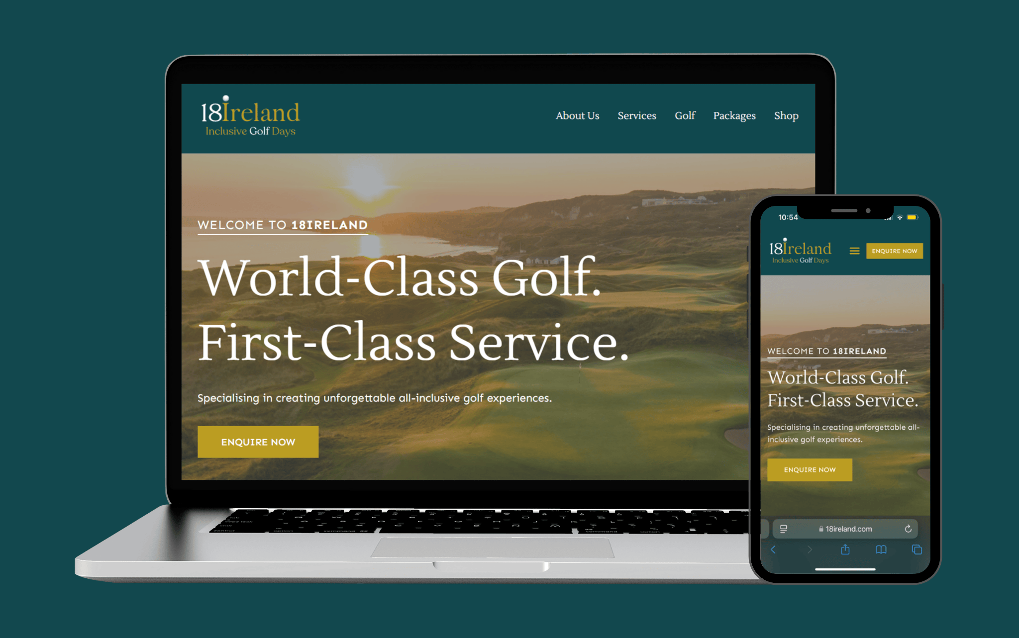
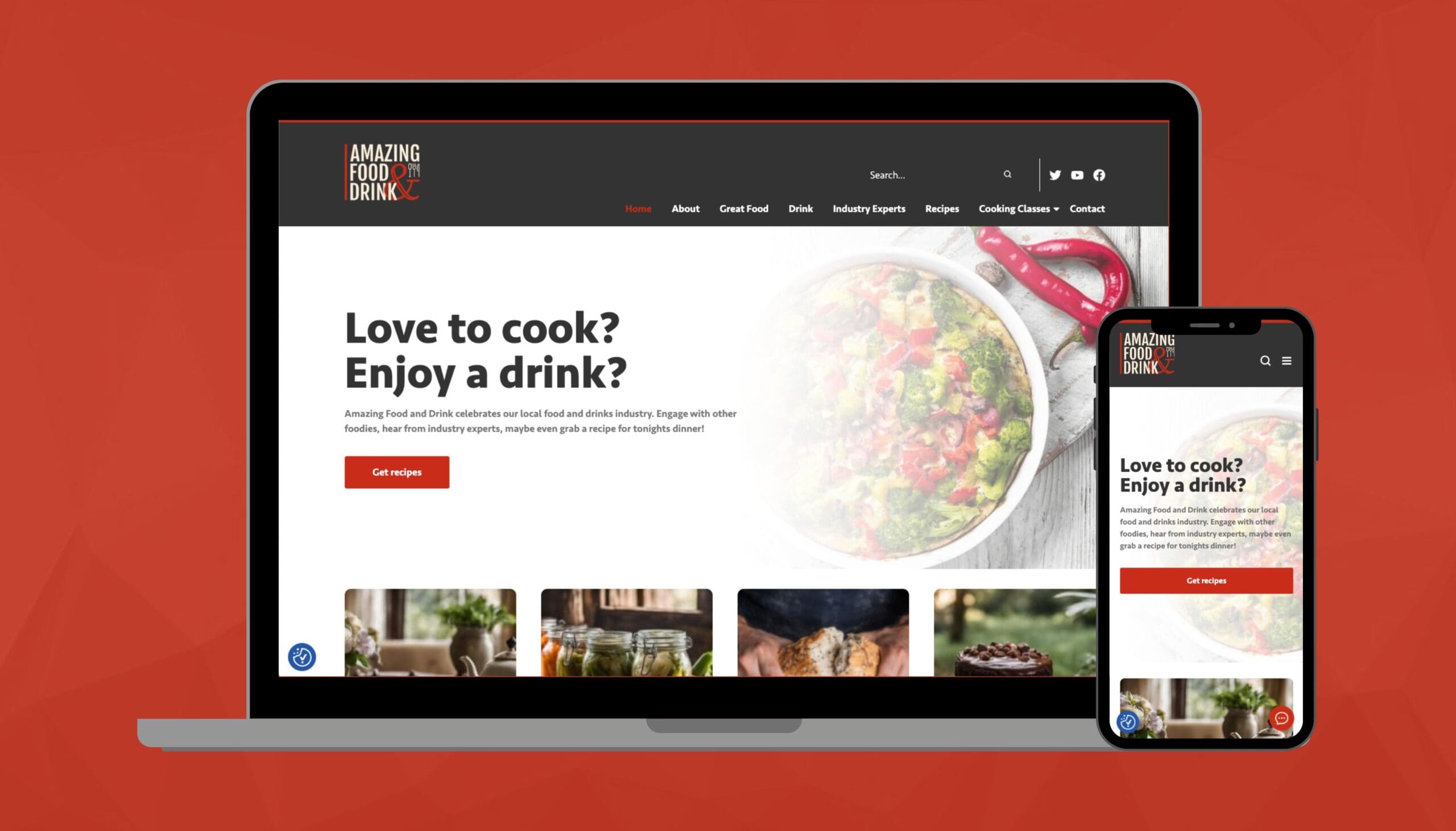
More Case Studies
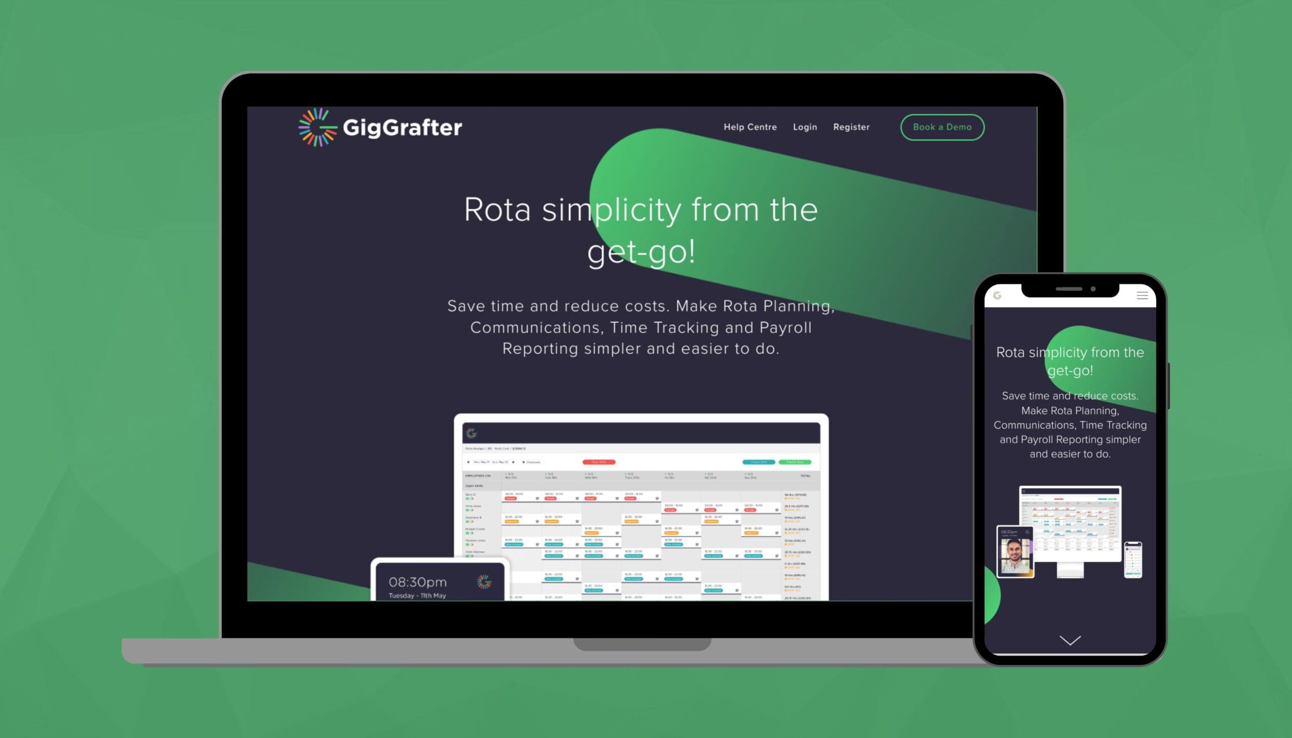
If you would like to see more about our previous case studies, be sure to check out the following articles: Community Charity Marketing Project | Consultant Web Design Project | Website Design for Membership Platform | Tourism Marketing for Crumlin Road Gaol | App Design for Gig Crafter.
Follow us on our socials for the latest news and articles: Facebook | Instagram | LinkedIn.